E-commerce · Landing pages
What Makes a Perfect E-commerce Landing Page?
Quick answer
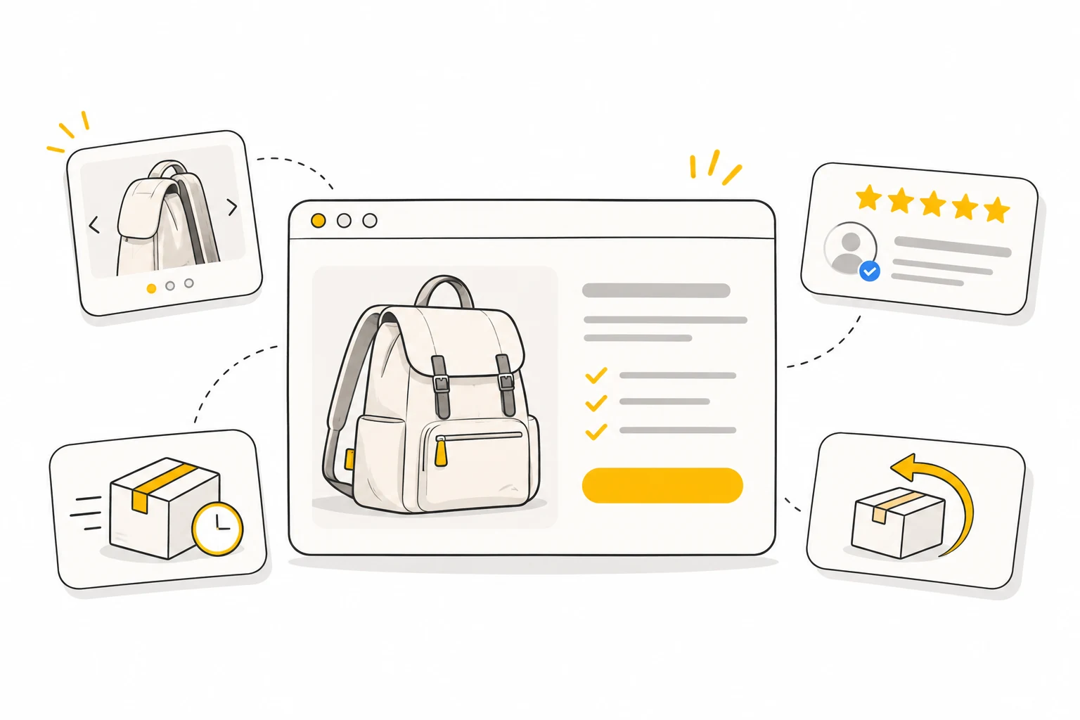
A clear e-commerce landing page answers five questions: what is the product, why should I care, do real people trust it, when will it arrive and can I return it? Use clear product images, benefits grounded in actual features, genuine customer proof, visible delivery details and a simple return-policy summary. Make those answers easy to find on mobile before adding more content.
Imagine you’re craving pizza. You open a delivery app, click on a restaurant and land on a cluttered, confusing page that takes forever to load. You leave.
Now imagine a page that shows close-ups of the pizza, lists clear prices and tells you when it will arrive. You order.
Your e-commerce landing page works the same way. If it’s messy or unclear, customers leave. If it’s simple, inviting and answers their questions, buying feels easier. Think of it like your favourite recipe: the ingredients need to work together.
So ask yourself: is your landing page creating clarity or confusion? Is it inviting action or making people hesitate?
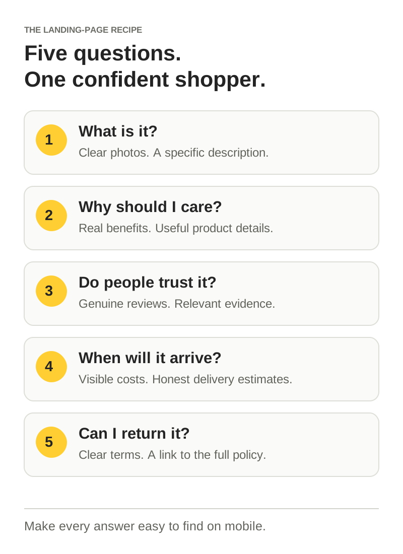
Ever been to a restaurant where the waiter ignores your table or the kitchen takes an hour for a simple order? You might not complain. You just never return. Online, leaving is even easier. Your page needs to answer five questions quickly: what’s the product, why should I care, do real people like it, when will I get it and can I return it?
01What’s the dish? Show the product clearly
When you walk into a restaurant, the menu helps you picture what you’re ordering. Not just the words, but the photos, descriptions and the way the dishes are presented. Your landing page needs to do the same: show, not just tell.
Start with clear product photography. People need to understand what they’re buying. If you’re selling a backpack, don’t just show it sitting on a white background. Show it from the front, the side and the inside. Help shoppers understand its shape, depth and capacity.
- The front: What does it look like? Show the shape, colour and finish.
- The side: How deep is it? Give shoppers a sense of proportion.
- The inside: What fits? Show the pockets, compartments and useful details.
- In use: Show someone packing it for a trip or wearing it, so its scale and purpose feel real.
Blurry or generic images leave questions unanswered. A short, useful video can do what a static image can’t: show how the zip opens, how a compartment works or how the product moves.
Use crisp, benefit-driven copy. A restaurant menu that only says “Soup” gives you very little to go on. Product copy should be just as specific. Instead of “Premium backpack”, try “An everyday backpack with a padded laptop pocket and room for your gym kit”, if that accurately describes the product.
Make the visuals relatable. For a portable blender, show it being used after a workout. Include close-ups of the blades, the blending action and the cleaning process. Real situations help shoppers imagine the product in their own lives.
When a visitor lands on the page, they should know what you’re selling without guessing. Keep the product, price, key benefit and next step easy to find, including on a phone. Compress images and choose video deliberately so the page still loads comfortably.
02Why should I care? Connect features to benefits
People come to a product with something they want to do: focus at work, make dinner faster or pack for a trip. Features matter when they help explain that outcome.
A feature is a fact about the product. A benefit explains what that fact means in someone’s day. Put them together so your copy is useful and believable.
- Headphones: “50mm drivers” tells a shopper about the hardware. Explain the listening experience and how it supports the use case, with evidence for any performance claims.
- Kitchen knife: “Stainless steel blade” describes a material. “Slice tomatoes cleanly” makes the task easier to picture, provided the product can deliver.
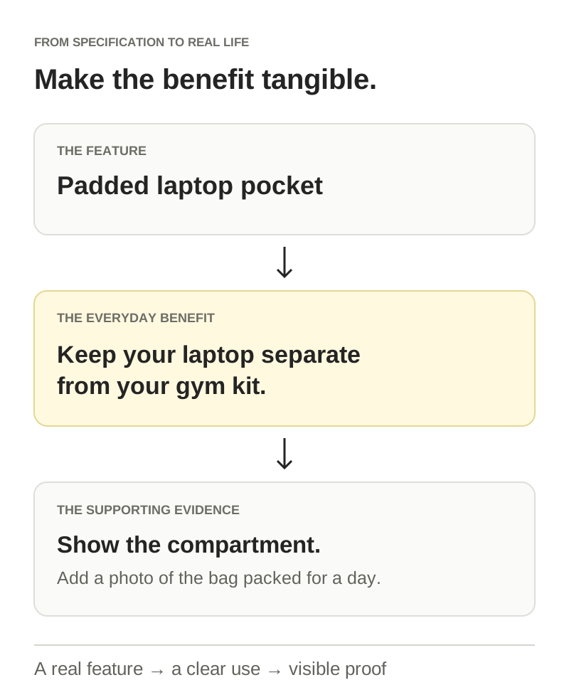
- Backpack: “Padded laptop compartment” is the feature. “Keep your laptop separate from your gym kit” explains why someone might want it.
- Charging cable: “Magnetic connector” is a specification. “Snaps into place without lining up the plug” explains the everyday convenience.
See the pattern? Translate the specification into a situation your customer recognises. Don’t turn an unsupported promise into a benefit: battery life, waterproofing and other measurable claims still need evidence and relevant conditions.
If your landing page reads like an engineering manual, start with the outcome and use the specifications to support it. Keep the details available for people who need them. The aim is to help shoppers understand the product, not make them decode it.
03Do real people like this? Show genuine social proof
A friend saying “This pizza is amazing” can make you want to try it. Customer feedback plays a similar role on a landing page: it helps someone understand what the experience might be like before they buy.
A good page doesn’t only tell people the product is good. It gives them useful, credible evidence. Start with the questions a new customer might ask.
- Customer reviews: Show genuine feedback and relevant detail. A review explaining how a blender fits into someone’s morning routine gives more context than stars alone. Display the rating alongside the review count.
- Customer photos and videos: Show how people use the product in real settings, with their permission. For a waterproof jacket, a customer’s hiking photo can add context alongside the product’s tested specifications.
- Relevant reassurance: Put accurate payment, guarantee or certification information near the decision it supports. Only show customer counts, badges and guarantees you can substantiate.
Place useful proof where shoppers are making decisions: a review summary near the purchase area, fuller reviews further down and relevant customer content beside the feature it demonstrates. You can also share approved customer feedback in emails and on social media.
Keep it real. Fake reviews and invented popularity undermine trust. A pile of badges can add clutter instead of reassurance. Choose the proof that answers a specific doubt and make it easy to inspect.
The goal isn’t to decorate the page with praise. It’s to give shoppers confidence that the product is right for them.
04When will I get it? Be clear about shipping
Nobody enjoys discovering a fee or a long delivery window just before paying. When someone is ready to buy, they want three practical answers: how much does shipping cost, when will the order arrive and can they track it?
Answer those questions before checkout wherever you can. If delivery depends on location, let shoppers enter their postcode or explain how to check an estimate.
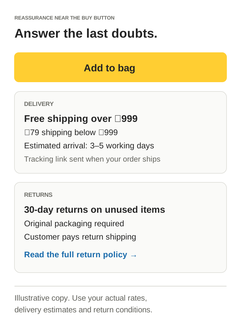
- Shipping cost: Instead of a vague message, state the actual rate or free-shipping threshold. For example: “Free shipping on orders over ₹999. ₹79 below ₹999.”
- Delivery estimate: Explain the likely arrival window for the shopper’s location. Distinguish dispatch time from transit time and account for working days.
- Tracking: Tell shoppers how they’ll receive tracking information after the order ships.
These are example messages, not recommended policies for every store. Use prices and timings your operations can support, and check that the product page, shipping policy and checkout agree.
Use urgency only when there’s a real deadline. “Order before 2pm for same-day dispatch” is helpful if it matches your fulfilment process. A timer that resets for every visitor creates pressure without useful information. Be clear about exclusions, weekends and serviceable locations.
After purchase, a tracking link helps answer the next question: “Where’s my order?” Keep the journey clear beyond the landing page.
05Can I return it? Make the policy easy to understand
No one wants to feel stuck with something that doesn’t work for them. Your return policy helps shoppers understand what happens if the size is wrong, the product arrives damaged or they change their mind.
Make the summary visible. Put a short, accurate explanation near the purchase area and link to the full policy. A footer link is useful, but it shouldn’t be the only place a shopper can find the answer.
Keep the language simple. Instead of “Returns subject to processing fees and must be requested within a reasonable timeframe”, specify the actual window, conditions and costs. “30-day returns on unused items. See the return policy for exclusions” is clearer if that is what you offer.
- Return window: How long does the customer have, and when does that period begin?
- Eligibility: Must the item be unused or in its original packaging? Which products are excluded?
- Costs: Who pays for return shipping? Are there any other charges?
- Refund timing: When is the refund processed, and what affects when the money arrives?
- Exchanges: Can someone choose a different size or product, and how do they start?
A short FAQ can answer common concerns without turning the product page into a contract. Link to the full policy for the details and keep both versions consistent.
Only say “free returns” or “no questions asked” if your policy actually supports it. Clear conditions help people make an informed decision and avoid disappointment later.
Clarity is the ingredient that ties it together
A useful landing page answers the right questions: what’s the product, why does it matter, who trusts it, when will it arrive and what happens if it needs to go back? Clear images, specific benefits, genuine proof and visible policies work together.
Open your page on a phone and walk through those five questions as a first-time shopper. Where do you have to hunt, guess or leave the page? Start there. Fix the confusing parts, then use customer feedback and your store’s data to understand what improves the experience.
For a structured review, download the landing-page scorecard in the free CRO toolkit. Need a fresh pair of eyes? Request a free CRO audit and get a practical starting point for your next improvements.
Common questions
What should an e-commerce landing page include?
Show the product, price, main benefit and a clear next step. Add useful product details, genuine customer proof, shipping costs and delivery estimates, and an accurate return-policy summary with a link to the full terms.
How do I turn product features into benefits?
Connect each relevant feature to a real customer need. A padded laptop pocket is a feature; keeping a laptop separate from gym kit is the everyday benefit. Show the detail that supports the claim and keep specifications available for shoppers who need them.
Where should I put shipping and return information?
Place a short summary near the purchase area, then link to the full policies. Explain costs, delivery estimates, return eligibility and any charges. Keep the product page, policies and checkout consistent, including on mobile.