80/20 Redesigns / Print shop / Cleveland, OH
By Anshul
Updated
An unsolicited 2-hour concept for Special Vinyls Unit, a family-owned print and sign shop in Cleveland. What held the old homepage back, what I changed, and how both score on the same checklist.
Unsolicited concept. Not commissioned by or affiliated with Special Vinyls Unit. All trademarks belong to their owners.
Checklist score66 → 94out of 100
Time spentabout 2 hours
The short version
- 01
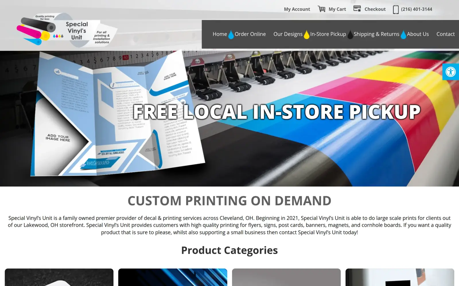
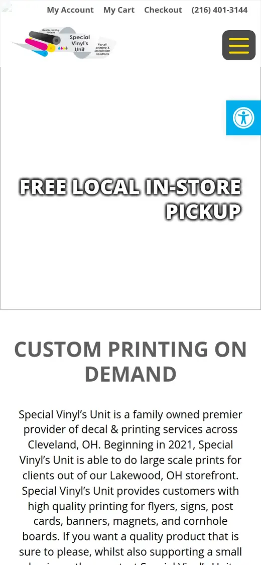
Problem: The first screen sold a pickup promo, not the shop. There was no button to act on.
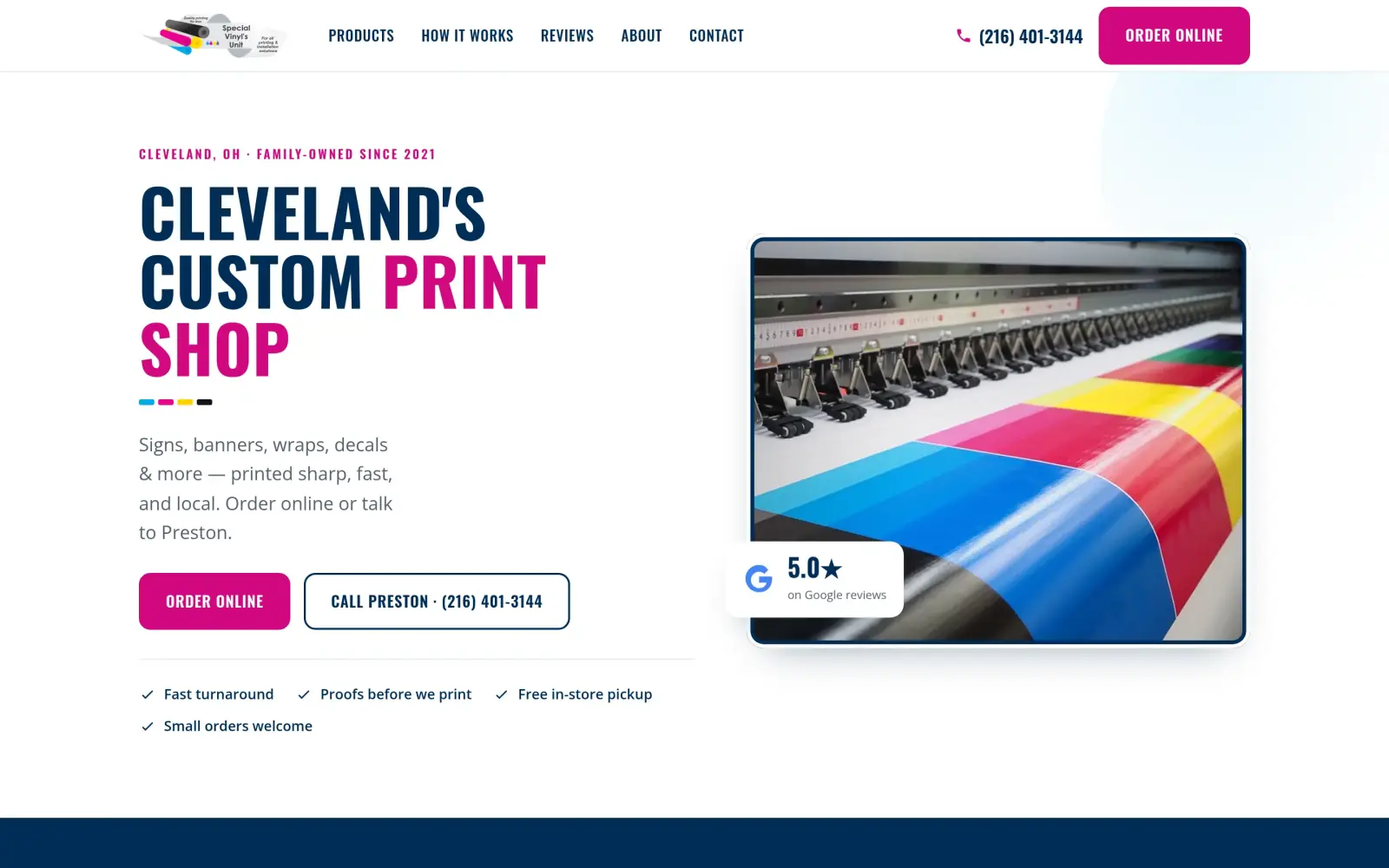
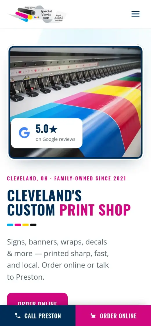
Fix: A plain headline ("Cleveland's Custom Print Shop") with one main button, Order Online, and a second one to call the owner.
- 02
Problem: Template text was still baked into the images: "YOUR HEADLINE GOES HERE" on product tiles, dummy Latin text in the hero.
Fix: Kept the real product photos and swapped every template mockup for a plain colour tile from the shop's own CMYK palette.
- 03
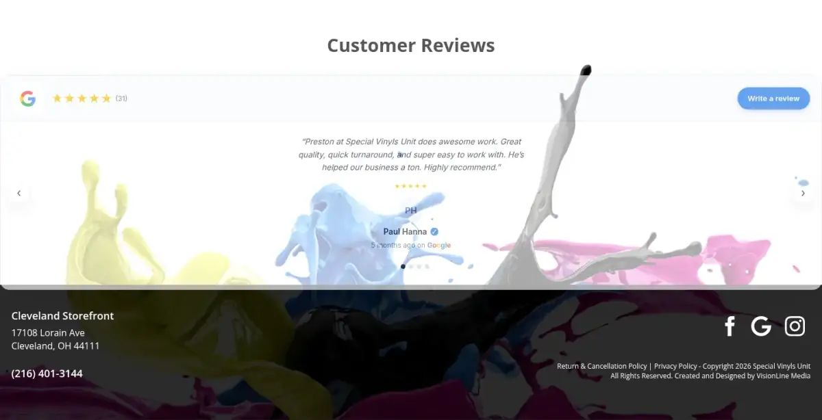
Problem: A wall of five-star reviews that name the owner sat at the very bottom, one at a time in a slider.
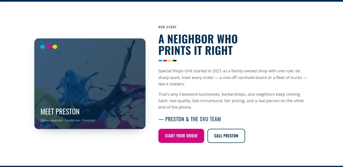
Fix: The rating goes on the first screen, the owner gets a name and a section, and the reviews run as a full band.
The shop and the job of its homepage
Special Vinyls Unit is a family-owned print and sign shop on Lorain Ave in Cleveland, running since 2021.
It prints business cards, flyers, yard signs, banners, magnets, decals, vehicle lettering and cornhole boards. Customers can order online and pick up in store, which none of the other Cleveland sign shops I looked at offer.
Its reviews keep saying the same three things: quality, fast turnaround, and Preston, the owner, is great to work with. Several come from other local businesses: barbershops, a garage, an HVAC company.
So the homepage has one job: get a local visitor to start an order or call Preston, fast.
Same checklist, both sites
The score
This is not an agency rebuild. I gave the concept about 2 hours and spent them on the fixes that do the most for customers: the 20% of the work that gets 80% of the improvement.
To show how much that improves, I score every original homepage and every concept on the same 100-point checklist. Most checks are yes or no, and a script runs the technical ones (speed, mobile, accessibility). When in doubt, the point goes to the original site.
Original site
66/ 100
Concept
94/ 100
ClarityOriginal: 14/20Concept: 20/20
First screen says what the business does, in plain words (8 pts)
PassOriginal: The heading "Custom Printing On Demand" and the intro paragraph name the services, just below the promo banner.
PassConcept: "Cleveland's Custom Print Shop" with "Signs, banners, wraps, decals & more" under it.
First screen says where, or who it serves (6 pts)
PassOriginal: The intro paragraph says "across Cleveland, OH", in small type.
PassConcept: Cleveland named in the headline and the line above it.
One main action stands out on the first screen (6 pts)
FailOriginal: No main button on the first screen: the banner says "Free local in-store pickup" and every link in the menu has the same weight.
PassConcept: A filled magenta "Order Online" button; "Call Preston" is a secondary outline button.
ContactOriginal: 20/20Concept: 20/20
Phone or main button visible on the first mobile screen (8 pts)
PassOriginal: first mobile screen: "(216) 401-3144", "Order Online", "Contact"
PassConcept: first mobile screen: "Order Online", "Call Preston · (216) 401-3144", "Call Preston"
Phone number is tap-to-call (4 pts)
PassOriginal: 2 tap-to-call link(s)
PassConcept: 6 tap-to-call link(s)
Phone or main button in the desktop header (4 pts)
PassOriginal: desktop header: "(216) 401-3144", "Order Online"
PassConcept: desktop header: "Contact", "(216) 401-3144"
Short form, or the main button leads straight to one (4 pts)
PassOriginal: No lead form; "Order Online" goes to the online shop, which is the right path for a print shop.
PassConcept: No lead form; "Order Online" leads to the product grid, where each product has an order link.
ProofOriginal: 9/15Concept: 15/15
Reviews or a rating in the first two screens (6 pts)
FailOriginal: The first review appears about 1,940px down, just past the first two desktop screens.
PassConcept: 5.0 Google rating badge on the first screen.
Testimonials carry real names or a named platform (5 pts)
PassOriginal: Google reviews with names (e.g. Paul Hanna).
PassConcept: Named Google reviews in the reviews section.
At least one specific, checkable number (4 pts)
PassOriginal: "Beginning in 2021" in the intro paragraph.
PassConcept: "Family-owned since 2021" and the 5.0 rating.
TrustOriginal: 11/15Concept: 15/15
Real photos of the team, work or place (5 pts)
PassOriginal: Some product tiles are real work (yard sign, cornhole board); others are template mockups. Benefit of the doubt.
PassConcept: Real product photos and the shop's own printer; template mockups replaced with plain colour tiles.
Owner or team named or shown (4 pts)
FailOriginal: The owner, Preston, is only named inside customer reviews; the site itself names or shows no one.
PassConcept: Preston named in the hero button and the "Meet Preston" section.
Full address or clear service area (3 pts)
PassOriginal: Street address (17108 Lorain Ave) in the footer.
PassConcept: Full address in the footer: 17108 Lorain Ave, Cleveland, OH 44111.
License, insurance or "since [year]" (3 pts)
PassOriginal: "Beginning in 2021".
PassConcept: "Family-owned since 2021".
MobileOriginal: 7/10Concept: 7/10
No sideways scroll at 390px (4 pts)
PassOriginal: page is 390px wide at 390px
PassConcept: page is 390px wide at 390px
Body text 16px or larger (3 pts)
PassOriginal: median paragraph text 16px on mobile
FailConcept: median paragraph text 15px on mobile
Main buttons at least 44px tall (3 pts)
FailOriginal: first-screen actions: 17px, 40px, 40px tall
PassConcept: first-screen actions: 60px, 60px, 54px, 54px tall
IntegrityOriginal: 2/5Concept: 5/5
No placeholder text or broken images (3 pts)
FailOriginal: Overrides the automatic pass: template text is baked into the images ("YOUR HEADLINE GOES HERE", "ADD YOUR IMAGE HERE" and dummy Latin text in the hero).
PassConcept: no placeholder text or broken images found (screenshots still get a manual look)
Header and footer links all work (2 pts)
PassOriginal: 7 header/footer link(s) checked, all work
PassConcept: 1 header/footer link(s) checked, all work
SpeedOriginal: 1/10Concept: 7/10
Lighthouse mobile performance (10 pts)
FailOriginal: Lighthouse mobile performance 7 (median of 2: 3, 7)
FailConcept: Lighthouse mobile performance 77 (median of 3: 75, 77, 87)
AccessibilityOriginal: 2/5Concept: 5/5
No serious accessibility issues (axe) (3 pts)
FailOriginal: 8 serious/critical axe issue(s)
PassConcept: 0 serious/critical axe issue(s)
Content images have alt text (2 pts)
PassOriginal: 2/2 content images have alt text
PassConcept: 5/5 content images have alt text
Scored 2026-09-29 · How the checklist works
What held the old homepage back
The old site does real things right: an online shop, a phone number in the header, real product photos for several categories and genuine reviews. The problems are about what a visitor sees first, and what they see that they shouldn't.
- The biggest words on the page are a promo, "Free local in-store pickup". They don't say what the shop does.
- The hero photo is a stock demo: its brochure still reads "ADD YOUR IMAGE HERE" over dummy Latin text.
- "Order Online", the main action, is one of seven menu links with the same weight. There is no button.
- What the shop actually does is in one long paragraph of small grey text.
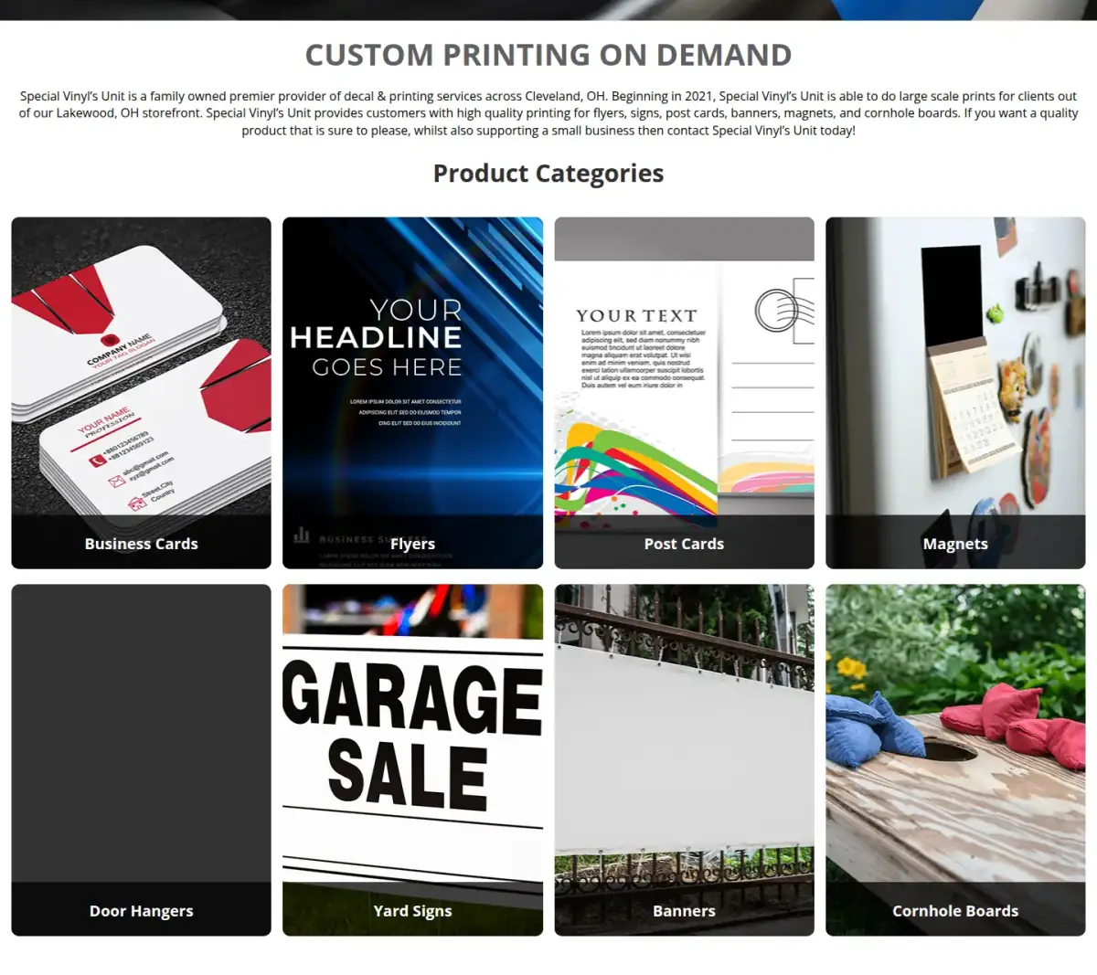
- The Flyers tile is a template mockup that still says "YOUR HEADLINE GOES HERE".
- The Post Cards tile says "YOUR TEXT". For a shop selling print quality, this reads as unfinished.
What other print shops do
I looked at two groups: the big online printers that set what "easy to order" means, and other Cleveland sign shops.
Competitor review
| Site | Type | What they do well | What a local customer misses |
|---|---|---|---|
| Signs.com | National online printer | Product picker right in the hero; star ratings on products | Not local; nobody to call by name |
| Vistaprint | National online printer | Real product photos; a clear button per category | Not local; nobody to call by name |
| 216 Signs | Cleveland sign shop | Bold, confident type; a clear "Get a quote" button | Quote only, no online ordering |
| Epic Signs | Cleveland sign shop | A category grid with real photos | Quote only, no online ordering |
| Cleveland Wrap | Cleveland wrap shop | A tight focus on vehicle wraps, with a gallery | Wraps only; quote only |
The gap nobody fills: a local, owner-run shop you can also order from online. The national printers have the ordering but no face. The local shops have the face but make you ask for a quote. Special Vinyls Unit has both, so that is what the new homepage leads with.
The direction: their own CMYK, made into a system
The shop's logo is four ink rollers in cyan, magenta, yellow and black: the four inks every colour printer uses. Its menu already had little ink drops in those colours. That is a brand identity no other shop in town owns, so I kept it and made it the whole design system.
Directions I considered (scored out of 55)
| Direction | Score | Why |
|---|---|---|
| CMYK print shop (chosen) | 52 | Their own brand, made into a system; real photos in hand; nobody local looks like it |
| Clean online store | 41 | Easy to order from, but looks like every national printer |
| Dark industrial | 38 | Looks like every wrap shop and drops the brand's colours |
The design system
- Navy
#002d56Structure, headings, footer - Cyan
#00aeefAccent: category colour, rules - Magenta
#ec008cMain button (a darker #d10880 behind white text, for contrast) - Yellow
#ffd200Accent, only on navy - Key
#111418Body text
- Oswald
- Headlines. Condensed, like printed signage; the shop already used it.
- Open Sans
- Body text. Also the shop's own font.
Section by section
Each part of the page, original on the left and concept on the right. The slider at the top of the post compares the first screen up close.
Before
After
First screen
- Say what and where
- "Cleveland's Custom Print Shop", then one line on what they print. A four-word headline and one line under it do the job of the old paragraph.
- One main button
- Order Online in magenta. Call Preston sits next to it as a lighter second choice.
- Proof up top
- The Google rating and four facts (fast turnaround, proofs before printing, free pickup, small orders welcome) sit right under the buttons.
Before
After
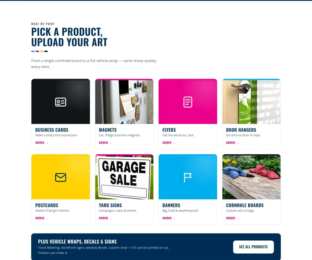
Products
- Only real photos
- Real photos stay. Every template mockup became a plain tile in one of the four ink colours, so nothing looks unfinished.
- Every tile is an action
- Each product gets a one-line description and an "Order" link, plus a band for wraps, decals and custom work.
Before
After
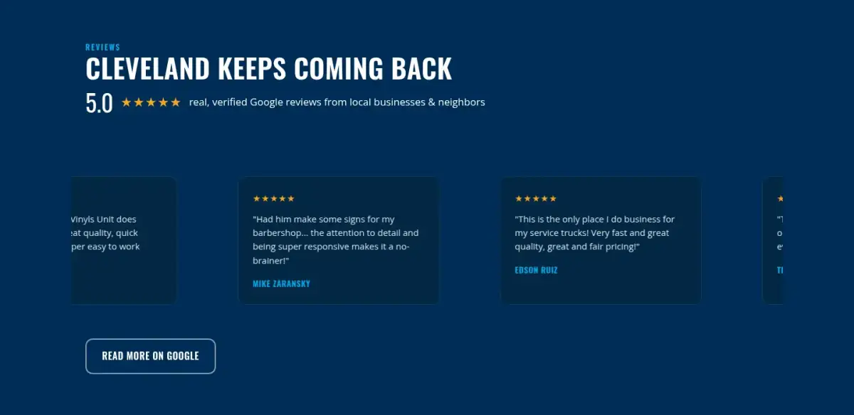
Reviews and the owner
- Reviews as a band
- The same real, named reviews, several visible at once, under "Cleveland keeps coming back".
- Name the owner
- Customers mention Preston by name again and again. The concept does too: in the hero button, and in a "Meet Preston" section.
Before
After
Mobile
- A sticky call bar
- "Call Preston" and "Order Online" stay at the bottom of the screen the whole way down.
- Bigger buttons
- On the old mobile first screen, the phone and menu links are 17 to 40px tall. The concept's buttons are 54 to 60px, easy to hit with a thumb.
Steal this: 6 fixes for any print or sign shop
- Put what you print and where in the first headline. "Cleveland's custom print shop" beats any promo.
- Pick one main button. Order online or get a quote, not both at the same weight. Make the phone number the second choice.
- Look at every image at full size. Hero sliders and product mockups often ship with template text. No tool that reads your page will catch it.
- Show your rating on the first screen, then show the reviews as a group, not one at a time.
- Name the owner. If your reviews mention a person, put that person on the page.
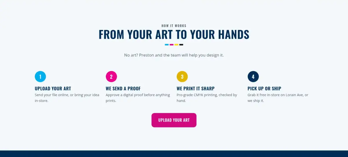
- Explain ordering in four steps: upload, proof, print, pick up. It answers "how does this work?" before anyone has to call.
What I'd still fix with more time
The concept scores 94, not 100. Two hours doesn't fix everything, and the checklist applies to my work too:
- Mobile text is 15px. It should be 16px or more.
- Mobile speed is 77 on Lighthouse. I'd get it above 90 before launch.
- The "5.0 on Google" badge needs checking against the live Google profile. I haven't confirmed the rating or the number of reviews.
- Business hours and an email address are on neither site. That is a question for Preston.
- "Order Online" jumps to the product grid. In a real build, each product would link straight to its order page in the existing shop.
My take
If I were talking to Preston, I would start here: your shop is better than your homepage makes it look. Customers name you in their reviews, the work in the photos is real, and none of the Cleveland sign shops I looked at let you order online and pick up in store. The old page buried all of that under a promo banner and a template brochure.
The part I am least sure about is the CMYK idea. It turns the shop's own logo into a design system, and I like that it belongs to them. But it is a loud look. The plain online-store direction scored lower in my notes (41 against 52), yet an owner who wants to feel more corporate could reasonably choose it. That is a taste call, and it is Preston's to make, not mine.
A word on the two hours. I spent them on the first screen, the products, the reviews and the mobile bar. I did not touch speed, and I have not confirmed the 5.0 rating against Google. Two hours fixed the biggest problems. It did not make a finished website, and I would not want the score to suggest it did.
The live concept
The full concept is live on this site, with a bar at the top saying it is a concept and not Special Vinyls Unit's real website.
The real site: specialvinylsunit.com
Questions
What should a print shop homepage show first?
What you print, where you are, one main button (order online or get a quote) and your rating. Everything else can sit lower on the page.
How do I find leftover template text on my website?
Open every image at full size, including slider images and product tiles. Tools that read your page can't see text inside images, which is how "YOUR HEADLINE GOES HERE" stayed live here.
Can a small-business website really be improved in 2 hours?
Its biggest problems often can. Here, about 2 hours went into a clear headline, one main button, the rating on the first screen, plain tiles in place of template mockups and a call bar on mobile. The score went from 66 to 94. Speed, final details and a real build take longer; they are listed under "What I'd still fix with more time".
Did Special Vinyls Unit ask for this redesign?
No. This is an unsolicited concept, and I'm not affiliated with the business. If you own it and want anything changed or removed, email me and it's done within 48 hours.
How is the score worked out?
With a 100-point checklist: clarity, contact, proof, trust, mobile, integrity, speed and accessibility. A script runs the technical checks; I judge the rest from screenshots and note a reason for each. The original site gets the benefit of the doubt.
Own Special Vinyls Unit and want this changed or removed? Email anshul@anshuldesigns.com and it's done within 48 hours.