80/20 Redesigns / Fractional executive firm / USA
By Anshul
Updated
An unsolicited 2-hour concept for Lighthouse Power Business, a fractional C-suite and advisory firm for mid-sized companies. What held the original homepage back, what I changed, and how both score on the same checklist.
Unsolicited concept. Not commissioned by or affiliated with Lighthouse Power Business. All trademarks belong to their owners.
Checklist score59 → 74out of 100
Time spentabout 2 hours
The short version
- 01
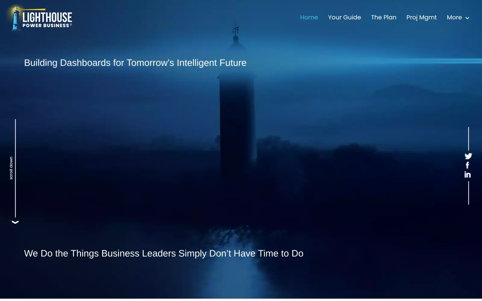
Problem: The first screen is a lighthouse photo with a line about "dashboards" and a slogan. It never says the firm supplies fractional executives, or for whom.
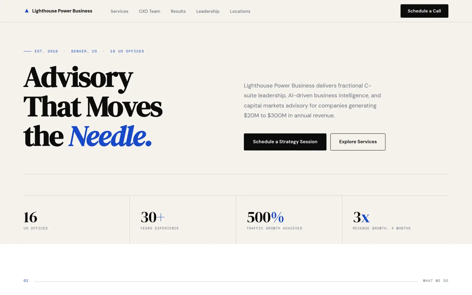
Fix: The headline is "Advisory That Moves the Needle." and the line beside it says what the firm delivers and that it serves companies with $20M to $300M in revenue.
- 02
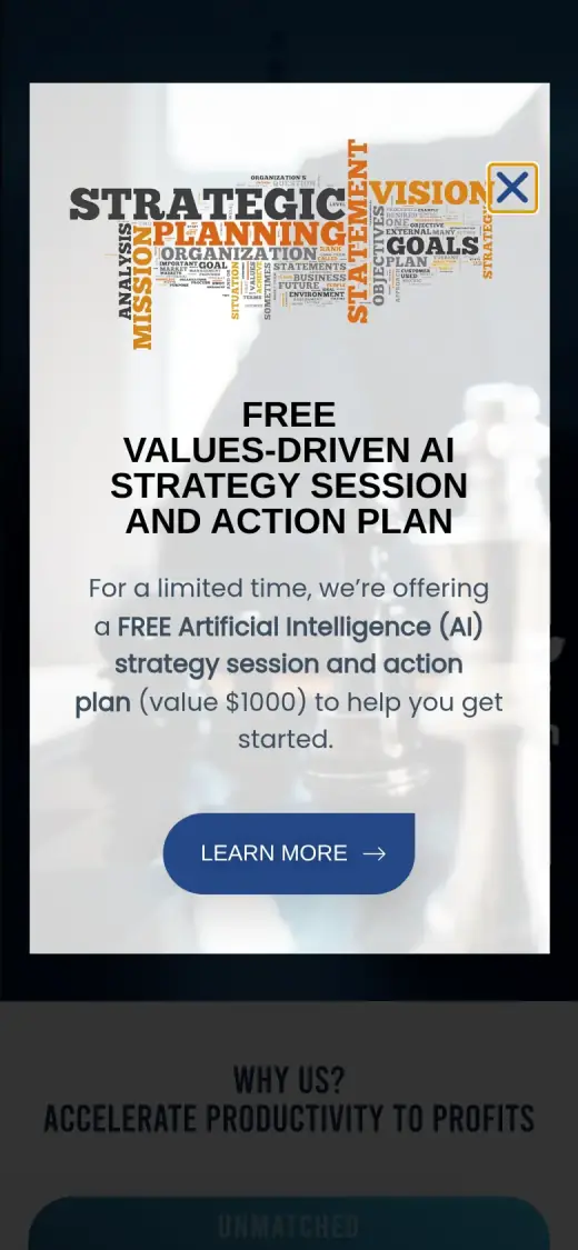
Problem: There is no button or phone number in the header, and the first thing a visitor meets is a pop-up that covers the page.
Fix: A black "Schedule a Call" button sits in the header, and "Schedule a Strategy Session" is the one filled button in the hero.
- 03
Problem: The proof is on other pages. The home page has no numbers, no client quotes and no picture of a person.
Fix: Four numbers sit under the hero, results and the founder get their own sections, and client quotes follow. Not solved: the quotes are signed only with job titles, so they still need real names.
Lighthouse Power Business and the job of its homepage
Lighthouse Power Business is an advisory firm for mid-sized companies. It supplies fractional executives (CFO, COO, CTO and strategy officers) who work inside a client's leadership team for a fraction of the cost of a full-time hire, plus AI and business-intelligence work and financial planning.
Its own site says it serves businesses with annual revenue of $20M to $300M, and that its team are IBM Certified AI Implementers and Certified Scrum Masters. It also lists what it does not do: it does not run your business, make your products, manage your workforce or give legal advice. The CEO is Jerry Nichols, named on the site.
A visitor here is probably an owner or executive who is deciding whether to book a call. The homepage has one job: make clear in a few seconds what the firm does, who it is for, and how to start.
Same checklist, both sites
The score
This is not an agency rebuild. I gave the concept about 2 hours and spent them on the fixes that do the most for customers: the 20% of the work that gets 80% of the improvement.
To show how much that improves, I score every original homepage and every concept on the same 100-point checklist. Most checks are yes or no, and a script runs the technical ones (speed, mobile, accessibility). When in doubt, the point goes to the original site.
Original site
59/ 100
Concept
74/ 100
ClarityOriginal: 6/20Concept: 20/20
First screen says what the business does, in plain words (8 pts)
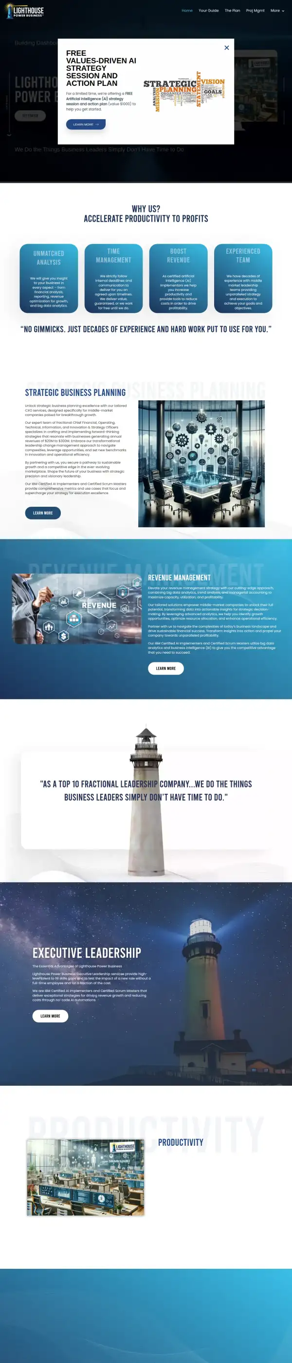
FailOriginal: A pop-up covers the first screen; around it I can read only "Building Dashboards", the name and the line "We Do the Things Business Leaders Simply Don't Have Time to Do", which is a slogan.
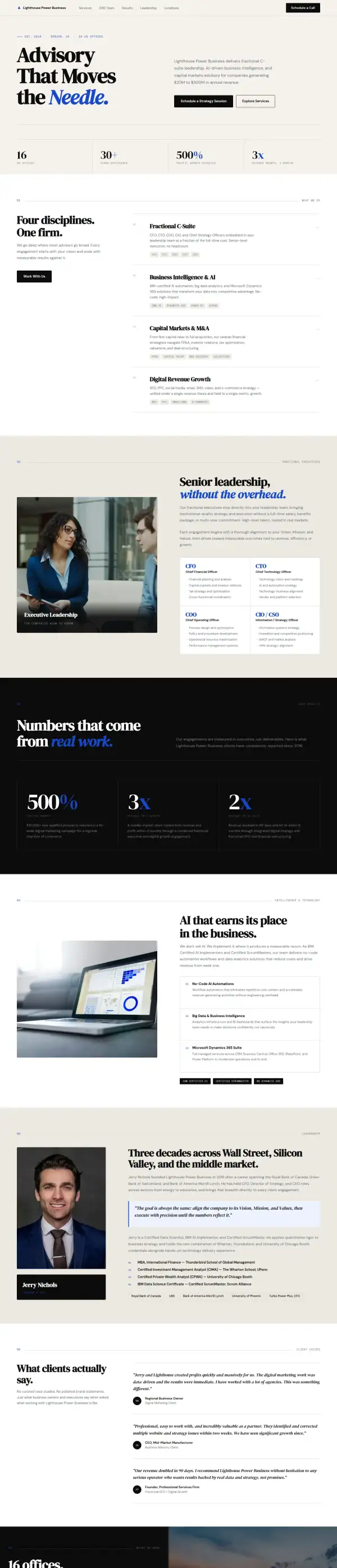
PassConcept: "Advisory That Moves the Needle." with "delivers fractional C-suite leadership, AI-driven business intelligence, and capital markets advisory" beside it.
First screen says where, or who it serves (6 pts)
FailOriginal: The first screen names no city and no kind of client; the "$20M to $300M" middle-market line is on the third screen.
PassConcept: The line under the headline says it serves "companies generating $20M to $300M in annual revenue", a figure the original uses; the "Denver, CO" tag above it is not on the original.
One main action stands out on the first screen (6 pts)
PassOriginal: The pop-up offers one button, "Learn More", for a free AI strategy session, and a grey "Get Started" button sits behind it.
PassConcept: A filled black "Schedule a Strategy Session" button, with "Explore Services" as an outline beside it and "Schedule a Call" in the header.
ContactOriginal: 16/20Concept: 16/20
Phone or main button visible on the first mobile screen (8 pts)
PassOriginal: Overrides the automatic check: the script read a bot-check page. The first mobile screen shows the pop-up with a "Learn More" button.
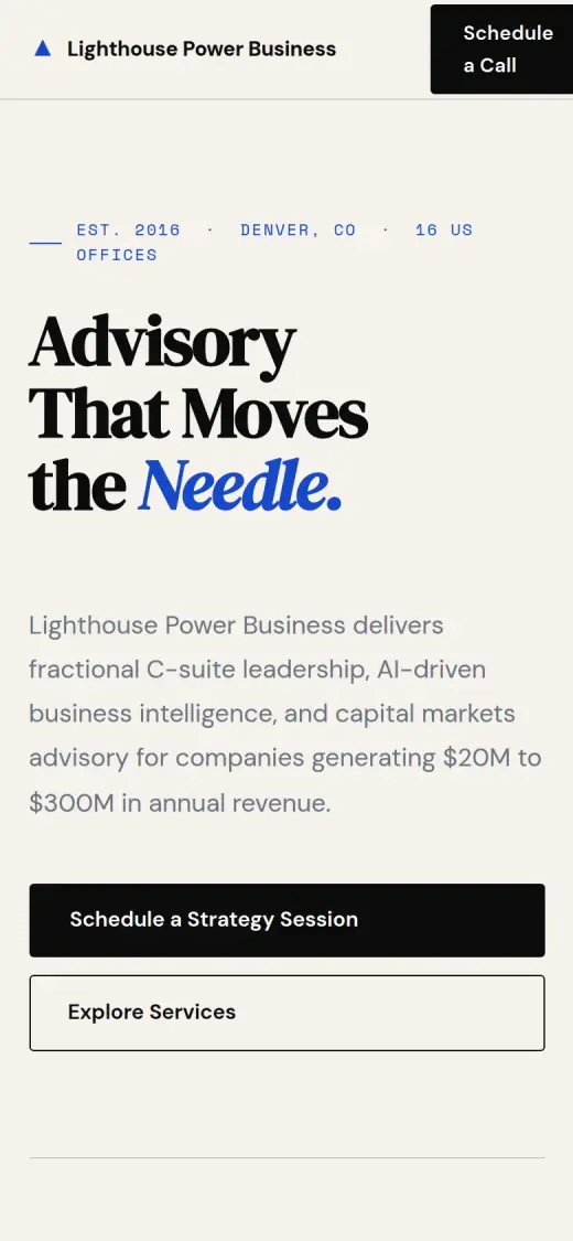
PassConcept: first mobile screen: "Schedule a Call", "Schedule a Strategy Session"
Phone number is tap-to-call (4 pts)
PassOriginal: Not measured: the original's server showed the scorer a bot-check page, so it gets the full points.
FailConcept: 0 tap-to-call link(s)
Phone or main button in the desktop header (4 pts)
FailOriginal: Overrides the automatic check: in the desktop capture the header shows Home, Your Guide, The Plan, Proj Mgmt and More, with no phone number or button.
PassConcept: desktop header: "Schedule a Call"
Short form, or the main button leads straight to one (4 pts)
PassOriginal: "Get Started" and "Request Quote" lead to a form with five fields (website, name, email, phone, message); I checked the live page.
PassConcept: The contact form near the bottom has three fields.
ProofOriginal: 0/15Concept: 4/15
Reviews or a rating in the first two screens (6 pts)
FailOriginal: No reviews, rating or testimonials appear in the first two screens; the second screen is the "Why us" cards.
FailConcept: The first two screens show a stats bar and a service list; the client quotes start about 3,500px down.
Testimonials carry real names or a named platform (5 pts)
FailOriginal: The home page has no testimonials; client quotes with initials live on a separate Case Study page.
FailConcept: The three quotes are signed "Regional Business Owner", "CEO, Mid-Market Manufacturer" and "Founder, Professional Services Firm", with no names or platform.
At least one specific, checkable number (4 pts)
FailOriginal: The home page shows no number that is proof; "decades of experience" has no figure and "a $1000 value" is an offer, not a result.
PassConcept: "500% traffic growth" and "100,000+ new prospects in 10 weeks" match the original's Case Study page; the "3x revenue in 4 months" figure does not (the original says 3x in 6 months).
TrustOriginal: 7/15Concept: 7/15
Real photos of the team, work or place (5 pts)
FailOriginal: The images are illustrations and stock (an AI-style boardroom picture, a revenue graphic, a lighthouse photo), not the team or its work.
FailConcept: The photos are a laptop, a city skyline and a portrait that I cannot confirm is Jerry Nichols; none shows the team's work.
Owner or team named or shown (4 pts)
PassOriginal: The footer text names Jerry Nichols and gives his email, jnichols@lighthousepowerbusiness.com; no photo of him appears.
PassConcept: "Jerry Nichols, Founder & CEO" has his own section; the name is on the original site, the portrait and the credentials list are unverified.
Full address or clear service area (3 pts)
FailOriginal: No address or service area on the home page; "16 locations" appears only on the About page.
FailConcept: The footer address (1200 17th St, Denver) and the list of 16 cities are not on the original, which says only "offices in 16 locations".
License, insurance or "since [year]" (3 pts)
PassOriginal: "IBM Certified AI Implementers and Certified Scrum Masters" appears in four service blocks.
PassConcept: "IBM Certified AI" and "Certified ScrumMaster" tags in the AI section, both stated on the original.
MobileOriginal: 10/10Concept: 10/10
No sideways scroll at 390px (4 pts)
PassOriginal: Not measured: the original's server showed the scorer a bot-check page, so it gets the full points.
PassConcept: page is 390px wide at 390px
Body text 16px or larger (3 pts)
PassOriginal: Not measured: the original's server showed the scorer a bot-check page, so it gets the full points.
PassConcept: median paragraph text 15.52px on mobile
Main buttons at least 44px tall (3 pts)
PassOriginal: Overrides the automatic check: the mobile pop-up button is about 55px tall.
PassConcept: first-screen actions: 62px, 50px tall
IntegrityOriginal: 5/5Concept: 5/5
No placeholder text or broken images (3 pts)
PassOriginal: no placeholder text or broken images found (screenshots still get a manual look)
PassConcept: no placeholder text or broken images found (screenshots still get a manual look)
Header and footer links all work (2 pts)
PassOriginal: Not measured: the original's server showed the scorer a bot-check page, so it gets the full points.
PassConcept: 2 header/footer link(s) checked, all work
SpeedOriginal: 10/10Concept: 10/10
Lighthouse mobile performance (10 pts)
PassOriginal: Not measured: the original's server showed the scorer a bot-check page, so it gets the full points.
PassConcept: Lighthouse mobile performance 97 (median of 3: 70, 97, 99)
AccessibilityOriginal: 5/5Concept: 2/5
No serious accessibility issues (axe) (3 pts)
PassOriginal: Not measured: the original's server showed the scorer a bot-check page, so it gets the full points.
FailConcept: 79 serious/critical axe issue(s)
Content images have alt text (2 pts)
PassOriginal: Not measured: the original's server showed the scorer a bot-check page, so it gets the full points.
PassConcept: 4/4 content images have alt text
Scored 2026-09-30 · How the checklist works
What held the original back
The original does real things right. The service copy is specific ("fractional Chief Financial, Operating, Technical, Information, and Innovation & Strategy Officers"), the "$20M to $300M" client range is stated, the certifications are stated, there is a "What we do" and "What we don't do" list, and a promise that "we deliver value, guaranteed, or we work for free until we do". The quote form behind "Get Started" has five fields. What gets in the way is the first screen. Two notes on the capture. First, the hero is animated, and in the frame I marked below its headline and button had not yet appeared. Second, my other screenshots show a pop-up covering the hero; it is in the page's own code, so it is real, and I checked that with curl. The measured scores for the original (speed, accessibility, links) came from a bot-check page, so I do not quote them.
- Five menu links and no button. I could not see a phone number, a "Request Quote" button or a call button in the header.
- "Building Dashboards for Tomorrow's Intelligent Future" is the first line. It suggests a software product, not fractional executives.
- Most of the first screen is a dark lighthouse photo. Nothing in it says who the firm helps or what it does.
- "We Do the Things Business Leaders Simply Don't Have Time to Do" is a slogan. It does not say which things.
What I changed
The first screen and the mobile view, original on the left and concept on the right. The slider at the top of the post compares the first screen up close.
Before
After
First screen
- Say what and for whom
- The headline and the line beside it say "fractional C-suite leadership, AI-driven business intelligence, and capital markets advisory for companies generating $20M to $300M". That range is the firm's own; on the original it sits on the third screen.
- One main button
- "Schedule a Strategy Session" is the filled button. "Explore Services" is an outline beside it, and "Schedule a Call" is in the header. The original's first offer, the free AI session, is not in the concept.
- Numbers under the hero
- The strip shows 16 offices, 30+ years and 500% traffic growth, which the original states on its About, Strategy Offer and Case Study pages. The fourth figure, "3x revenue growth, 4 months", is not one I could match (the Case Study page says revenue doubled in 90 days and tripled in 6 months).
Before
After
Mobile
- No pop-up in the way
- On the original mobile page a pop-up fills almost the whole first screen. In the concept the first screen is the headline, one line about the firm and two buttons.
- Two buttons a thumb can hit
- The hero button is 50px tall and the header button 62px. The header button wraps "Schedule a Call" onto two lines at this width, which I list below.
The whole page, before and after
Steal this: 6 fixes for any fractional executive firm
- Put what you do and who it is for in the first line. "Fractional executives for companies with $20M to $300M in revenue" tells a visitor at once whether the page is for them. A line about dashboards does not.
- Give the header one button. A visitor who has decided to talk should not need to open a menu. One filled button, worded as the action ("Schedule a Call"), is enough.
- Treat a pop-up with care. A pop-up on the first screen hides your headline, and on a phone it hides the whole page. If you keep one, show it after a delay or on exit and make it small.
- Bring your best proof onto the home page. This firm has a Case Study page with named clients and figures, but the home page shows none of it. Lift one number and one quote to the top.
- Name your clients, or say why you cannot. A quote signed "Founder, Professional Services Firm" reads as weaker than one signed with a name. If clients need to stay private, say so in a line.
- Show the person you are asking a visitor to trust. For a firm selling senior advice, the founder is the product. Give him a photo, a name and a short line on the home page.
What I'd still fix with more time
The concept does not score 100. About 2 hours doesn't fix everything, and the checklist applies to my work too:
- The quotes are reworded and anonymous. The concept quotes follow the tone of client feedback on the original's Case Study page but are reworded, and they drop the names (the original signs them Greg B, Betsy H and so on). I would go back to the real wording, with names or a note on why not.
- Several claims are mine, not the firm's. "Denver, CO" as headquarters, "Est. 2016", the street address in the footer, the list of sixteen cities, the bank names, "Turbo Power Plus, CFO" and the "3x in 4 months" figure are not on the original pages I checked. The firm needs to confirm each one or I remove it.
- The photos are stock. The portrait labelled Jerry Nichols, the laptop and the skyline are not confirmed as the firm, its people or its work. A real photo of the founder would do more than any layout change.
- The form is not wired up. The contact form only looks right; nothing receives it. The original's quote form has five fields, so I would also check what the firm needs to qualify a lead.
- The header button breaks on a phone. "Schedule a Call" wraps onto two lines and crowds the menu icon at 390px wide.
- Mobile text is 15.5px. It should be 16px or more, and the accessibility scan found 79 contrast issues, mostly the pale grey body text on cream.
- No phone number anywhere. Neither the original nor the concept has one. If the firm takes calls, a number in the header is the quickest way to add a second way in.
My take
If I were talking to Jerry Nichols, I would say: the substance of your site is good. You say who you serve, you list what you do and what you do not do, and you back it with certifications and a guarantee. The trouble is that the first thing a visitor gets is a pop-up and a line about dashboards. My concept mostly moves the same substance to the front and puts one button next to it.
The choice I am least sure about is the look. I went with a cream page and a serif headline, which feels like a boutique advisory firm. Your original is dark blue with a lighthouse, which is a stronger picture of your name. A visitor might well remember the lighthouse and forget my page, so that is a call for you, not me. I also hid the free AI session, and that is a trade-off, because it is your best offer.
What the concept does not solve is trust. The quotes are anonymous, the photos are stock and some of the details are mine and need checking. I could not make the firm look bigger than its own pages show it. Two hours fixed the order of the page. Real names, real photos and a checked set of facts have to come from the firm.
The live concept
The full concept is live on this site, with a bar at the top saying it is a concept and not Lighthouse Power Business's real website.
The real site: lighthousepowerbusiness.com
Questions
What should an advisory firm's homepage show first?
What you sell, who it is for and one way to start. For a firm selling fractional executives, that is a plain first line, the size of company you serve, and a button to book a call. The awards, the AI credentials and the client results can follow right after.
Is a pop-up offer a good idea on a homepage?
Sometimes, but not over the headline. Lighthouse's offer (a free AI strategy session, "a $1000 value") is a real reason to call. The problem is where it lands: on top of the first screen, before a visitor knows what the firm does. I would move it to a banner or a section lower down.
What did the 2 hours on Lighthouse Power Business go into?
About 2 hours went into the headline and the line under it, the header and hero buttons, the numbers strip, the services list, the results, founder and quote sections, and the mobile layout. They did not cover real photos, real client names, checking each claim with the firm, wiring up the form or fixing the accessibility issues.
Did Lighthouse Power Business ask for this redesign?
No. This is an unsolicited concept, and I'm not affiliated with the business. If you own it and want anything changed or removed, email me and it's done within 48 hours.
How is the score worked out?
With a 100-point checklist: clarity, contact, proof, trust, mobile, integrity, speed and accessibility. A script runs the technical checks; I judge the rest from screenshots and note a reason for each. The original site gets the benefit of the doubt.
Own Lighthouse Power Business and want this changed or removed? Email anshul@anshuldesigns.com and it's done within 48 hours.