80/20 Redesigns / Executive coach and speaker / USA
By Anshul
Updated
An unsolicited 2-hour concept for Rocky Garza, an executive coach and keynote speaker. What held the original homepage back, what I changed, and how both score on the same checklist.
Unsolicited concept. Not commissioned by or affiliated with Rocky Garza. All trademarks belong to their owners.
Checklist score38 → 54out of 100
Time spentabout 2 hours
The short version
- 01
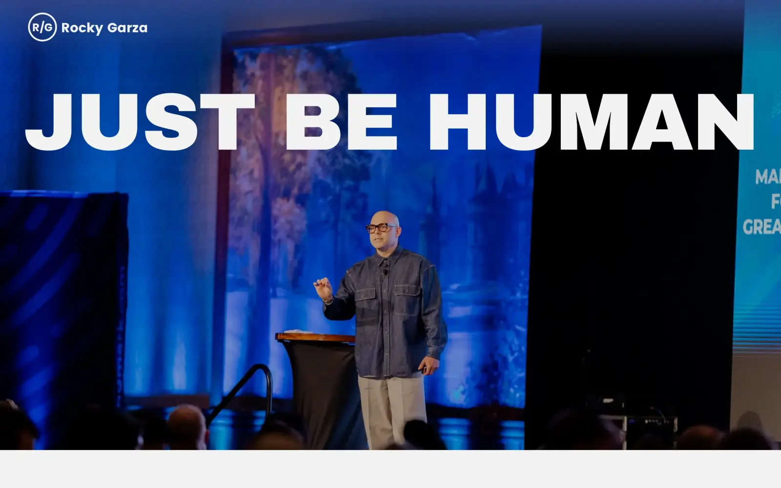
Problem: The first screen is a photo and the words "JUST BE HUMAN". It says nothing about what Rocky does, and there is no button or menu.
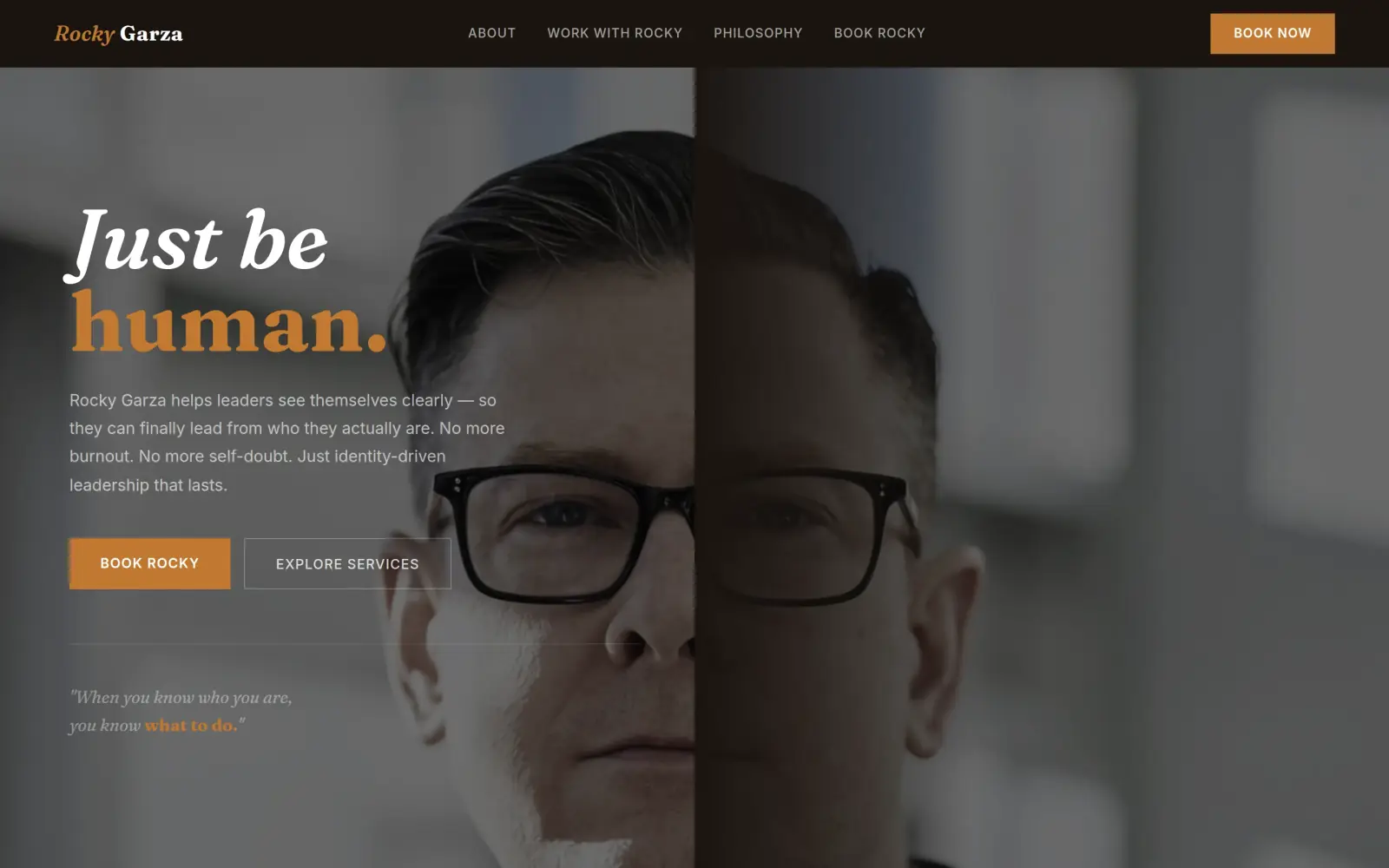
Fix: A line under the headline says he helps leaders see themselves clearly. The header carries a Book Now button and the hero has one filled Book Rocky button. Not solved: it still never says "coach" or "speaker" on that screen.
- 02
Problem: Proof is spread thin: client logos on the second screen, and a single named testimonial about five screens down.
Fix: Not solved. The concept swaps the named WebPT quote for three anonymous cards, and none of them can be used. The real quote and the client logos need to go back in.
- 03
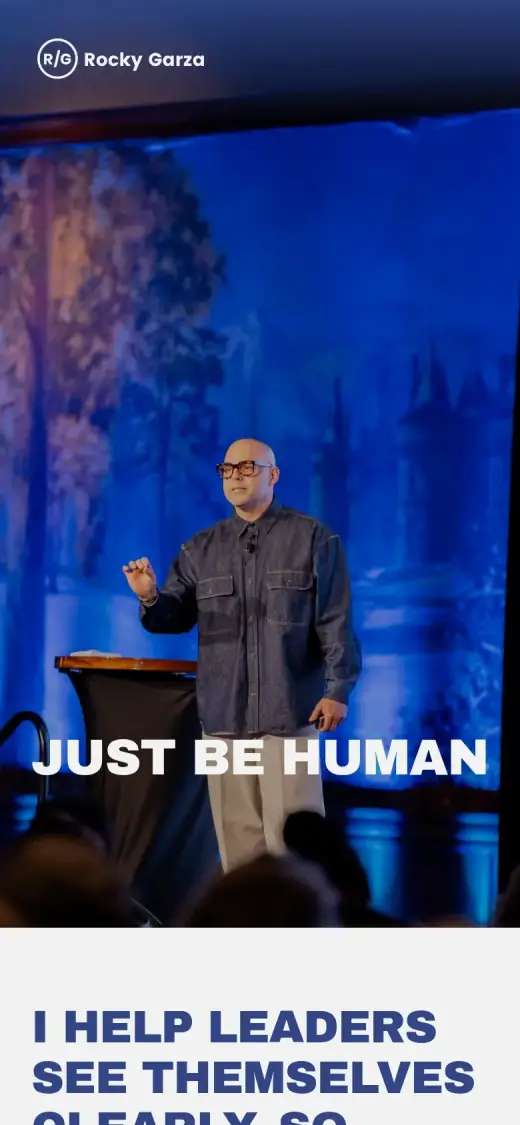
Problem: On a phone, the first screen has no button at all, and how to book is not clear until the About section.
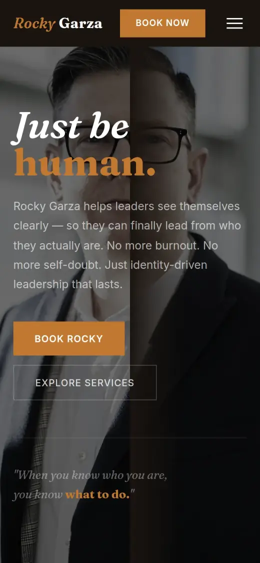
Fix: A Book Now button sits in the mobile header and a Book Rocky button sits under the intro, and both open a five-field inquiry form.
Rocky Garza and the job of its homepage
Rocky Garza is an executive coach, keynote speaker and author. His site says he helps leaders see themselves clearly so they can lead from who they actually are.
He works in three ways: keynote speaking, executive coaching and corporate consulting, and his About text also mentions workshops and retreats. The page carries a video of him on stage, a podcast called "Real With Rocky" and a free e-book, "The Imposter Within". It says he has spent over a decade working with leaders.
The visitor is most likely an event organizer, a People or HR lead, or an executive looking for a coach. Their question is quick: is this the right person, and how do I book him?
Same checklist, both sites
The score
This is not an agency rebuild. I gave the concept about 2 hours and spent them on the fixes that do the most for customers: the 20% of the work that gets 80% of the improvement.
To show how much that improves, I score every original homepage and every concept on the same 100-point checklist. Most checks are yes or no, and a script runs the technical ones (speed, mobile, accessibility). When in doubt, the point goes to the original site.
Original site
38/ 100
Concept
54/ 100
ClarityOriginal: 0/20Concept: 12/20
First screen says what the business does, in plain words (8 pts)
FailOriginal: The first screen is a stage photo with "JUST BE HUMAN" in huge type; what Rocky does ("I help leaders see themselves clearly") only appears on the second screen.
FailConcept: The headline is the slogan "Just be human."; the line under it says he helps leaders see themselves clearly but never says coach, speaker or workshops.
First screen says where, or who it serves (6 pts)
FailOriginal: The first screen names no city, region or audience; no place is named anywhere on the page.
PassConcept: The line under the headline says who it serves: "Rocky Garza helps leaders see themselves clearly".
One main action stands out on the first screen (6 pts)
FailOriginal: The first screen has a logo and a headline only, with no button, menu link or phone number.
PassConcept: A filled amber "Book Rocky" button, with "Explore Services" as a quiet outline button and "Book Now" in the header.
ContactOriginal: 4/20Concept: 16/20
Phone or main button visible on the first mobile screen (8 pts)
FailOriginal: no phone link or call-to-action on the first mobile screen
PassConcept: first mobile screen: "Book Now", "Book Rocky"
Phone number is tap-to-call (4 pts)
FailOriginal: 0 tap-to-call link(s)
FailConcept: 0 tap-to-call link(s)
Phone or main button in the desktop header (4 pts)
FailOriginal: no phone or call-to-action in the top 120px on desktop
PassConcept: desktop header: "Book Rocky", "Book Now"
Short form, or the main button leads straight to one (4 pts)
PassOriginal: The homepage has no form, but its "Book Rocky" button links to the contact page, which has a form; I could not count its fields, so the point goes to the original.
PassConcept: "Book Rocky" leads to a form with five fields (name, organization, email, a how-to-work-together select and a message).
ProofOriginal: 9/15Concept: 4/15
Reviews or a rating in the first two screens (6 pts)
FailOriginal: The second screen shows client logos (BlueCross BlueShield, Rams, Zillow, Microsoft, Hilton), not reviews; the one testimonial is about five screens down.
FailConcept: The three testimonial cards start about 2,400px down the page, past the first two desktop screens.
Testimonials carry real names or a named platform (5 pts)
PassOriginal: The testimonial is signed "Felicia C. T., Chief People Officer at WebPT", with a name, a title and a company.
FailConcept: The cards are signed "Executive Coaching Client, CEO, Mid-Market Company" and similar, with no names; none is on the original site, which has a named quote from WebPT.
At least one specific, checkable number (4 pts)
PassOriginal: The About text says "For over a decade he's been in the trenches with leaders", a years-in-practice claim on the page, though not a precise number.
PassConcept: The stats bar says "10+ Years Coaching Leaders", which matches "over a decade" on the original; "100s of leaders transformed" is not on the original site.
TrustOriginal: 9/15Concept: 4/15
Real photos of the team, work or place (5 pts)
PassOriginal: Every photo is of Rocky himself: on stage, in a studio, recording his podcast and writing at a desk.
FailConcept: The hero is a close-up of a dark-haired man, not Rocky (he is bald in every photo on his site), and the About photo is a stock boardroom.
Owner or team named or shown (4 pts)
PassOriginal: Rocky Garza is named in the header and the footer and shown in every photo.
PassConcept: Rocky Garza is named in the header, the headline copy and the footer, although the photos do not show him.
Full address or clear service area (3 pts)
FailOriginal: No address, city or service area appears anywhere on the page.
FailConcept: The footer says "Based in Texas", which is not on the original site, so it earns nothing.
License, insurance or "since [year]" (3 pts)
FailOriginal: No license, accreditation, insurance or "since [year]" is shown.
FailConcept: No license, accreditation or founding year; the footer says only "© 2024 Rocky Garza".
MobileOriginal: 7/10Concept: 4/10
No sideways scroll at 390px (4 pts)
PassOriginal: page is 390px wide at 390px
PassConcept: page is 390px wide at 390px
Body text 16px or larger (3 pts)
PassOriginal: median paragraph text 16px on mobile
FailConcept: median paragraph text 15.36px on mobile
Main buttons at least 44px tall (3 pts)
FailOriginal: no actions on the first mobile screen
FailConcept: first-screen actions: 42px, 51px tall
IntegrityOriginal: 5/5Concept: 5/5
No placeholder text or broken images (3 pts)
PassOriginal: Overrides the automatic check: all photos in the screenshots load and no placeholder text shows; the 5 flagged images have an empty address in the capture, which looks like lazy loading.
PassConcept: no placeholder text or broken images found (screenshots still get a manual look)
Header and footer links all work (2 pts)
PassOriginal: 5 header/footer link(s) checked, all work
PassConcept: 1 header/footer link(s) checked, all work
SpeedOriginal: 1/10Concept: 7/10
Lighthouse mobile performance (10 pts)
FailOriginal: Lighthouse mobile performance 37 (median of 3: 36, 37, 38)
FailConcept: Lighthouse mobile performance 76 (median of 3: 76, 76, 78)
AccessibilityOriginal: 3/5Concept: 2/5
No serious accessibility issues (axe) (3 pts)
PassOriginal: 1 serious/critical axe issue(s)
FailConcept: 44 serious/critical axe issue(s)
Content images have alt text (2 pts)
PassOriginal: 25/26 content images have alt text
PassConcept: 2/2 content images have alt text
Scored 2026-09-30 · How the checklist works
What held the original back
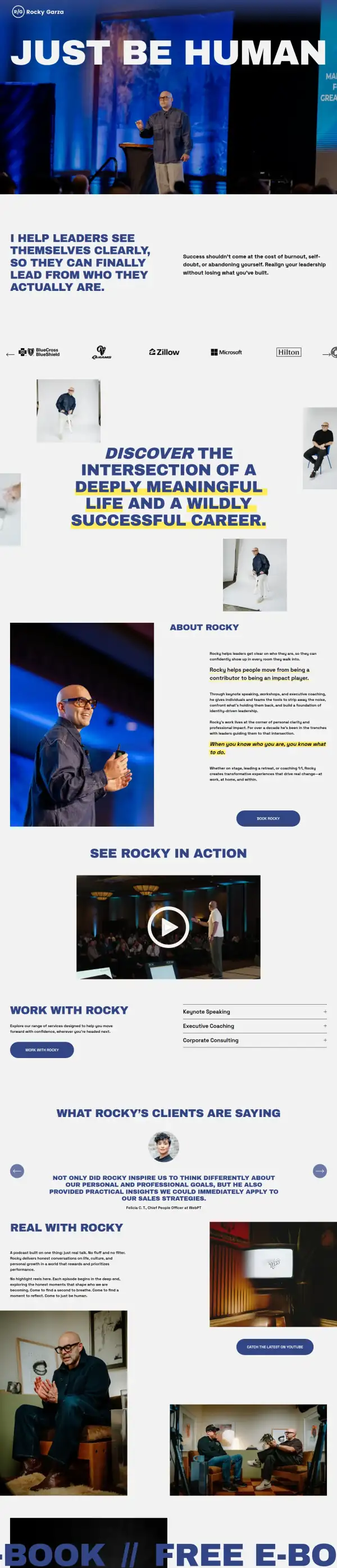
The original does a lot right. Every photo is of Rocky himself, the stage photo shows him in front of a real audience, and the page has a video, a named testimonial from a Chief People Officer and recognizable client logos (BlueCross BlueShield, the Rams, Zillow, Microsoft, Hilton). It has a real voice. The problem is the order. The first screen is an image and a slogan, and the useful facts come later. One note on the capture: everything on the page loaded in my screenshots and the original scored 37 on Lighthouse for mobile speed.
- The header is a logo and a name. There is no menu link, no Book button and no phone number, so a visitor who is ready to book has nowhere to press.
- "JUST BE HUMAN" is a slogan. It does not say that Rocky is a coach or a speaker, or who he works with. The line that does ("I help leaders see themselves clearly") is on the second screen.
- Under the photo there is no button or line of text, and the first screen ends on a blank grey band. The "Book Rocky" button is about three screens further down.
What I changed
The first screen and the mobile view, original on the left and concept on the right. The slider at the top of the post compares the first screen up close.
Before
After
First screen
- Say who he helps, right under the headline
- "Rocky Garza helps leaders see themselves clearly" sits under "Just be human." The slogan stays, since it is his. The original puts the same sentence on the second screen.
- One main button, in two places
- "Book Rocky" is the filled button and "Explore Services" is a quiet outline. A "Book Now" button sits at the top right of the header, so it is visible on every screen.
- A short inquiry form
- Every Book button goes to a form with five fields: name, organization, email, how you would like to work with Rocky, and a message. The select asks keynote, workshop or coaching, so Rocky knows what the request is before he replies.
Before
After
Mobile
- A button on the first phone screen
- The original has no button on its first mobile screen. The concept puts "Book Now" in the header and "Book Rocky" under the intro paragraph.
- Buttons of a fair size, text a bit small
- The two first-screen buttons are 42 and 51px tall. Paragraph text measures 15.4px on the phone, which I list below.
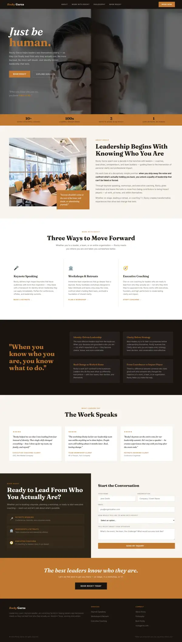
The whole page, before and after
Steal this: 6 fixes for any executive coach and speaker
- Say what you do in plain words above the fold. A slogan is fine as a headline, but put "executive coach and keynote speaker" within sight of it.
- Put one Book button in the header and keep it there. A visitor who decides on the second screen should not have to scroll back up to find how.
- Move your best proof up. A named quote from a Chief People Officer at a known company, or a row of client logos, should be in the first two screens, not the fifth.
- Ask for only what you need to reply. For a speaker, five fields (name, organization, email, type of work, message) is enough to start.
- Name where you work. A page for a speaker or coach should say a city, a region or "anywhere". Neither the original nor a reader can tell if Rocky travels or is local.
- Keep your own photos. Real photos of you on stage do more than any stock image. The one weakness of the concept is that it lost them.
What I'd still fix with more time
The concept does not score 100. About 2 hours doesn't fix everything, and the checklist applies to my work too:
- The hero photo is not Rocky. The concept uses a close-up of a man with dark hair. Rocky is bald in every photo on his own site. The About photo is a stock boardroom. His real stage, studio and podcast photos need to go back in.
- The testimonials are invented. The three cards ("Executive Coaching Client, CEO, Mid-Market Company" and two others) are not on the original site. The real one, from a Chief People Officer at WebPT, is missing. They need to be swapped for real, named quotes.
- Some claims are mine, not his. "100s of leaders transformed" and "Based in Texas" are not on the original site. The "10+ years" figure matches "over a decade" in his About text. Rocky needs to confirm each one or drop it.
- Things that worked on the original are gone. The stage video, the client logos, the podcast, the free e-book and "Corporate Consulting" are all missing from the concept. Some of these are among his best proof.
- The first screen still does not say "coach" or "speaker". His page title does. The hero should too.
- The form is not wired up, and there is no phone or email. It does not send anywhere yet.
- Mobile text is 15.4px and the accessibility scan found 44 serious issues. I did not dig into each one, but they need fixing. Text should be 16px or more. Mobile speed is 76 on Lighthouse, up from 37.
My take
If I were talking to Rocky, I would start with what is already strong. You have a great deal of proof and you look good on stage: real photos of you speaking, a video, a named quote from a People chief and client logos anyone recognizes. The old page holds it back only by making a visitor scroll to find it.
The part I am least sure about is the look. I went with a warm, dark, editorial style, and it lost the bold blue you already own and the photos that made the site feel like you. That is a trade-off I should not have made in a concept. If I kept working, I would keep his blue and his photos and only change the order.
What the concept does not solve is proof. It replaced your real testimonial with placeholders, and the hero picture is a stranger. A layout cannot fix that. Two hours got the first screen to say who you help and where to book, and that is worth keeping. The rest of the concept needs to be rebuilt from your own material.
The live concept
The full concept is live on this site, with a bar at the top saying it is a concept and not Rocky Garza's real website.
The real site: rockygarza.com
Questions
What should a speaker or coach homepage show first?
What you do, who you do it for, and one way to book you. Event organizers and HR leads often decide from the first screen, so the slogan can stay, but "keynote speaker" and "executive coach" should be near it. Proof and photos can sit below.
What did the 2 hours on Rocky Garza go into?
About 2 hours went into the first screen (headline, one line about who he helps, a Book button in the header and the hero), the three ways to work together, a five-field inquiry form and the mobile layout. They did not cover his real photos, his real testimonial and logos, the video, the podcast and e-book, the form connection, or checking each claim with him.
Did Rocky Garza ask for this redesign?
No. This is an unsolicited concept, and I'm not affiliated with the business. If you own it and want anything changed or removed, email me and it's done within 48 hours.
How is the score worked out?
With a 100-point checklist: clarity, contact, proof, trust, mobile, integrity, speed and accessibility. A script runs the technical checks; I judge the rest from screenshots and note a reason for each. The original site gets the benefit of the doubt.
Own Rocky Garza and want this changed or removed? Email anshul@anshuldesigns.com and it's done within 48 hours.