80/20 Redesigns / Electronics manufacturer / Troy, MI
By Anshul
Updated
An unsolicited 2-hour concept for Amtech, an electronics manufacturer in Troy, MI. What held the original homepage back, what I changed, and how both score on the same checklist.
Unsolicited concept. Not commissioned by or affiliated with Amtech. All trademarks belong to their owners.
Checklist score60 → 70out of 100
Time spentabout 2 hours
The short version
- 01
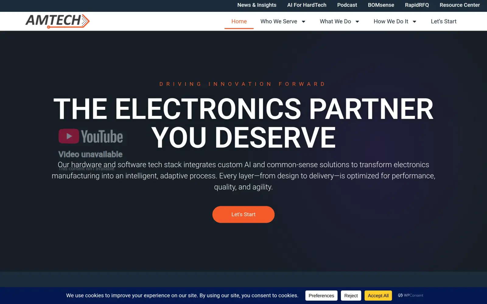
Problem: The headline is a slogan ("The Electronics partner you deserve"). What Amtech makes is in a paragraph under it, and where it is (Troy, Michigan) is only in the footer.
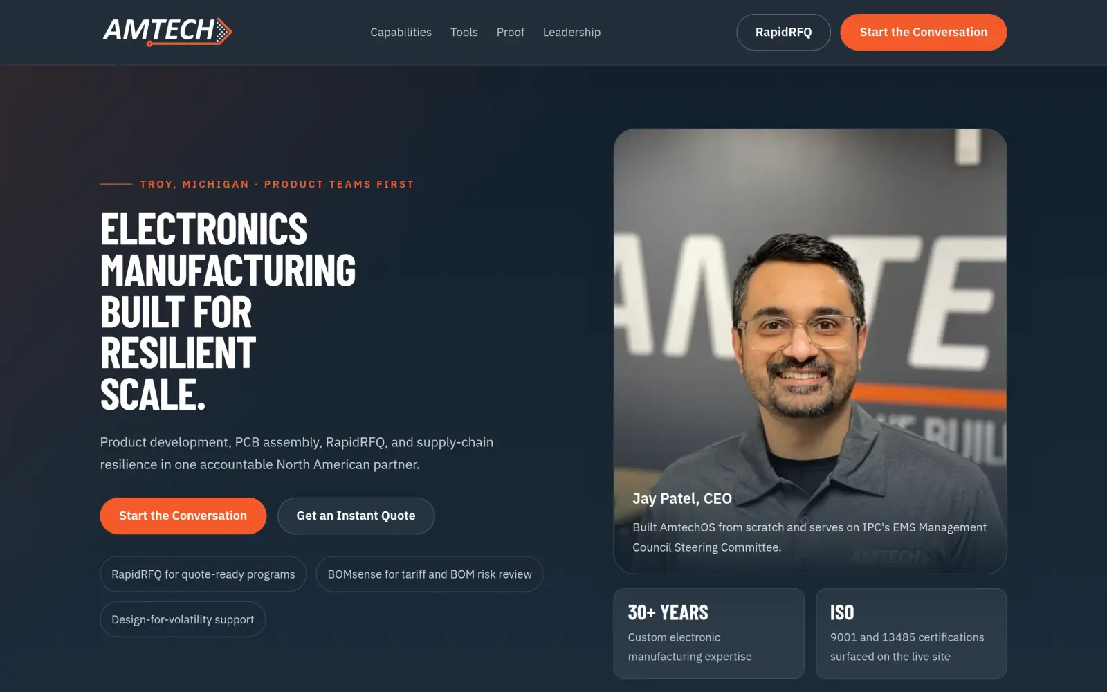
Fix: The headline says "Electronics manufacturing built for resilient scale", a "Troy, Michigan" tag sits above it and one line names product development, PCB assembly and the two tools.
- 02
Problem: The proof is far down the page. The three testimonials start about 3,800px down and are signed only by role, and no person from Amtech is named on the homepage.
Fix: CEO Jay Patel's photo and name are in the hero, next to a 30+ years tile and the ISO certifications. Not solved: the testimonials are still anonymous and still start about 3,600px down.
- 03
Problem: Eleven links sit above the headline, six in a top strip and five in the main menu, and there is one plain "Let's Start" button, with the quote tool only a menu link.
Fix: Four menu links, and two buttons in the header and the hero: "Start the Conversation" for the broad path and "Get an Instant Quote" for people who already have files.
Amtech and the job of its homepage
Amtech is a contract electronics manufacturer in Troy, Michigan. Its own site lists PCB assembly, wire harness and box build, product development, design for volatility and on/re-shoring.
The menu says it serves venture-backed companies, open hardware teams, drone makers and other engineering-led customers. It also runs two tools, RapidRFQ for instant PCB quotes and BOMsense for tariff and parts-risk checks, and lists ISO 9001, ISO 13485 and Minority Supplier certifications in the footer.
The buyer is an engineer or sourcing lead comparing a few manufacturers. The homepage has to answer three things quickly: what do you make, are you a safe pair of hands, and how do I start.
Same checklist, both sites
The score
This is not an agency rebuild. I gave the concept about 2 hours and spent them on the fixes that do the most for customers: the 20% of the work that gets 80% of the improvement.
To show how much that improves, I score every original homepage and every concept on the same 100-point checklist. Most checks are yes or no, and a script runs the technical ones (speed, mobile, accessibility). When in doubt, the point goes to the original site.
Original site
60/ 100
Concept
70/ 100
ClarityOriginal: 14/20Concept: 20/20
First screen says what the business does, in plain words (8 pts)
PassOriginal: The line under "The Electronics partner you deserve" says the company turns "electronics manufacturing into an intelligent, adaptive process"; the headline alone is a slogan.
PassConcept: "Electronics manufacturing built for resilient scale" with "Product development, PCB assembly, RapidRFQ, and supply-chain resilience" under it.
First screen says where, or who it serves (6 pts)
FailOriginal: The first screen names no city, state or region; Troy, MI first appears in the footer and "Who We Serve" is only a menu item.
PassConcept: A "Troy, Michigan · Product teams first" tag sits above the headline and the line under it says "North American partner".
One main action stands out on the first screen (6 pts)
PassOriginal: A single orange "Let's Start" button sits under the hero text, repeated in the header.
PassConcept: A filled orange "Start the Conversation" button, with "Get an Instant Quote" as a dark secondary button beside it.
ContactOriginal: 16/20Concept: 12/20
Phone or main button visible on the first mobile screen (8 pts)
PassOriginal: first mobile screen: "Let's Start"
PassConcept: first mobile screen: "Start the Conversation", "Start the Conversation", "Start the Conversation"
Phone number is tap-to-call (4 pts)
FailOriginal: 0 tap-to-call link(s)
FailConcept: 0 tap-to-call link(s)
Phone or main button in the desktop header (4 pts)
PassOriginal: desktop header: "Let’s Start"
PassConcept: desktop header: "Start the Conversation"
Short form, or the main button leads straight to one (4 pts)
PassOriginal: The "Let's Connect" form near the bottom has five text fields (email, first name, last name, company, mobile) plus a message box and a required checklist of interests.
FailConcept: The concept has no form; the button leads to the original site's Let's Start page, whose form I could not see field by field, so I do not count it.
ProofOriginal: 4/15Concept: 4/15
Reviews or a rating in the first two screens (6 pts)
FailOriginal: The three testimonials start about 3,800px down the page, far past the first two desktop screens.
FailConcept: The first two screens show a "30+ years" tile and ISO chips, but no reviews or rating; the testimonials start about 3,600px down.
Testimonials carry real names or a named platform (5 pts)
FailOriginal: The testimonials are signed only by role and industry ("President, Automotive Industry", "CEO, IoT Industry").
FailConcept: The three testimonials are signed by role only ("President, Automotive Industry", "R&D Director, Industrial Automation Industry", "CEO, IOT Industry"), and the quotes are trimmed.
At least one specific, checkable number (4 pts)
PassOriginal: The page says leaders have "20+ years of experience", shows a "20+ Year Industrial Automation Partnership" case study and a client quote about working together "since 1998".
PassConcept: "30+ years of custom electronic manufacturing expertise" appears in the hero tile; the original's team page says "Over 30 Years of Custom Electronic Manufacturing Expertise".
TrustOriginal: 11/15Concept: 15/15
Real photos of the team, work or place (5 pts)
PassOriginal: The case-study cards show real customer products (a respirator unit, a Rocon LLC meter, a relay module); the service cards above them are stock or generated images.
PassConcept: The hero shows a real photo of CEO Jay Patel in an Amtech shirt, and the page uses the company's real process diagram; the service images are stock-style, as on the original.
Owner or team named or shown (4 pts)
FailOriginal: No owner or team member is named or shown on the homepage; the team is only a menu link (Our Team).
PassConcept: "Jay Patel, CEO" is named and shown in the hero and again in the leadership section, with a bio that matches the original's team page.
Full address or clear service area (3 pts)
PassOriginal: The footer gives "701 Minnesota Drive Troy, MI 48083" and two phone numbers.
PassConcept: The closing block gives "701 Minnesota Drive, Troy, MI 48083" with a phone number and email.
License, insurance or "since [year]" (3 pts)
PassOriginal: The footer lists ISO 9001, ISO 13485 Medical Device and Minority Supplier certifications.
PassConcept: A credentials panel lists ISO 9001, ISO 13485 Medical Device and Minority Supplier, all on the original's footer.
MobileOriginal: 7/10Concept: 7/10
No sideways scroll at 390px (4 pts)
PassOriginal: page is 390px wide at 390px
PassConcept: page is 390px wide at 390px
Body text 16px or larger (3 pts)
FailOriginal: median paragraph text 15px on mobile
PassConcept: median paragraph text 16px on mobile
Main buttons at least 44px tall (3 pts)
PassOriginal: first-screen actions: 48px tall
FailConcept: first-screen actions: 46px, 39px, 46px, 46px tall
IntegrityOriginal: 5/5Concept: 2/5
No placeholder text or broken images (3 pts)
PassOriginal: no placeholder text or broken images found (screenshots still get a manual look)
FailConcept: Overrides the automatic check: builder notes are printed on the page, such as "Claim surfaced on Amtech's leadership page", "Linked directly from the live footer" and a footer line "Built in `projects/buildamtech` as a static redesign".
Header and footer links all work (2 pts)
PassOriginal: 27 header/footer link(s) checked, all work
PassConcept: 1 header/footer link(s) checked, all work
SpeedOriginal: 1/10Concept: 7/10
Lighthouse mobile performance (10 pts)
FailOriginal: Lighthouse mobile performance 26 (median of 3: 25, 26, 33)
FailConcept: Lighthouse mobile performance 82 (median of 3: 82, 82, 85)
AccessibilityOriginal: 2/5Concept: 3/5
No serious accessibility issues (axe) (3 pts)
FailOriginal: 35 serious/critical axe issue(s)
PassConcept: 3 serious/critical axe issue(s)
Content images have alt text (2 pts)
PassOriginal: 11/11 content images have alt text
PassConcept: 7/7 content images have alt text
Scored 2026-09-30 · How the checklist works
What held the original back
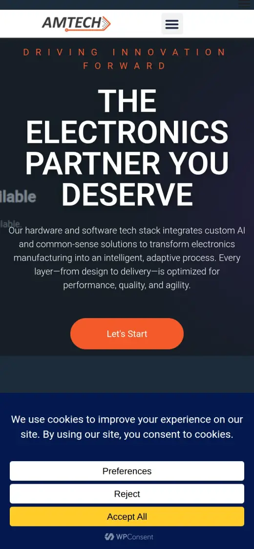
The original does real things well. The certifications, the address and the case studies with real product photos are all on the page, and "Let's Start" is a clear orange button. Two notes on the capture. The hero has a YouTube background video that did not load for the capture browser, so a "Video unavailable" label sits over the text. I do not count that as a flaw and I could not see the video. And a cookie bar covers the bottom of the screen, and over a quarter of the phone screen. That is part of the live page's code, so I mention it, but I do not score it. What held the page back is what the first screen says and what it leaves for later.
- The headline is a slogan. It does not say what Amtech makes, and a buyer comparing manufacturers has nothing to check it against.
- The paragraph talks about a "hardware and software tech stack" and "custom AI". It says electronics manufacturing, but no city, no product and no certification.
- A clear button, but "Let's Start" does not say what happens next, and the quote tool (RapidRFQ) is only a small link in the top strip.
- A cookie bar covers the bottom of the first screen, and over a quarter of the phone screen. Everything on the page that proves Amtech is real sits below it.
What other electronics makers do
I looked at five competitors from the concept's research to see what a buyer sees elsewhere.
Competitor review
| Site | What they do well | Gap |
|---|---|---|
| MacroFab | Big industrial type and a quote path right away | Feels like software, with less of a human story |
| Green Circuits | Quote urgency and production language up front | Dated, and little beyond turnaround |
| Dynamic Source | Real facility photos | A generic manufacturing headline |
| EMS Technologies | Longevity and a factory backdrop | Conventional contract-manufacturing framing |
| Vexos | Global scale and enterprise confidence | A cookie wall and broad corporate language |
The gap: quote speed with a named person behind it. The platform sites have the quote path but no face. Amtech has both, its own tools and a CEO with a public track record on its team page, so the concept leads with them together.
The direction: keep the navy and orange, add the person
I kept Amtech's own navy and orange. I compared two directions: a dark, people-first "operator" look and a brighter, tool-first "platform" look. The first scored 45 and the second 41 on the concept's weighted list, mostly because a real CEO photo and process diagram were already available and the buyer needs trust before novelty.
The design system
- Ink
#1c2b3aAmtech's navy: hero, bands, headings - Orange
#f45a2bThe action colour: buttons and tags - Steel
#e8edf0Panels and cards - Page
#f6f8f9Light sections
- Barlow Condensed
- Headlines. Industrial, and narrow enough for long headlines.
- IBM Plex Sans
- Body text.
What I changed
The first screen and the mobile view, original on the left and concept on the right. The slider at the top of the post compares the first screen up close.
Before
After
First screen
- Say what and where
- "Electronics manufacturing built for resilient scale", a "Troy, Michigan" tag and one line naming product development, PCB assembly, RapidRFQ and supply-chain resilience. The original's paragraph moves to one line.
- Two ranked paths
- "Start the Conversation" is the filled orange button, and "Get an Instant Quote" is the darker one beside it. The same two sit in the header. Six top-strip links became four.
- A person and proof up top
- Jay Patel, CEO, is named and shown in the hero, with a 30+ years tile and an ISO tile. On the original, no one from Amtech is named on the homepage.
Before
After
Mobile
- The action in the header
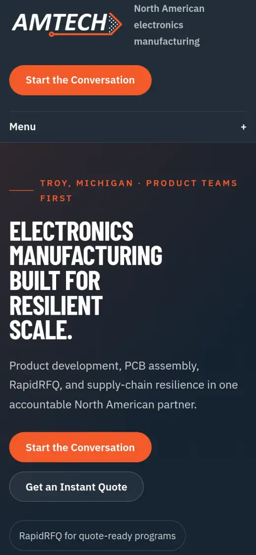
- A "Start the Conversation" button is in the phone header and again under the headline. The original mobile screen has one "Let's Start" button, and it sits above the cookie panel.
- A caveat on the comparison
- The concept has no cookie bar, so its phone screen looks emptier than a live one would. The buttons are 39 to 46px tall, under the 48px the original's was.
The whole page, before and after
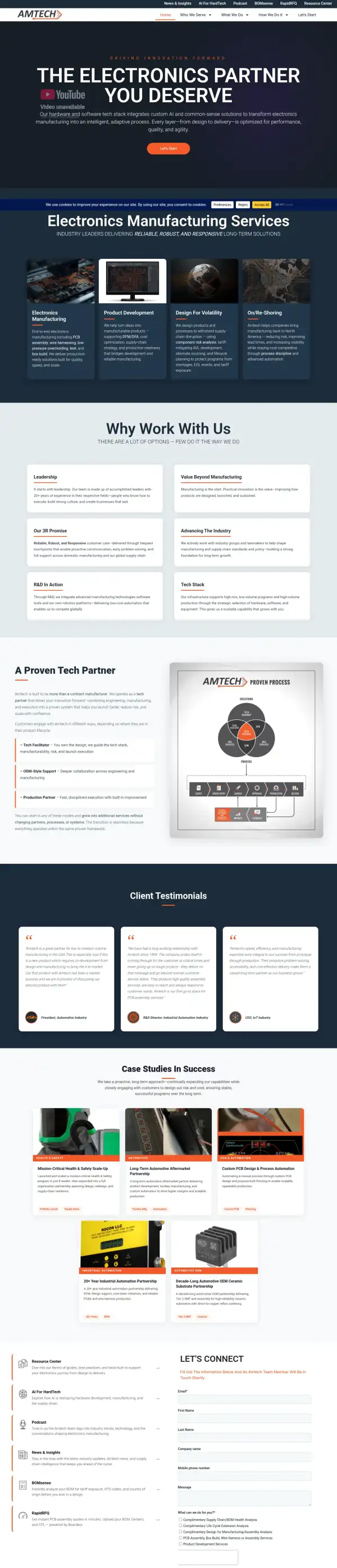
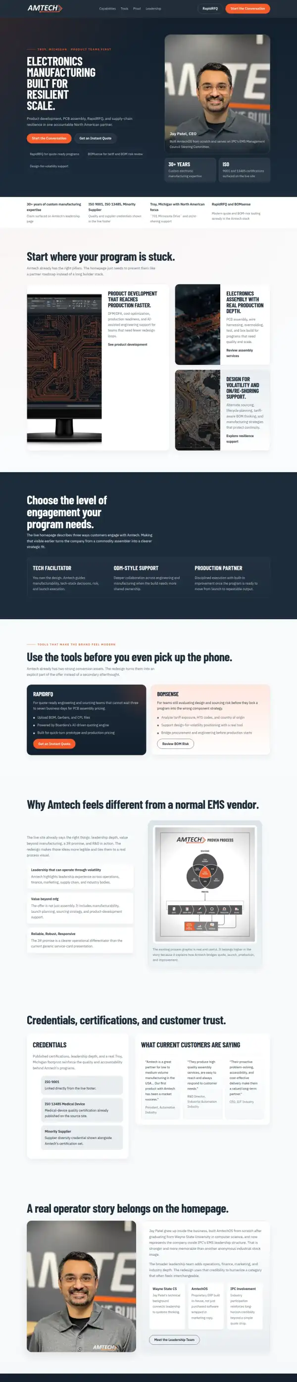
Steal this: 6 fixes for any electronics manufacturer
- Replace the slogan with the product. "Electronics manufacturing" and the city beat "the partner you deserve" for a buyer who is comparing five sites.
- Rank your paths. Amtech has a contact button, an instant quote tool, a BOM checker, a podcast and a resource centre. Pick the two a buyer needs first and demote the rest.
- Show a person, by name, on the first screen. The CEO with a public track record is worth more than another service card.
- Put proof above the fold, not at the bottom. Certifications and years in business fit in two small tiles beside the photo.
- Sign your testimonials. "President, Automotive Industry" is a start. A name, a company and a permission to use it turns it into proof.
- Keep the case studies. Real products and real durations ("8-week launch", "20+ year partnership") are what engineers look for, and the concept dropped them.
What I'd still fix with more time
The concept does not score 100. About 2 hours doesn't fix everything, and the checklist applies to my work too:
- Builder notes are printed on the page. Text such as "Claim surfaced on Amtech's leadership page", "Linked directly from the live footer" and "Built in `projects/buildamtech` as a static redesign" is visible to visitors. All of it has to be rewritten for buyers before anything ships.
- The testimonials are still anonymous. They are trimmed versions of the original's three role-only quotes, and they start about 3,600px down. Names, or at least company types with permission, would help, and one should move up.
- The case studies are gone. The original has five with real product photos. Those were among its best proof, and the concept does not carry them over.
- There is no form. All the buttons link to the original site's Let's Start page. I did not check how many fields its form has.
- Only one phone number is shown, while the original footer lists two, (248) 583-1801 and (248) 583-1802, without saying what the second is. That is a question for Amtech.
- Mobile: text is 16px, buttons are 39 to 46px tall, and Lighthouse is 82. The original scored 26. I would take it above 90, and fix the 3 contrast issues left by the accessibility scan (the original had 35).
- A cookie bar is missing. The original has one, and a real build needs one, which would take space from the first screen.
My take
If I were talking to Amtech, I would say this: the substance is already here. The certifications, the tools, the real case studies and a CEO with a record are more than most small manufacturers have. The old first screen used almost none of it. It led with a slogan and a paragraph about a tech stack, and everything that makes you look real sat below a cookie bar.
The choice I am unsure about is the dark, condensed look. It suits an engineering buyer, but a dark, industrial look is also the safe choice in this trade, and it may not make Amtech stand out. I also dropped the case studies to make room, and I would probably bring them back before anything else. That was a trade-off I made for a cleaner page, and it cost real proof.
What the concept does not solve is a lot. The page still shows anonymous testimonials, it has no form and it has notes to me printed on it. Two hours got the first screen to say what Amtech does and who is behind it. Turning it into a page a buyer can trust, end to end, needs Amtech's own words and names.
The live concept
The full concept is live on this site, with a bar at the top saying it is a concept and not Amtech's real website.
The real site: buildamtech.com
Questions
What should a contract electronics manufacturer's homepage show first?
What you make, where you are, and how to start: a plain headline, the city, one main button and a quote path for people who already have files. A named person and the certifications beside them do the trust work early.
What did the 2 hours on Amtech go into?
About 2 hours went into the first screen (headline, location, two ranked buttons, the CEO photo and the proof tiles), the capability layout, the tools band, the leadership section and the mobile header. They did not cover the form, the case studies, real reviews with names, the cookie bar, speed or checking each claim with Amtech.
Does the concept use any content that is not on the Amtech site?
I checked the claims against the original and its team page, and the CEO details, the certifications and the 30+ years all come from there. The wording of the tool blurbs and section headings is mine, and Amtech should approve it.
Did Amtech ask for this redesign?
No. This is an unsolicited concept, and I'm not affiliated with the business. If you own it and want anything changed or removed, email me and it's done within 48 hours.
How is the score worked out?
With a 100-point checklist: clarity, contact, proof, trust, mobile, integrity, speed and accessibility. A script runs the technical checks; I judge the rest from screenshots and note a reason for each. The original site gets the benefit of the doubt.
Own Amtech and want this changed or removed? Email anshul@anshuldesigns.com and it's done within 48 hours.