80/20 Redesigns / Realtor / Doylestown, PA
By Anshul
Updated
An unsolicited 2-hour concept for Red Sign Network, a Keller Williams real estate team in Doylestown, PA. What held the original homepage back, what I changed, and how both score on the same checklist.
Unsolicited concept. Not commissioned by or affiliated with Red Sign Network. All trademarks belong to their owners.
Checklist score47 → 57out of 100
Time spentabout 2 hours
The short version
- 01
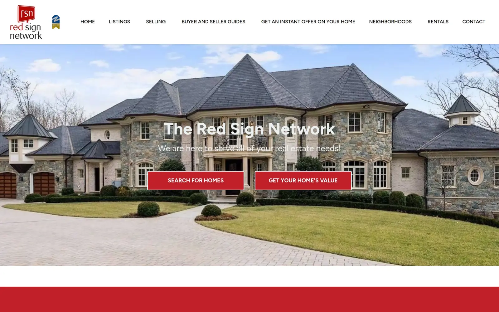
Problem: The headline is the business name and a slogan, in white text over a bright sky, and the first screen has no place name. Two red buttons of equal weight ask the visitor to pick a path.
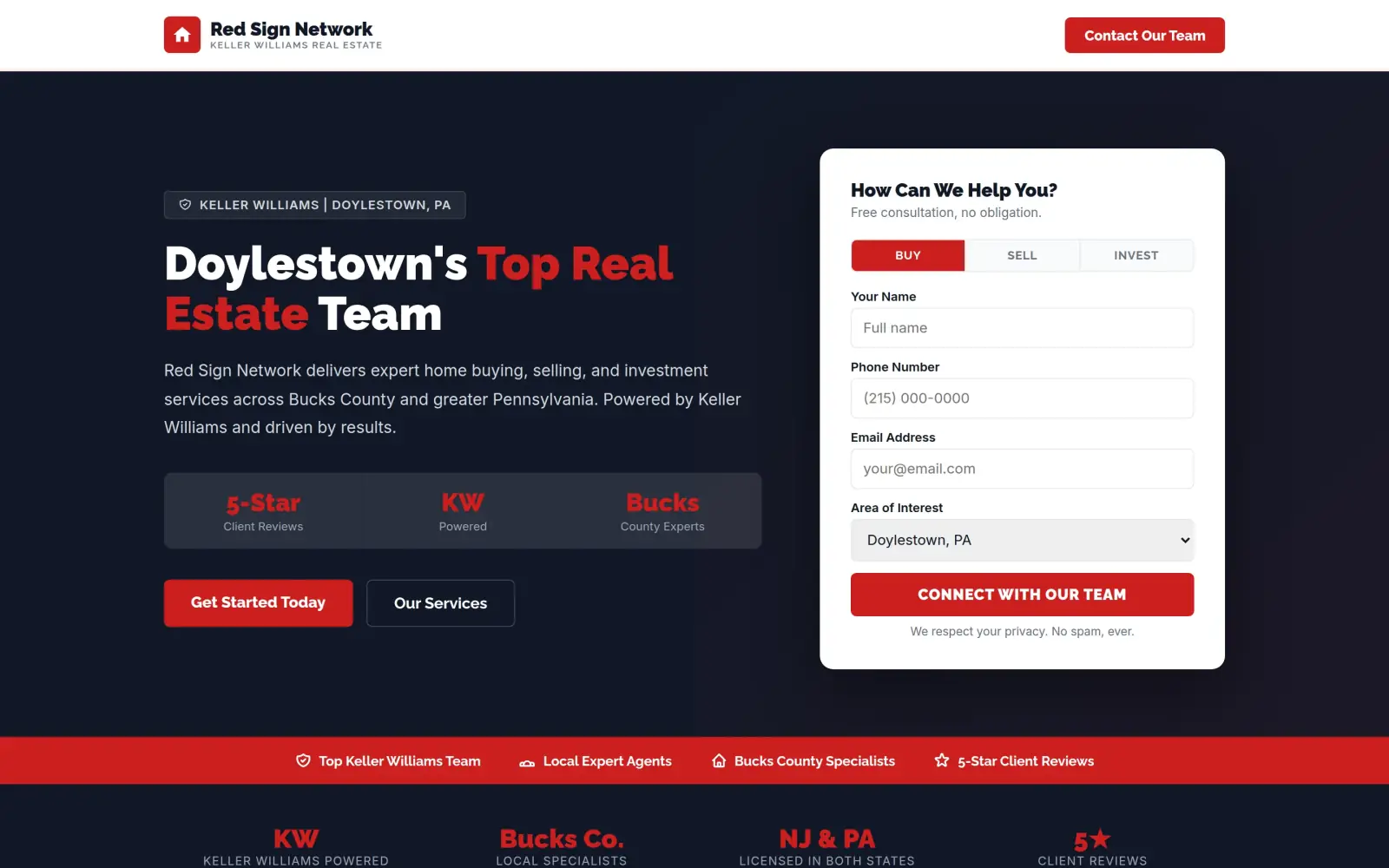
Fix: The headline is "Doylestown's Top Real Estate Team", with "Bucks County" in the line under it, one filled button and a form in the same screen.
- 02
Problem: Reaching the team means finding "Contact" as the last of seven menu links. There is no form on the page and no phone number.
Fix: A four-field form sits on the first screen, next to the headline. Not solved: there is still no phone number, and the form is not connected to anything.
- 03
Problem: The best proof is small text in three white boxes: the 29-day guarantee, "over 1000 families" and the satisfaction promise.
Fix: Not solved: the concept drops all three and puts stats and reviews in their place that I could not find on the original site. They have to come out or be replaced with real ones.
Red Sign Network and the job of its homepage
Red Sign Network is a real estate team in Doylestown, Pennsylvania, working under Keller Williams. Its homepage shows homes it has listed around Bucks and Montgomery County and Philadelphia.
The site offers more than listings. The menu links to selling, buyer and seller guides, an instant offer on your home, neighborhoods and rentals. The page promises "Get Your Home Sold in 29 Days GUARANTEED", a 100% satisfaction guarantee, and says the team has "helped over 1000 families buy their forever home".
A visitor here is either looking for a house or wondering what theirs is worth. The homepage has to work out which one within a few seconds and give each a clear next step.
Same checklist, both sites
The score
This is not an agency rebuild. I gave the concept about 2 hours and spent them on the fixes that do the most for customers: the 20% of the work that gets 80% of the improvement.
To show how much that improves, I score every original homepage and every concept on the same 100-point checklist. Most checks are yes or no, and a script runs the technical ones (speed, mobile, accessibility). When in doubt, the point goes to the original site.
Original site
47/ 100
Concept
57/ 100
ClarityOriginal: 8/20Concept: 20/20
First screen says what the business does, in plain words (8 pts)
PassOriginal: Over the hero photo, "The Red Sign Network" with "We are here to serve all of your real estate needs!" under it, and buttons reading "Search for homes" and "Get your home's value".
PassConcept: Headline "Doylestown's Top Real Estate Team" with "delivers expert home buying, selling, and investment services" under it.
First screen says where, or who it serves (6 pts)
FailOriginal: The first screen names no city or region; the only place names on the captured page are in the listing cards further down.
PassConcept: "Keller Williams | Doylestown, PA" tag above the headline and "across Bucks County and greater Pennsylvania" in the line under it.
One main action stands out on the first screen (6 pts)
FailOriginal: Two red buttons of equal size and weight, "Search for homes" and "Get your home's value", sit side by side in the hero.
PassConcept: A filled red "Get Started Today" button beside a plain outline "Our Services" button, next to a form whose red button is "Connect with our team".
ContactOriginal: 12/20Concept: 16/20
Phone or main button visible on the first mobile screen (8 pts)
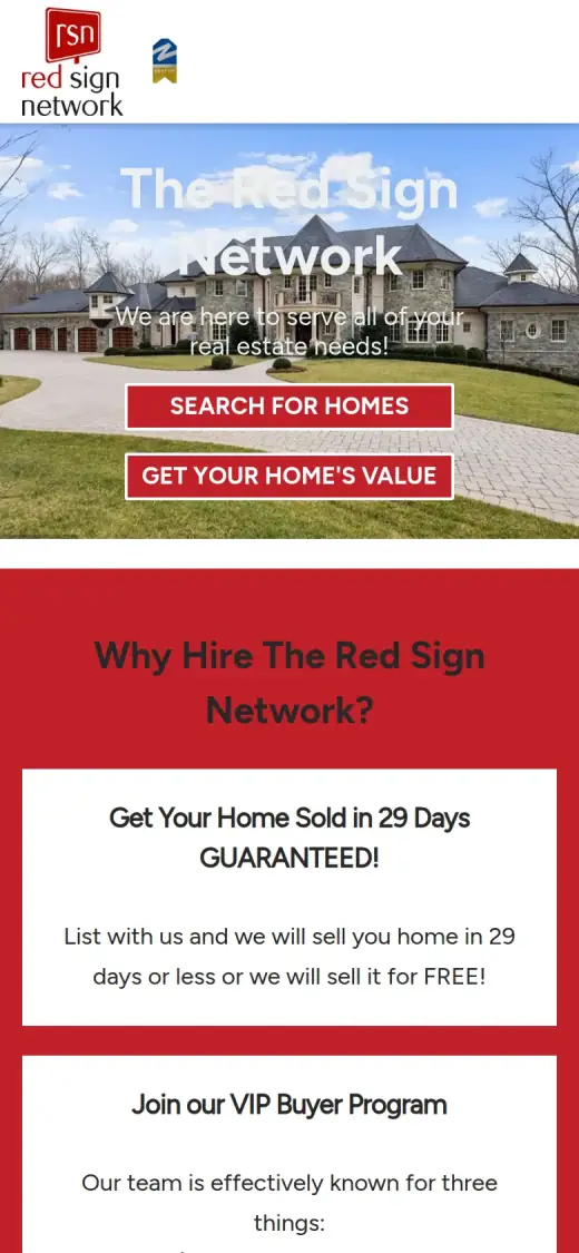
PassOriginal: first mobile screen: "Get an Instant Offer on Your Home", "Contact", "GET YOUR HOME'S VALUE"
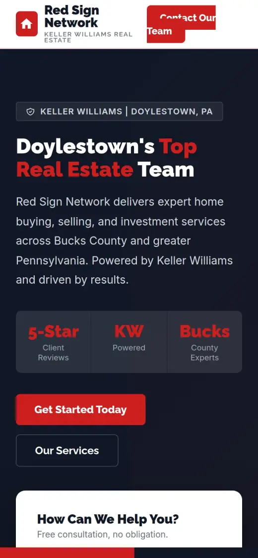
PassConcept: first mobile screen: "Contact Our Team", "Get Started Today", "Contact Us"
Phone number is tap-to-call (4 pts)
FailOriginal: 0 tap-to-call link(s)
FailConcept: 0 tap-to-call link(s)
Phone or main button in the desktop header (4 pts)
PassOriginal: desktop header: "Get an Instant Offer on Your Home", "Contact"
PassConcept: desktop header: "Contact Our Team"
Short form, or the main button leads straight to one (4 pts)
FailOriginal: There is no form on the captured page, and I could not check where "Get your home's value" leads because the live site refused my request (403).
PassConcept: The first-screen form has four fields (name, phone, email and an area select) and one red button.
ProofOriginal: 4/15Concept: 0/15
Reviews or a rating in the first two screens (6 pts)
FailOriginal: No reviews, rating or testimonials appear in the first two screens, which hold the hero, three guarantee boxes and the first listings.
FailConcept: "5-Star Client Reviews" appears in the hero, but the rating is not on the original site and the three quotes start about 2,250px down; both fail the proof rules.
Testimonials carry real names or a named platform (5 pts)
FailOriginal: No testimonials appear anywhere on the captured page; the section near the bottom was still showing a "Loading" spinner.
FailConcept: The three quotes are signed "The Kellerman Family", "Margaret & Tom S." and "The Harrison Family" with no platform, and none of them appears on the original site.
At least one specific, checkable number (4 pts)
PassOriginal: The second box under "Why Hire The Red Sign Network?" says "We have helped over 1000 families buy their forever home".
FailConcept: The stats ("5-Star", "KW Powered", "Bucks County Experts", "Licensed in both states") are not on the original site; the checkable "over 1000 families" is gone.
TrustOriginal: 5/15Concept: 3/15
Real photos of the team, work or place (5 pts)
PassOriginal: The Featured Listings are the team's own homes for sale, with real photos, address, price and MLS number on each card.
FailConcept: The only photos are two house pictures under Buyers and Sellers that I cannot tie to the team's work, and the real listings are gone.
Owner or team named or shown (4 pts)
FailOriginal: No agent or team member is named or shown on the captured page; a name appears only in the browser tab title.
FailConcept: No agent or team member is named or shown anywhere on the concept.
Full address or clear service area (3 pts)
FailOriginal: No address or service area is stated in the captured page; the footer did not load in my capture and the town names appear only inside listing cards.
PassConcept: A "Serving Bucks County and Beyond" section lists towns such as Doylestown, New Hope and Newtown, and the hero says Bucks County.
License, insurance or "since [year]" (3 pts)
FailOriginal: No license, accreditation or "since" year is visible; "Keller Williams Real Estate" appears only as small print on each listing card, and the badge beside the logo is unreadable.
FailConcept: "Licensed in both states" is not on the original site, and the footer carries only a copyright line, so no verified license or "since" year.
MobileOriginal: 4/10Concept: 3/10
No sideways scroll at 390px (4 pts)
PassOriginal: page is 390px wide at 390px
FailConcept: page is 405px wide at 390px
Body text 16px or larger (3 pts)
FailOriginal: median paragraph text 14px on mobile
FailConcept: median paragraph text 14.08px on mobile
Main buttons at least 44px tall (3 pts)
FailOriginal: first-screen actions: 51px, 51px, 32px tall
PassConcept: first-screen actions: 57px, 47px, 49px tall
IntegrityOriginal: 5/5Concept: 5/5
No placeholder text or broken images (3 pts)
PassOriginal: no placeholder text or broken images found (screenshots still get a manual look)
PassConcept: no placeholder text or broken images found (screenshots still get a manual look)
Header and footer links all work (2 pts)
PassOriginal: 28 header/footer link(s) checked, all work
PassConcept: 2 header/footer link(s) checked, all work
SpeedOriginal: 7/10Concept: 7/10
Lighthouse mobile performance (10 pts)
FailOriginal: Lighthouse mobile performance 70 (median of 3: 70, 70, 72)
FailConcept: Lighthouse mobile performance 82 (median of 3: 82, 82, 82)
AccessibilityOriginal: 2/5Concept: 3/5
No serious accessibility issues (axe) (3 pts)
FailOriginal: 46 serious/critical axe issue(s)
PassConcept: 5 serious/critical axe issue(s)
Content images have alt text (2 pts)
PassOriginal: 12/12 content images have alt text
PassConcept: 2/2 content images have alt text
Scored 2026-09-30 · How the checklist works
What held the original back
The original does a lot right. The listings are real, with prices, addresses and photos, which a house hunter wants. The promises in the three boxes are specific, and the "What's it worth?" banner gives a seller a clear way in. My capture also has two gaps I do not count against the site: a "Loading" spinner sits where the page content ends, and the live site refused my request when I checked it again, so I could not see what it shows there. What I can judge is the first screen.
- Seven menu links of the same size, including "Get an instant offer on your home". There is no phone number and no button in the header.
- The headline is the business name, in white over a pale sky. "We are here to serve all of your real estate needs!" under it is harder to read still, and neither line says where.
- Two red buttons of equal size and weight, "Search for homes" and "Get your home's value". A buyer and a seller each have a button, but neither stands out.
- The lower half of the photo is a lawn and a driveway. Nothing here says Doylestown, Bucks County or how to call.
What I changed
The first screen and the mobile view, original on the left and concept on the right. The slider at the top of the post compares the first screen up close.
Before
After
First screen
- Say what and where
- The headline reads "Doylestown's Top Real Estate Team". "Top" is the original's own wording: its browser tab says "Top Real Estate Team in Doylestown, PA". Under it, "across Bucks County and greater Pennsylvania".
- A form instead of a second button
- Name, phone, email and an area picker, with Buy, Sell and Invest tabs above them and one red button below. The original has no form on the page.
- One filled button
- "Get Started Today" is solid red. "Our Services" is an outline beside it, so the two no longer compete.
Before
After
Mobile
- The headline moves onto a dark background
- On the original the white words sit on the photo and fade into the sky. In the concept they sit on dark navy and can be read.
- A contact bar at the bottom
- A "Contact Us" bar stays at the bottom of the phone screen. It scrolls to the form; it does not dial.
- Tap targets are fine on both
- The original's two buttons are 51px tall and the concept's are 47px and 49px. What breaks in the concept is the header: the "Contact Our Team" button is too small for its text, which spills out of it.
The whole page, before and after
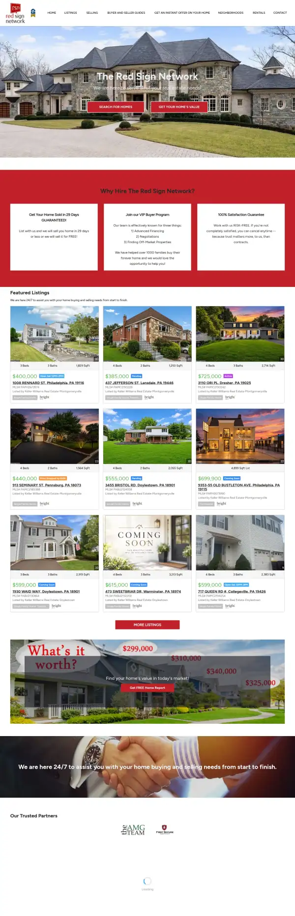
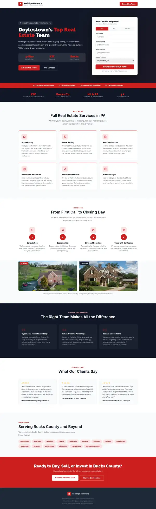
Steal this: 6 fixes for any realtor
- Put the town in the first line. "Doylestown's Top Real Estate Team" tells a local they are in the right place. The original's first screen, "The Red Sign Network", does not.
- Give buyers and sellers one main button each, and make one of them louder. Two equal red buttons make the visitor stop and decide. A sentence like "Buying or selling?" with the main button first does the job.
- Move the guarantee up. "Sold in 29 days or we sell it for free" is the strongest thing on the page and it is in small text in a box. Put it in the hero.
- Keep the number that can be checked. "Over 1000 families" is a specific claim. Say what it counts and since when.
- Add the reviews that already exist, with the platform. A quote signed "The Kellerman Family" proves nothing. A Google or Zillow name and a link do.
- Show the team. A house-hunter is choosing a person. The original page names no agent and shows no face; a name and a photo would do more than any layout change.
What I'd still fix with more time
The concept does not score 100. About 2 hours doesn't fix everything, and the checklist applies to my work too:
- The reviews are not real. The three quotes, "The Kellerman Family", "Margaret & Tom S." and "The Harrison Family", are not on the original site. They are placeholders and have to be replaced with the team's real reviews and their source.
- Some claims are mine, not the business's. "5-Star Client Reviews", "Licensed in both states", "NJ & PA" and the list of towns are not on the original page. The team has to confirm each one or drop it.
- I dropped what the original does best. The real listings, the "sold in 29 days" guarantee and "over 1000 families" are gone. A homepage for this team should keep listings, or link to them from the first screen.
- The logo is gone. I replaced the red sign logo with a plain house icon. The real logo needs to go back in.
- The photos are not the team's. The two house photos under Buyers and Sellers are not tied to a named sale, and no agent is named or shown.
- No phone number and no working form. The fields are not connected to anything, and there is no tap-to-call link. A buyer or seller who prefers to call has no way to.
- Mobile has bugs. The page is 405px wide on a 390px screen, so it scrolls sideways. The header button spills its text and body text is 14px, when it should be 16px or more.
- Speed and accessibility. Mobile Lighthouse is 82, against 70 for the original. I would get it above 90 and clear the 5 contrast and label issues the accessibility scan found.
My take
If I were talking to the Red Sign Network team, I would say this: you have real listings, a guarantee that most agents will not put in writing and a number, over 1000 families, that a visitor can remember. The old homepage has all three and hides two of them. My concept fixes the first screen and then goes too far. It threw out the listings and the guarantee and put nothing verified in their place.
The choice I am least sure about is the dark navy. It reads as serious and it makes the white text readable, but the original's bright red and white feels friendlier, and a real estate team is a people business. I would test both. I also chose a form over a phone number. Some sellers would rather call, and the concept gives them no way to.
What the concept does not solve is proof and people. There are no real reviews, no named agent and no photo of the team, and I could not confirm the licensing wording I wrote. Two hours got the first screen to say what and where. Making a visitor trust the team needs their reviews, their faces and their listings, and that is the business's to supply.
The live concept
The full concept is live on this site, with a bar at the top saying it is a concept and not Red Sign Network's real website.
The real site: redsignnetwork.com
Questions
What should a real estate team's homepage show first?
Who you are, where you work and one clear next step. A buyer wants to search and a seller wants a value, so lead with one and make the other a smaller second button. The listings can sit on their own page or below the first screen.
What did the 2 hours on Red Sign Network go into?
About 2 hours went into the first screen (headline, town, form and one main button), the services, the process steps and the mobile layout. They did not cover the listings, the real logo, real reviews or team photos, a phone number, connecting the form, or fixing the mobile overflow.
Should a realtor keep property listings on the homepage?
Usually yes, in some form. The original's nine cards are real proof that the team sells homes. My concept dropped them, which is a loss. A short row of three or four with a "See all listings" link would keep the proof without crowding the first screen.
Did Red Sign Network ask for this redesign?
No. This is an unsolicited concept, and I'm not affiliated with the business. If you own it and want anything changed or removed, email me and it's done within 48 hours.
How is the score worked out?
With a 100-point checklist: clarity, contact, proof, trust, mobile, integrity, speed and accessibility. A script runs the technical checks; I judge the rest from screenshots and note a reason for each. The original site gets the benefit of the doubt.
Own Red Sign Network and want this changed or removed? Email anshul@anshuldesigns.com and it's done within 48 hours.