80/20 Redesigns / Real estate investor / New Haven, CT
By Anshul
Updated
An unsolicited 2-hour concept for Market Equities Group, a real estate investment company in New Haven, CT. What held the original homepage back, what I changed, and how both score on the same checklist.
Unsolicited concept. Not commissioned by or affiliated with Market Equities Group. All trademarks belong to their owners.
Checklist score48 → 61out of 100
Time spentabout 2 hours
The short version
- 01
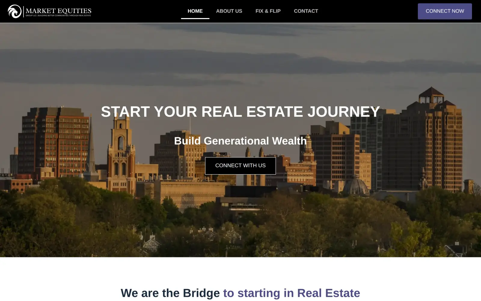
Problem: The first screen is a slogan. "Start Your Real Estate Journey" does not say what the company does, and the city is not named until the footer.
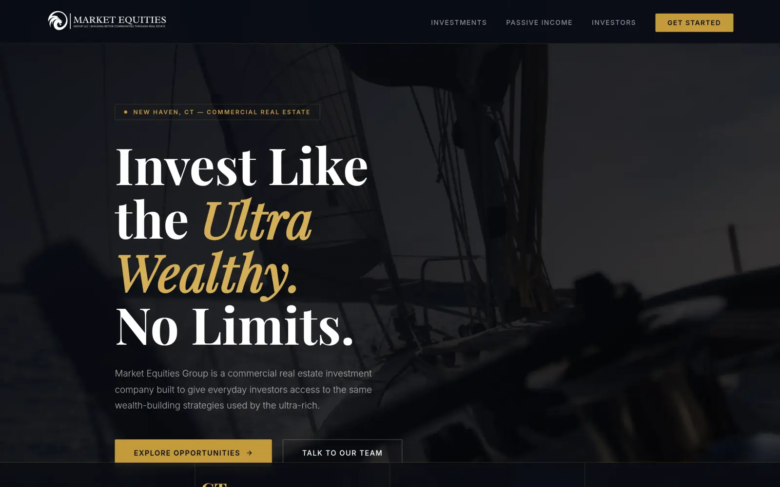
Fix: A "New Haven, CT, Commercial Real Estate" tag and a line saying it is a real estate investment company for everyday investors, then a section that names the three ways to invest.
- 02
Problem: One action has three names (Connect Now, Contact, Connect With Us), and the phone number is only in the footer.
Fix: A filled "Explore Opportunities" button next to "Talk to Our Team", and on a phone a bar at the bottom with the number and "Invest Now". Not solved: the contact form still has seven fields.
- 03
Problem: The three investor quotes, the best proof on the page, start on the fourth screen.
Fix: Not solved: the concept moves the quotes no higher, and I reworded them, which I should not have done. They need the original wording back.
Market Equities Group and the job of its homepage
Market Equities Group is a real estate investment company in New Haven, Connecticut. Its own page describes it as "the bridge to starting in Real Estate" and its menu has a Fix & Flip page.
The three quotes on the page come from people who invested with it in single-family flips and a multi-family fund, and two of them mention 2023. The people it wants to reach are newer investors, with money sitting in the bank, who have never bought into real estate before.
That visitor is not in a hurry, but is cautious. The homepage has one job: make a first-time investor feel this is a real company with a real office, and give them an easy way to start a conversation.
Same checklist, both sites
The score
This is not an agency rebuild. I gave the concept about 2 hours and spent them on the fixes that do the most for customers: the 20% of the work that gets 80% of the improvement.
To show how much that improves, I score every original homepage and every concept on the same 100-point checklist. Most checks are yes or no, and a script runs the technical ones (speed, mobile, accessibility). When in doubt, the point goes to the original site.
Original site
48/ 100
Concept
61/ 100
ClarityOriginal: 14/20Concept: 20/20
First screen says what the business does, in plain words (8 pts)
PassOriginal: "Start Your Real Estate Journey" and "Build Generational Wealth" on the first screen, with "We are the Bridge to starting in Real Estate" at its bottom edge; it names real estate but not what the company does, so the doubt goes to the original.
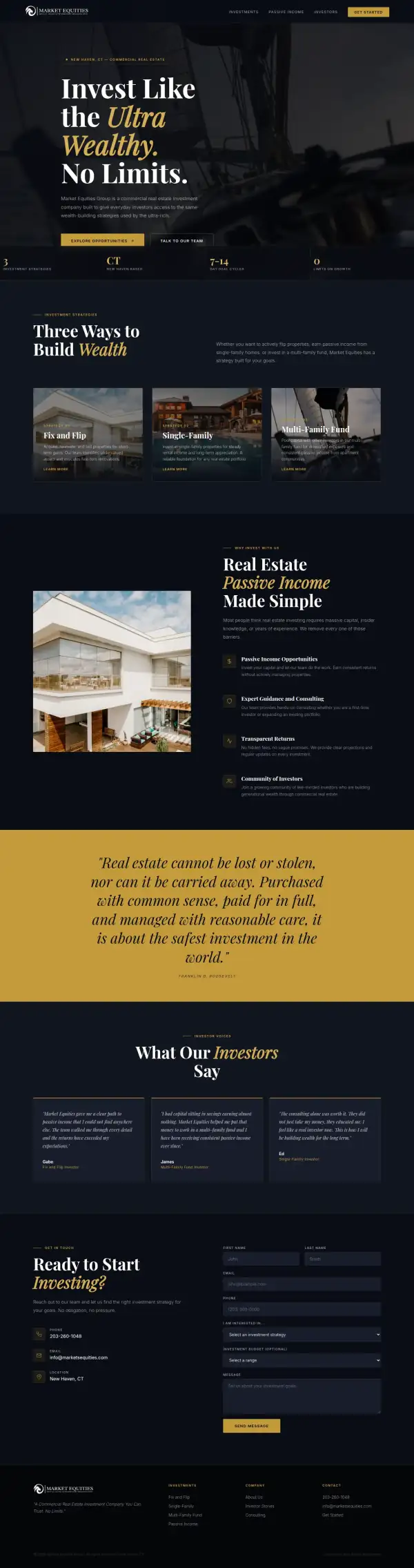
PassConcept: "Market Equities Group is a commercial real estate investment company built to give everyday investors access to..." under the headline "Invest Like the Ultra Wealthy. No Limits."
First screen says where, or who it serves (6 pts)
FailOriginal: The first two screens name no city or region; "Office: New haven, CT" appears only in the footer.
PassConcept: "New Haven, CT — Commercial Real Estate" tag above the headline.
One main action stands out on the first screen (6 pts)
PassOriginal: One "Connect With Us" button under the headline, backed by a filled "Connect Now" button in the header.
PassConcept: A filled gold "Explore Opportunities" button; "Talk to Our Team" is an outline button beside it.
ContactOriginal: 12/20Concept: 16/20
Phone or main button visible on the first mobile screen (8 pts)
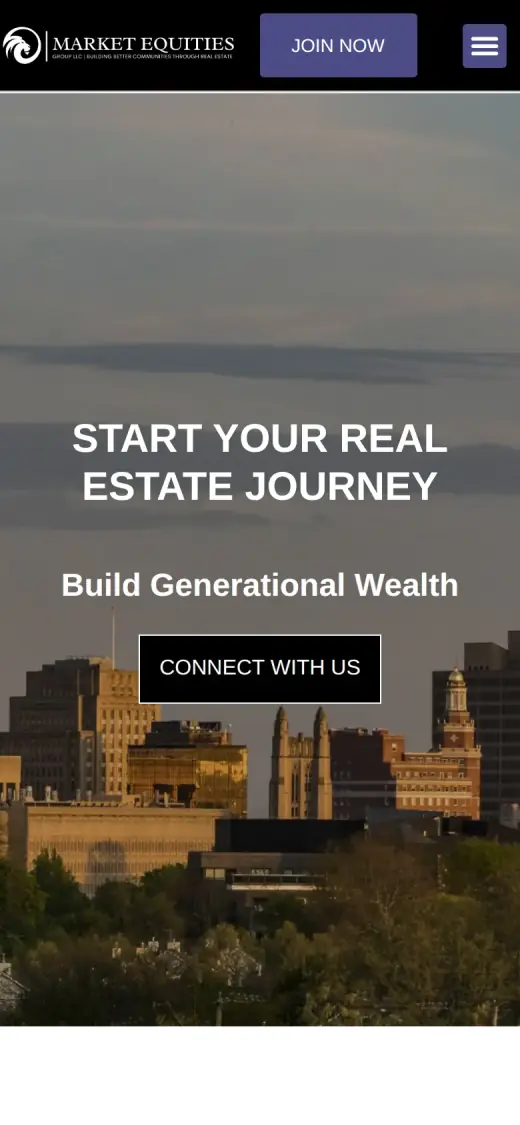
FailOriginal: no phone link or call-to-action on the first mobile screen
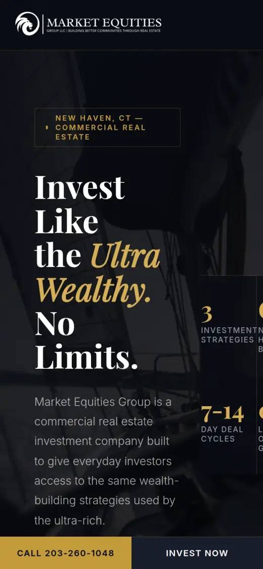
PassConcept: first mobile screen: "Call 203-260-1048"
Phone number is tap-to-call (4 pts)
PassOriginal: 1 tap-to-call link(s)
PassConcept: 3 tap-to-call link(s)
Phone or main button in the desktop header (4 pts)
PassOriginal: desktop header: "CONTACT"
PassConcept: desktop header: "Get Started"
Short form, or the main button leads straight to one (4 pts)
PassOriginal: The footer form has four fields (first name, last name, email, phone) and a Connect button.
FailConcept: Both buttons lead to a contact form with seven fields (first name, last name, email, phone, two menus and a message box).
ProofOriginal: 0/15Concept: 0/15
Reviews or a rating in the first two screens (6 pts)
FailOriginal: The "What people say about us" cards start on the fourth screen, well past the first two.
FailConcept: The three investor quotes start on the fourth screen, below a Roosevelt quote banner.
Testimonials carry real names or a named platform (5 pts)
FailOriginal: The three quotes are signed with first names only (Gabe, James, Ed) and a cartoon avatar, with no platform named.
FailConcept: The quotes keep the original's first names (Gabe, James, Ed) but the text and the labels ("Fix and Flip Investor") are reworded, so they are unverified.
At least one specific, checkable number (4 pts)
FailOriginal: No years in business, deal count, return figure or rating appears anywhere on the page.
FailConcept: The hero stat strip ("3" strategies, "CT", "7-14" day deal cycles, "0" limits) is not proof, and the 7-14 days is not on the original.
TrustOriginal: 3/15Concept: 3/15
Real photos of the team, work or place (5 pts)
FailOriginal: The photos are a city skyline, a sailboat deck and an apartment block; none shows the team or a property the company owns.
FailConcept: Stock photos only: a dark sailboat, a modern white house and a lodge with a pool.
Owner or team named or shown (4 pts)
FailOriginal: No owner or team member is named or shown.
FailConcept: No owner or team member is named or shown.
Full address or clear service area (3 pts)
PassOriginal: "Office: New haven, CT" with phone and email in the footer.
PassConcept: "New Haven, CT" with phone and email in the contact block and footer.
License, insurance or "since [year]" (3 pts)
FailOriginal: No license, accreditation or founding year; the footer says only "Copyright © 2023 | Market Equities Group".
FailConcept: No license, accreditation or founding year is shown.
MobileOriginal: 7/10Concept: 7/10
No sideways scroll at 390px (4 pts)
PassOriginal: page is 390px wide at 390px
PassConcept: page is 390px wide at 390px
Body text 16px or larger (3 pts)
PassOriginal: median paragraph text 18px on mobile
FailConcept: median paragraph text 14.08px on mobile
Main buttons at least 44px tall (3 pts)
FailOriginal: no actions on the first mobile screen
PassConcept: first-screen actions: 48px tall
IntegrityOriginal: 5/5Concept: 5/5
No placeholder text or broken images (3 pts)
PassOriginal: no placeholder text or broken images found (screenshots still get a manual look)
PassConcept: no placeholder text or broken images found (screenshots still get a manual look)
Header and footer links all work (2 pts)
PassOriginal: 6 header/footer link(s) checked, all work
PassConcept: 1 header/footer link(s) checked, all work
SpeedOriginal: 4/10Concept: 7/10
Lighthouse mobile performance (10 pts)
FailOriginal: Lighthouse mobile performance 64 (median of 3: 60, 64, 64)
FailConcept: Lighthouse mobile performance 74 (median of 3: 72, 74, 75)
AccessibilityOriginal: 3/5Concept: 3/5
No serious accessibility issues (axe) (3 pts)
PassOriginal: 5 serious/critical axe issue(s)
PassConcept: 5 serious/critical axe issue(s)
Content images have alt text (2 pts)
PassOriginal: 5/5 content images have alt text
PassConcept: 4/4 content images have alt text
Scored 2026-09-30 · How the checklist works
What held the original back
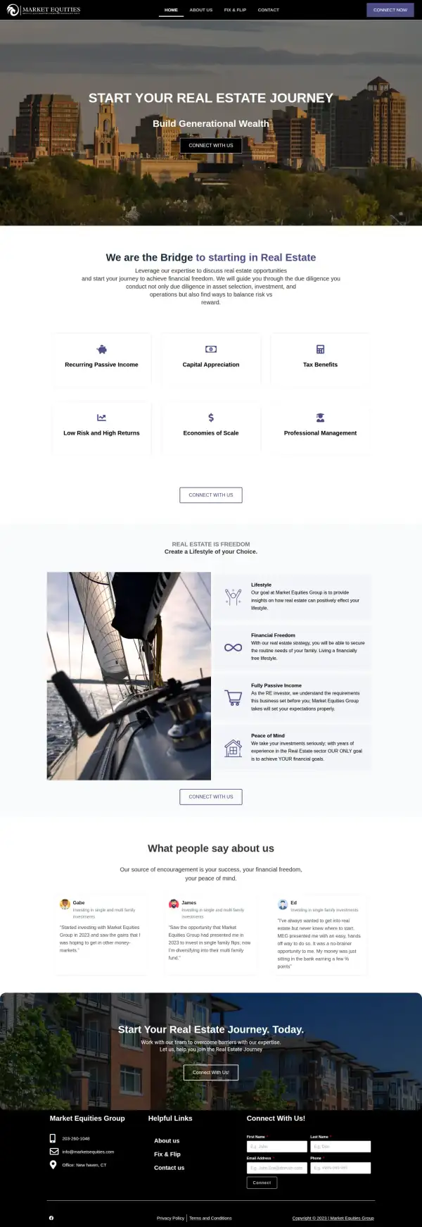
The original does real things right. Its footer has a phone number, an email and an office town. The form is short, four fields. The three quotes are the kind of proof a new investor wants: they mention 2023 and say what the person invested in. The pages themselves were fine in my capture, and the live site shows the same text. The trouble is in the first screen, where a visitor has to decide whether this is the right kind of company.
- The headline is a slogan. It says "real estate" but not what Market Equities does. Only "Fix & Flip" is in the menu; the other ways to invest are further down.
- The header button says "Connect Now", the menu says "Contact" and the hero says "Connect With Us". That is one action under three names. The phone number is in the footer, not here.
- The only hero button gives no hint of what happens next. The form it leads to is in the footer, at the very bottom of the page.
- The photo is a skyline with no caption. New Haven, CT first appears as "Office: New haven, CT" in the footer.
What I changed
The first screen and the mobile view, original on the left and concept on the right. The slider at the top of the post compares the first screen up close.
Before
After
First screen
- Say what it is, and where
- A "New Haven, CT, Commercial Real Estate" tag sits above the headline, and the line under it says the company is a commercial real estate investment company for everyday investors. The original names neither on its first screen.
- One filled button
- "Explore Opportunities" is the filled gold button, "Talk to Our Team" is an outline beside it, and the header button reads "Get Started". It is still three phrases, but a clearer main one.
- Name the three ways to invest
- The next screen is "Three Ways to Build Wealth": Fix and Flip, Single-Family and the Multi-Family Fund, each with a short line. On the original a visitor has to find them in the menu and the quotes.
Before
After
Mobile
- A call bar that stays put
- "Call 203-260-1048" and "Invest Now" stay at the bottom of the screen the whole way down, and both are 48px tall. The original mobile first screen has "Join Now" and "Connect With Us", but no number.
- City on the first screen
- The New Haven, CT tag wraps to three lines but still sits right above the headline, so the town shows without scrolling. My paragraph text is smaller than the original's, 14px against 18px, which I list below.
The whole page, before and after
Steal this: 6 fixes for any real estate investor
- Say what the company does in the first line, not only the feeling. "Start your real estate journey" could be an agent, a course or a fund. "A commercial real estate investment company" leaves no doubt.
- Name your town on the first screen. A cautious investor wants to know there is a real office nearby. "New Haven, CT" beside the headline does more than a skyline photo.
- Give one action one name. If the button, the menu link and the header all say something different, the visitor wonders whether they lead to different places.
- Put the phone number where a person can press it. In the header on a desktop and in a bar on a phone, not only in the footer.
- Show the investor quotes early and keep the original wording. The three quotes are the best proof this site has. Add the platform or the last name and ask before you change a word.
- Show the people. Someone about to put savings into a fund wants to see who runs it. A photo and a name of the owner beats any skyline.
What I'd still fix with more time
The concept does not score 100. About 2 hours doesn't fix everything, and the checklist applies to my work too:
- The investor quotes are not real proof yet. The three quotes in the concept keep the original's first names (Gabe, James, Ed), but I reworded every one, and added labels such as "Fix and Flip Investor". None of that comes from the original site. They need to go back to the original text, with the years it mentions and ideally a last name or a source.
- Some claims are mine. "7-14 day deal cycles", "Transparent Returns: no hidden fees ... regular updates on every investment", "consistent returns" and the Franklin D. Roosevelt banner are not on the original site. Market Equities has to confirm each one or drop it. Investment wording may also have legal rules that I cannot judge.
- "Invest like the ultra wealthy. No limits." is a promise. It reads well, but a real estate investment company may not be able to make it. The original's "Low Risk and High Returns" tile has the same problem.
- The photos are not the company. The sailboat, the white house and the lodge are stock. I would use real photos of a property Market Equities has done, and the owner.
- No owner, no team and no numbers. Nobody is named or shown on either version, and neither page has a year founded, a deal count or a fund size. Layout cannot fix that.
- The form still has seven fields. Both buttons lead to a form with names, email, phone, two menus and a message. Two fields and a call is enough to start.
- The mobile stat strip is cut off at the right edge, and mobile text is 14px. Mobile speed is 74 on Lighthouse (the original scored 64), and I would get it above 90.
My take
If I were talking to Market Equities, I would say this: your best material is already on the page. Real quotes from people who invested with you, an office in New Haven, a phone number. The old first screen just did not use any of it, and asked a visitor to press "Connect With Us" without saying what you do.
The part I am least sure about is the tone. "Invest Like the Ultra Wealthy. No Limits." is bold and it fits the original's "No Limits" title, but it is a promise about money, and I do not know what Market Equities is allowed or wants to say. A plainer line might serve a cautious first-time investor better. I also went dark and gold, which feels more like a private bank than the original's purple and white. That is a taste call for the business.
What the concept does not solve is trust. I reworded the quotes, which I should not have done. The photos are stock, no one is named, and there is still a seven-field form. Two hours got the first screen to say what the company is and how to call it. It did not make Market Equities look more established than its own page shows; that needs the owner's photo, real numbers and the original quotes.
The live concept
The full concept is live on this site, with a bar at the top saying it is a concept and not Market Equities Group's real website.
The real site: marketsequities.com
Questions
What should a real estate investment company's homepage show first?
What it does, where it is, and one way to start. Someone deciding whether to put money into a fund is cautious. A plain first line, a town, a phone number and a real face come before the benefit list.
What did the 2 hours on Market Equities Group go into?
About 2 hours went into the first screen (a plain description, the town, one main button), the three-strategies section, the quotes and contact section, and the mobile call bar. They did not cover real photos, the original quote wording, the form, speed, or checking each claim with the business.
Did Market Equities Group ask for this redesign?
No. This is an unsolicited concept, and I'm not affiliated with the business. If you own it and want anything changed or removed, email me and it's done within 48 hours.
How is the score worked out?
With a 100-point checklist: clarity, contact, proof, trust, mobile, integrity, speed and accessibility. A script runs the technical checks; I judge the rest from screenshots and note a reason for each. The original site gets the benefit of the doubt.
Own Market Equities Group and want this changed or removed? Email anshul@anshuldesigns.com and it's done within 48 hours.