80/20 Redesigns / Realtor team / Kansas City, MO
By Anshul
Updated
An unsolicited 2-hour concept for Priority Homes KC, a two-agent real estate team in Kansas City. What held the original one-screen page back, what I changed, and how both score on the same checklist.
Unsolicited concept. Not commissioned by or affiliated with Priority Homes KC. All trademarks belong to their owners.
Checklist score49 → 67out of 100
Time spentabout 2 hours
The short version
- 01
Problem: The only things to press are two equal buttons, one per agent, and each leads to a separate personal website. There is no main action.
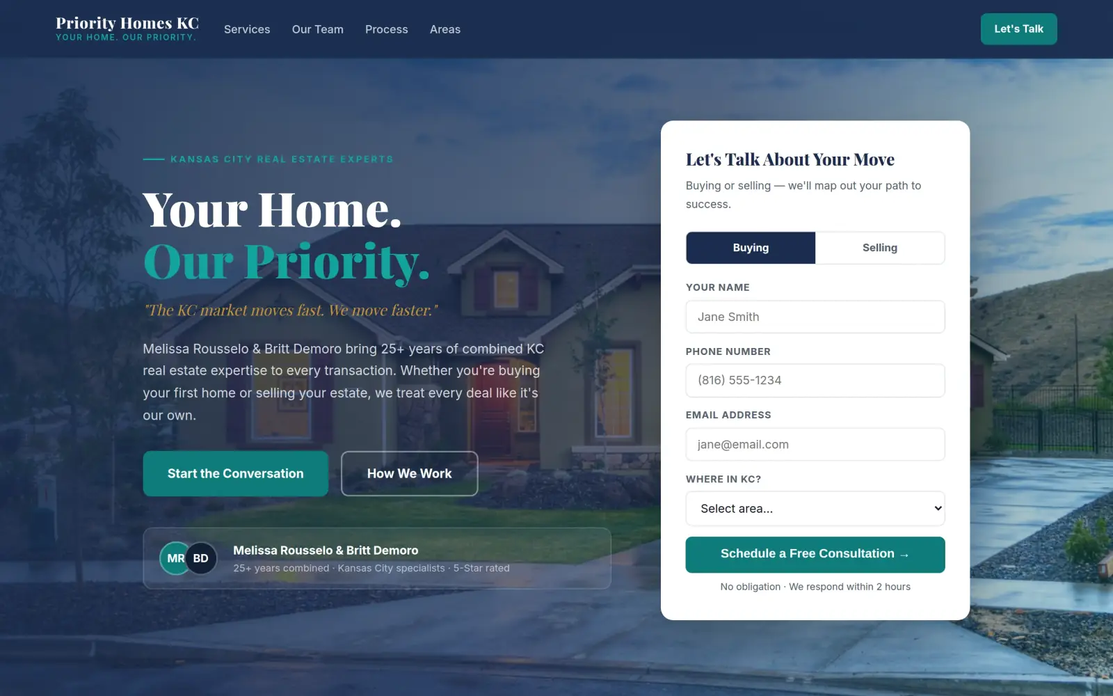
Fix: One filled button, "Start the Conversation", and a consultation form on the same screen, with a switch for buying or selling.
- 02
Problem: There is nothing to send from this page: no form, no email and no phone number, so a visitor has to pick an agent and start over on another site.
Fix: A four-field form (name, phone, email, area). Not solved: there is still no phone number, because I could not find one on the original.
- 03
Problem: What the team does is one small line of light grey text under a slogan, and the big type is only the name.
Fix: A "Kansas City Real Estate Experts" tag and a services section say what they do and where, in plain words.
Priority Homes KC and the job of its homepage
Priority Homes KC is a two-agent real estate team in Kansas City: Melissa Rousselo and Britt Demoro. They help people buy, sell and move up.
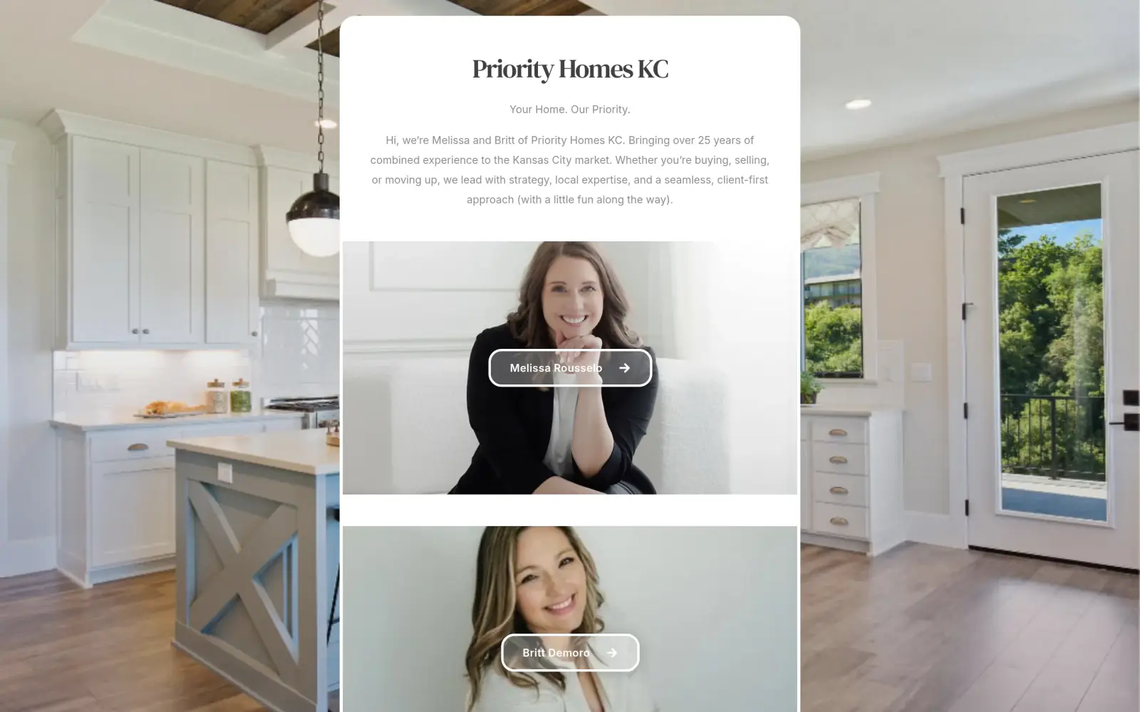
Their own page says they bring "over 25 years of combined experience to the Kansas City market" and work with a "client-first approach (with a little fun along the way)". The live page loads from a Carrd address (priorityhomeskc.carrd.co) and is a single screen.
A person landing here has probably been sent by a friend or a link and wants to know one thing: is this the right agent, and how do I start? The page has one job: get that person to talk to Melissa or Britt.
Same checklist, both sites
The score
This is not an agency rebuild. I gave the concept about 2 hours and spent them on the fixes that do the most for customers: the 20% of the work that gets 80% of the improvement.
To show how much that improves, I score every original homepage and every concept on the same 100-point checklist. Most checks are yes or no, and a script runs the technical ones (speed, mobile, accessibility). When in doubt, the point goes to the original site.
Original site
49/ 100
Concept
67/ 100
ClarityOriginal: 14/20Concept: 20/20
First screen says what the business does, in plain words (8 pts)
PassOriginal: The intro line says "buying, selling, or moving up" in "the Kansas City market", which tells a visitor it is a real estate team; the headline "Priority Homes KC" and the slogan alone would not.
PassConcept: "Kansas City Real Estate Experts" above the headline, and "whether you're buying your first home or selling your estate" under it.
First screen says where, or who it serves (6 pts)
PassOriginal: "Kansas City market" is in the intro line on the first screen and "KC" is in the name.
PassConcept: "Kansas City Real Estate Experts" tag above the headline and "KC real estate" in the intro line.
One main action stands out on the first screen (6 pts)
FailOriginal: The only actions are two equal outlined buttons, "Melissa Rousselo" and "Britt Demoro", each linking to a personal site; there is no single main action.
PassConcept: A filled teal "Start the Conversation" button, with "How We Work" as an outline, next to a consultation form.
ContactOriginal: 0/20Concept: 12/20
Phone or main button visible on the first mobile screen (8 pts)
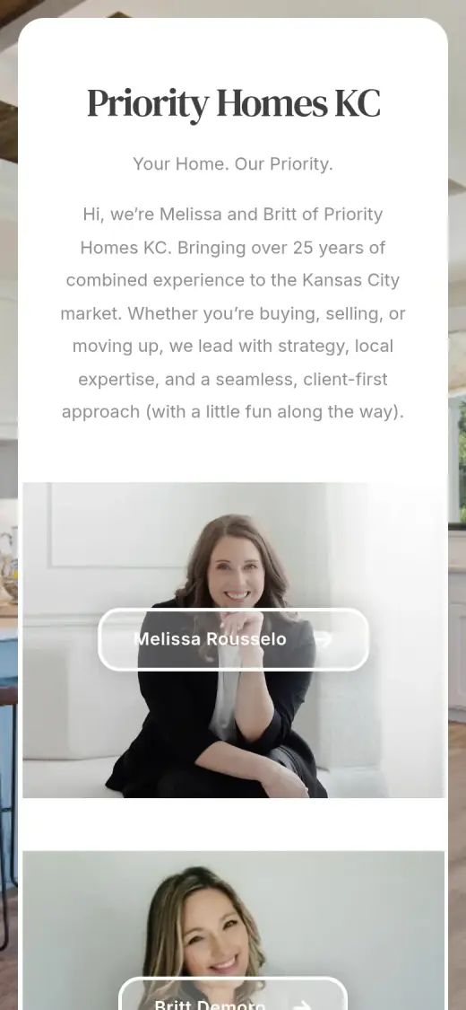
FailOriginal: no phone link or call-to-action on the first mobile screen
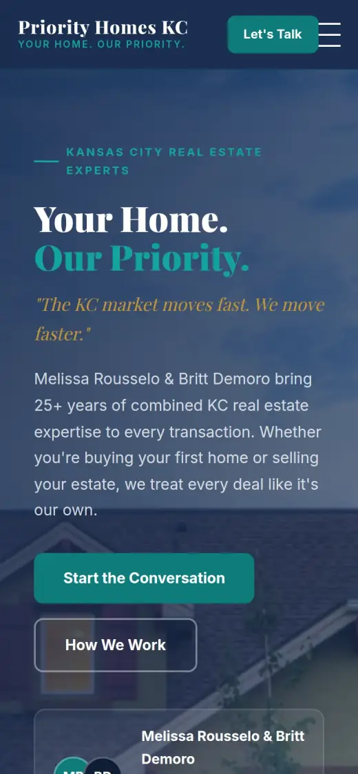
PassConcept: first mobile screen: "Start the Conversation"
Phone number is tap-to-call (4 pts)
FailOriginal: 0 tap-to-call link(s)
FailConcept: 0 tap-to-call link(s)
Phone or main button in the desktop header (4 pts)
FailOriginal: no phone or call-to-action in the top 120px on desktop
FailConcept: no phone or call-to-action in the top 120px on desktop
Short form, or the main button leads straight to one (4 pts)
FailOriginal: There is no form on the page and the two buttons lead to other websites, not to a short form.
PassConcept: The first-screen form has four fields (name, phone, email, area) plus a Buying or Selling toggle.
ProofOriginal: 4/15Concept: 4/15
Reviews or a rating in the first two screens (6 pts)
FailOriginal: No reviews, rating or testimonials appear anywhere on the one-screen page.
FailConcept: The "5-Star rated" line, the "5 star average rating" and "98% client satisfaction" figures are not on the original site, so they do not count.
Testimonials carry real names or a named platform (5 pts)
FailOriginal: There are no testimonials, named or anonymous.
FailConcept: Three testimonials (Sarah & Tom Harrington, Paul & Ginny Morrison, Amanda & Chris Tran) are not on the original site and are unverified.
At least one specific, checkable number (4 pts)
PassOriginal: "Bringing over 25 years of combined experience to the Kansas City market" is a specific number in the intro text.
PassConcept: "25+ years combined experience" comes from the original's "over 25 years of combined experience"; the 300+ transactions, 15+ years and 10+ years figures do not, so only this one counts.
TrustOriginal: 12/15Concept: 10/15
Real photos of the team, work or place (5 pts)
PassOriginal: Two real portrait photos of the agents fill the page, one above the other.
FailConcept: The original's real portraits of Melissa and Britt are gone; the team section shows a stock photo of a group at a table and the hero is a stock house.
Owner or team named or shown (4 pts)
PassOriginal: "Hi, we're Melissa and Britt" plus the two named photo buttons, Melissa Rousselo and Britt Demoro.
PassConcept: Melissa Rousselo and Britt Demoro are named in the hero and in the team section, with initials in place of their photos.
Full address or clear service area (3 pts)
PassOriginal: "The Kansas City market" in the intro is the stated service area; there is no street address.
PassConcept: A "Serving All of Kansas City Metro" section lists twelve cities; the original only says "Kansas City market".
License, insurance or "since [year]" (3 pts)
FailOriginal: No license, brokerage, insurance or accreditation is visible on the page; "Realtor" appears only in the browser tab title.
PassConcept: The footer reads "REALTOR®", matching the "Realtor" in the original's page title; no license number or brokerage is shown.
MobileOriginal: 4/10Concept: 7/10
No sideways scroll at 390px (4 pts)
PassOriginal: page is 390px wide at 390px
PassConcept: page is 390px wide at 390px
Body text 16px or larger (3 pts)
FailOriginal: median paragraph text 14.6667px on mobile
FailConcept: median paragraph text 14.4px on mobile
Main buttons at least 44px tall (3 pts)
FailOriginal: no actions on the first mobile screen
PassConcept: first-screen actions: 55px tall
IntegrityOriginal: 5/5Concept: 5/5
No placeholder text or broken images (3 pts)
PassOriginal: no placeholder text or broken images found (screenshots still get a manual look)
PassConcept: no placeholder text or broken images found (screenshots still get a manual look)
Header and footer links all work (2 pts)
PassOriginal: 0 header/footer link(s) checked, all work
PassConcept: 1 header/footer link(s) checked, all work
SpeedOriginal: 7/10Concept: 7/10
Lighthouse mobile performance (10 pts)
FailOriginal: Lighthouse mobile performance 70 (median of 3: 70, 70, 72)
FailConcept: Lighthouse mobile performance 81 (median of 3: 81, 81, 84)
AccessibilityOriginal: 3/5Concept: 2/5
No serious accessibility issues (axe) (3 pts)
PassOriginal: 2 serious/critical axe issue(s)
FailConcept: 13 serious/critical axe issue(s)
Content images have alt text (2 pts)
PassOriginal: 0/0 content images have alt text
PassConcept: 2/2 content images have alt text
Scored 2026-09-30 · How the checklist works
What held the original back
The original does some things better than most agent sites. Both agents are shown in real, warm portrait photos, they are named right on the page, and the "25 years of combined experience" line is a concrete number. The design is calm and uncluttered. My note is about what a visitor can do after that. One note on the capture: my first screenshot of the desktop page came back as an error message from my own network, so I cut the picture below from the full-page capture instead. The page itself loaded fine.
- The two outlined name buttons are the only things to press. They look the same and lead to each agent's own website, so a visitor must choose a person before they can ask anything.
- This small grey paragraph is the only place that says what the team does: buying, selling and moving up in Kansas City. The contrast is low, so it is easy to skim past.
- The biggest words are the business name. "Your Home. Our Priority." sits under it in small grey type and says nothing about what they do.
- There is no form, no phone number and no email on the page, and no reviews. A visitor who just wants to ask a question has nowhere to do it here.
What I changed
The first screen and the mobile view, original on the left and concept on the right. The slider at the top of the post compares the first screen up close.
Before
After
First screen
- Say what and where, then act
- The tag "Kansas City Real Estate Experts" sits above the headline, and the line under it says they help you buy your first home or sell your estate. In the original that information is in the small paragraph.
- One main button and a form
- "Start the Conversation" is the filled button, and a form sits beside it with a Buying or Selling switch. The original has no form and two equal buttons.
- A short form
- Name, phone, email and area, four fields in all. Everything else can be asked on the first call.
Before
After
Mobile
- A button in the header and one in the hero
- "Let's Talk" stays in the header, and "Start the Conversation" is 55px tall, easy for a thumb. The original mobile first screen has nothing to press except an agent's name.
- Not a phone call yet
- There is no tap-to-call link, because neither the original nor my concept has a phone number to put there. I list this below.
The whole page, before and after
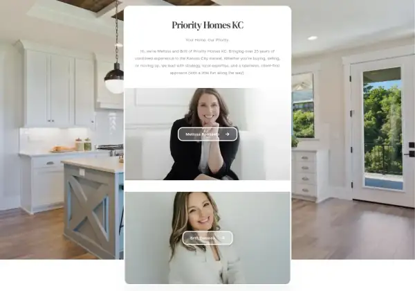
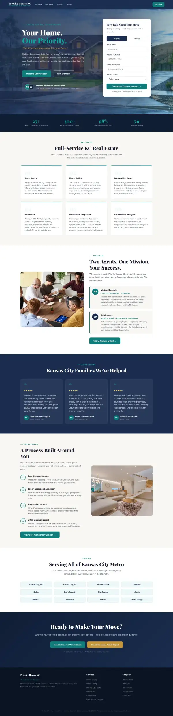
Steal this: 5 fixes for any realtor team
- Give the first screen one main action. Two agents can share one button, "Start the Conversation", and let the agents split up the requests afterwards.
- Put a form on the page itself. A link that sends people to a personal website is one more step where a visitor can drop off. Keep the form to four or five fields.
- Say what you do in the biggest words. A name and a slogan are worth keeping, but the line that says "real estate agents in Kansas City" should not be the smallest text on the screen.
- Keep the real portraits. The original's two photos are its best asset. A visitor choosing an agent wants to see a face, and no stock photo does that job.
- Add a phone number and a review or two, with a source. An agent page with neither asks for a lot of trust with nothing to hold onto.
What I'd still fix with more time
The concept does not score 100. About 2 hours doesn't fix everything, and the checklist applies to my work too:
- The reviews are not real yet. The three testimonials in the concept (three named couples with towns) are not on the original site. They need to be swapped for real ones from clients, with a source.
- Several numbers are mine, not the business's. "300+ KC transactions", "98% client satisfaction", "5 star average rating", "15+ years" for Melissa, "10+ years" for Britt, "average days on market: 12" and "we respond within 2 hours" are not on the original. Only "25+ years combined" comes from it. The team needs to confirm each one or drop it.
- The real portraits are missing. The team section shows a stock photo of people around a table and initials in circles. The original's photos of Melissa and Britt should be back on the page.
- The links to their own sites are gone. The original sends visitors to melissarousselo.com and yourkansascitylife.com. The concept does not link to either of them.
- The form is not wired up. It does not send anywhere, and the twelve cities and six services in the concept are my wording, not the team's.
- There is no phone number. A tap-to-call link and an email address are the first things to add once the team says which to show.
- Mobile text is 14.4px, and the accessibility scan found 13 serious issues (12 low-contrast text and one unlabeled dropdown), against 2 on the original. Mobile speed is 81 on Lighthouse against 70 for the original.
My take
If I were talking to Melissa and Britt, I would say this: your two portraits are the best thing on the page, and I would not lose them. The concept keeps your name and your "25 years combined" line, but I had to fill a full page and I filled it with stock photos and placeholder reviews. That is the wrong way round, and it is the first thing to fix.
The part I am least sure about is length. Your original is one calm screen, and a lot of agents do well with exactly that. I made a long page because a visitor who does not know you needs to see what you do, where and what people say before they fill in a form. If you already get all your leads through referrals, a one-screen page with one added form might be all you need.
What the concept does not solve is proof and reach. It has no real reviews, no phone number and no link to your existing sites. Two hours got the first screen to do a job, and it did not make the page more true than yours. That part needs both of you.
The live concept
The full concept is live on this site, with a bar at the top saying it is a concept and not Priority Homes KC's real website.
The real site: www.priorityhomeskc.com
Questions
What should a real estate team's homepage show first?
What you do, where, one main button and a way to reach you. People choosing an agent also want a face and a name, so keep real photos. Reviews, services and the process can sit below.
What did the 2 hours on Priority Homes KC go into?
About 2 hours went into the first screen (headline, tag, one main button and a four-field form), a services section, a team section, a reviews section, a three-step process and a list of areas. They did not cover the real photos, real reviews, the phone number, the form connection, mobile text size or checking each number with the team.
Did Priority Homes KC ask for this redesign?
No. This is an unsolicited concept, and I'm not affiliated with the business. If you own it and want anything changed or removed, email me and it's done within 48 hours.
How is the score worked out?
With a 100-point checklist: clarity, contact, proof, trust, mobile, integrity, speed and accessibility. A script runs the technical checks; I judge the rest from screenshots and note a reason for each. The original site gets the benefit of the doubt.
Own Priority Homes KC and want this changed or removed? Email anshul@anshuldesigns.com and it's done within 48 hours.