80/20 Redesigns / Chiropractor / Oklahoma City, OK
By Anshul
Updated
An unsolicited 2-hour concept for Native Chiropractic, a family and pediatric chiropractor in Oklahoma City. What held the original homepage back, what I changed, and how both score on the same checklist.
Unsolicited concept. Not commissioned by or affiliated with Native Chiropractic. All trademarks belong to their owners.
Checklist score53 → 69out of 100
Time spentabout 2 hours
The short version
- 01
Problem: The headline is a mission line, "unleash your native ability to heal, feel, and function". It never says chiropractic, kids or Oklahoma City.
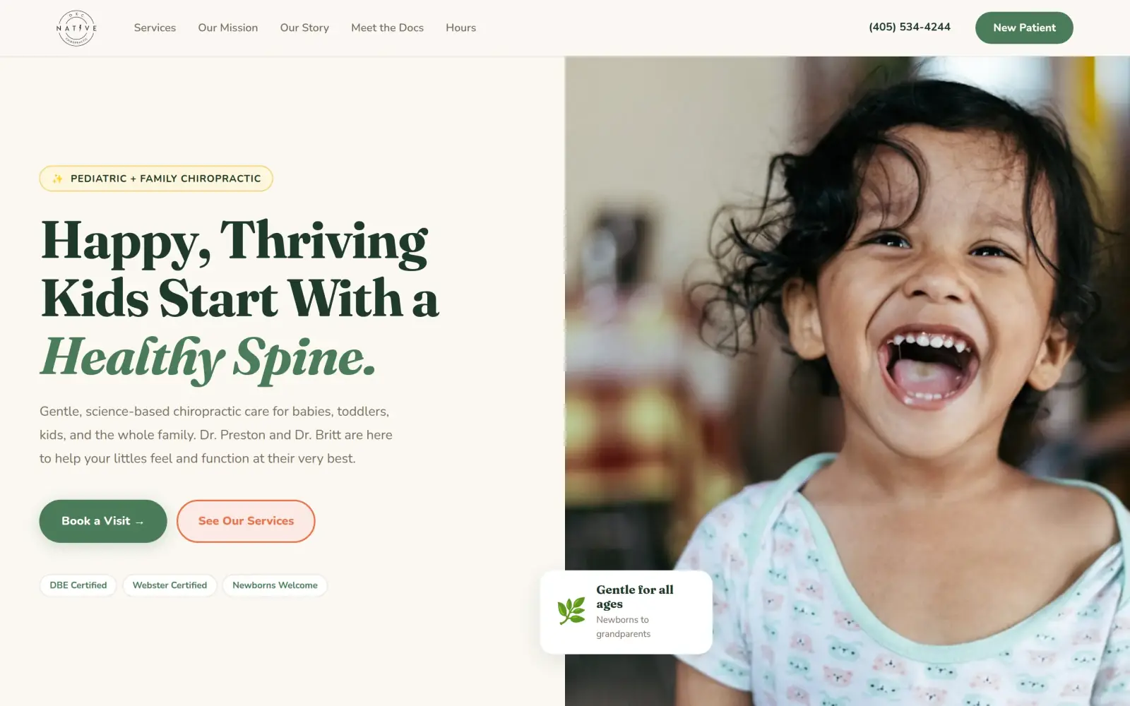
Fix: The headline says "Happy, Thriving Kids Start With a Healthy Spine.", and a tag and a line under it say pediatric and family chiropractic, for babies through the whole family.
- 02
Problem: There is no phone number in the header and none as a tap-to-call link anywhere on the page. The number is plain text in the footer.
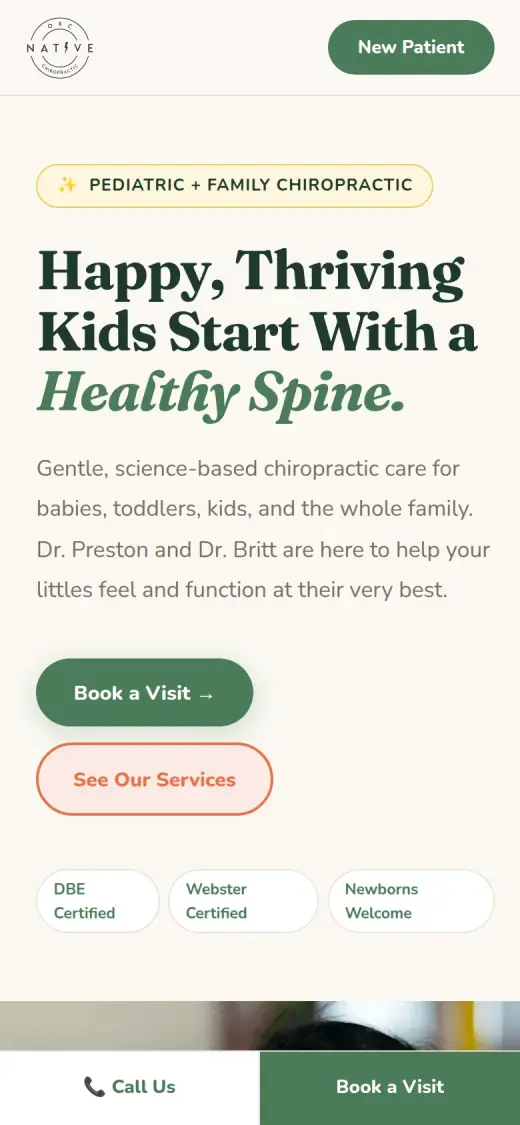
Fix: The number is in the header on desktop, and on a phone a bar with "Call Us" and "Book a Visit" stays at the bottom of the screen.
- 03
Problem: Nothing on the page shows what other families think. Testimonials are a separate page, one click away from the menu.
Fix: Not solved: the concept adds a quotes section, but the three quotes are mine, not real patients'. They have to be replaced with the office's own.
Native Chiropractic and the job of its homepage
Native Chiropractic is a family and pediatric chiropractic office at 2237 W. Memorial Rd in Oklahoma City, run by Dr. Preston Cook and Dr. Brittany Wetzel.
According to its own site, the two doctors worked as associates at Innate Chiropractic in Newburgh, NY before opening in Oklahoma City. They use Torque Release Technique and CLA Insight scans, and the office is open Monday, Wednesday and Thursday 10 to 1 and 3 to 6, and Tuesday 3 to 6. It is closed Friday to Sunday.
A parent looking at this homepage is probably comparing a few local offices on their phone. The page has one job: make it clear in seconds that this office treats kids and families, and make it easy to book.
Same checklist, both sites
The score
This is not an agency rebuild. I gave the concept about 2 hours and spent them on the fixes that do the most for customers: the 20% of the work that gets 80% of the improvement.
To show how much that improves, I score every original homepage and every concept on the same 100-point checklist. Most checks are yes or no, and a script runs the technical ones (speed, mobile, accessibility). When in doubt, the point goes to the original site.
Original site
53/ 100
Concept
69/ 100
ClarityOriginal: 6/20Concept: 20/20
First screen says what the business does, in plain words (8 pts)
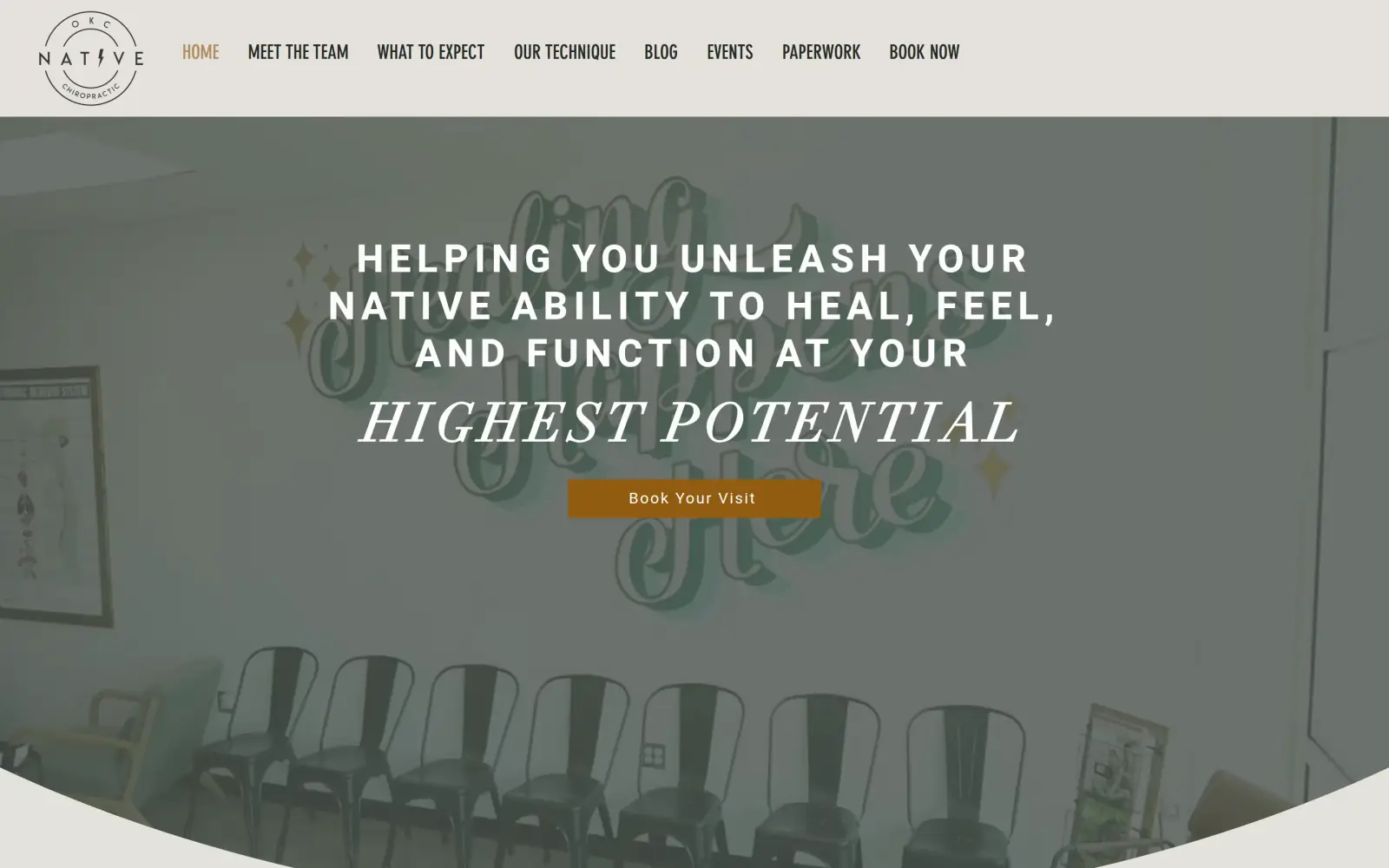
FailOriginal: The headline "Helping you unleash your native ability to heal, feel, and function at your highest potential" never says chiropractic or who it is for; only the small logo says "OKC Native Chiropractic".
PassConcept: The tag "Pediatric + Family Chiropractic" and the line "Gentle, science-based chiropractic care for babies, toddlers, kids, and the whole family" sit under the headline.
First screen says where, or who it serves (6 pts)
FailOriginal: No city or audience in the first screen; "OKC" appears only as tiny letters in the logo.
PassConcept: The first screen says who it serves: babies, toddlers, kids and the whole family, "newborns to grandparents"; it does not name the city.
One main action stands out on the first screen (6 pts)
PassOriginal: One brown "Book Your Visit" button under the headline; the header repeats it as "Book Now" among eight menu links.
PassConcept: A filled green "Book a Visit" button; "See Our Services" is a paler outline beside it.
ContactOriginal: 16/20Concept: 16/20
Phone or main button visible on the first mobile screen (8 pts)
PassOriginal: first mobile screen: "Book Your Visit"
PassConcept: first mobile screen: "Book a Visit →", "📞 Call Us", "Book a Visit"
Phone number is tap-to-call (4 pts)
FailOriginal: 0 tap-to-call link(s)
PassConcept: 4 tap-to-call link(s)
Phone or main button in the desktop header (4 pts)
PassOriginal: desktop header: "BOOK NOW"
PassConcept: Overrides the automatic check: the desktop header shows the phone number (405) 534-4244 and a green New Patient button, as tile 1 shows.
Short form, or the main button leads straight to one (4 pts)
PassOriginal: "Book Your Visit" leads to /book-now, a form with four fields (name, email, phone, message).
FailConcept: Every "Book a Visit" and "New Patient" button jumps to the hours block; the concept has no form.
ProofOriginal: 0/15Concept: 0/15
Reviews or a rating in the first two screens (6 pts)
FailOriginal: No reviews or rating on the homepage; testimonials sit on a separate page linked from the menu.
FailConcept: The parent quotes start about 4,900px down the page, far past the first two desktop screens.
Testimonials carry real names or a named platform (5 pts)
FailOriginal: No testimonials appear on the homepage, only an Instagram feed.
FailConcept: The three quotes (Ashley M., James T., Sarah R.) are not on the original site and name no platform, so they are unverified.
At least one specific, checkable number (4 pts)
FailOriginal: No years in business, patient count or rating with a review count on the homepage; "©2021" is a copyright line.
FailConcept: No years in business, patient count or rating; the concept shows no number that is proof.
TrustOriginal: 12/15Concept: 15/15
Real photos of the team, work or place (5 pts)
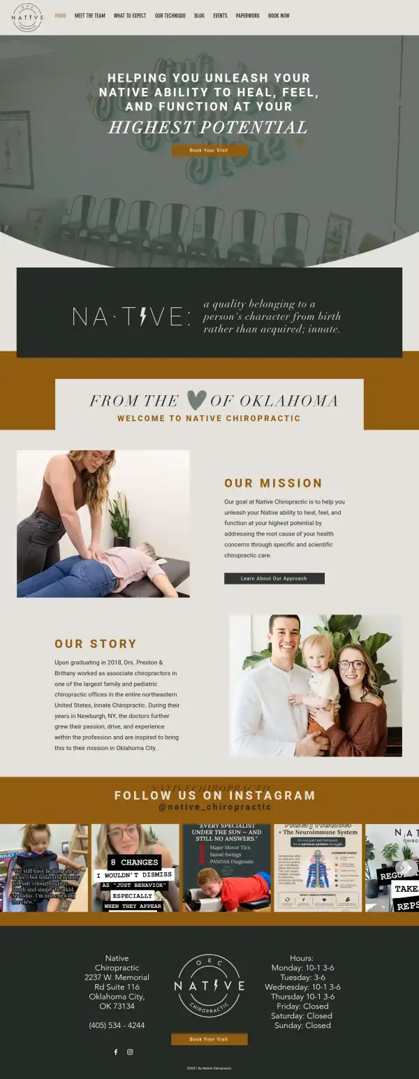
PassOriginal: Real photos of the office waiting room, a treatment on the table and the two doctors with their child.
PassConcept: The "Our Story" section reuses the original's real photo of the two doctors with their child, although the hero and the service cards are stock.
Owner or team named or shown (4 pts)
PassOriginal: The "Our Story" text names Drs. Preston and Brittany beside a photo of them with their child.
PassConcept: "Dr. Preston and Dr. Britt" are named in the first screen and get their own section, with bios that match the original's Meet the Team page.
Full address or clear service area (3 pts)
PassOriginal: The footer gives the full address, 2237 W. Memorial Rd Suite 116, Oklahoma City, OK 73134, and the weekly hours.
PassConcept: The footer and the hours block give the full address, 2237 W. Memorial Rd Suite 116, Oklahoma City, OK 73134.
License, insurance or "since [year]" (3 pts)
FailOriginal: No license, accreditation or founding year on the homepage; the footer says only "©2021 By Native Chiropractic".
PassConcept: Dr. Britt's Webster Technique certification is on the original's Meet the Team page; the "DBE Certified" badge is not on it, so I do not count that one.
MobileOriginal: 7/10Concept: 7/10
No sideways scroll at 390px (4 pts)
PassOriginal: page is 320px wide at 390px
PassConcept: page is 390px wide at 390px
Body text 16px or larger (3 pts)
PassOriginal: median paragraph text 21px on mobile
FailConcept: median paragraph text 14.4px on mobile
Main buttons at least 44px tall (3 pts)
FailOriginal: first-screen actions: 42px tall
PassConcept: first-screen actions: 52px, 55px, 55px tall
IntegrityOriginal: 5/5Concept: 5/5
No placeholder text or broken images (3 pts)
PassOriginal: no placeholder text or broken images found (screenshots still get a manual look)
PassConcept: no placeholder text or broken images found (screenshots still get a manual look)
Header and footer links all work (2 pts)
PassOriginal: 9 header/footer link(s) checked, all work
PassConcept: 2 header/footer link(s) checked, all work
SpeedOriginal: 4/10Concept: 4/10
Lighthouse mobile performance (10 pts)
FailOriginal: Lighthouse mobile performance 50 (median of 3: 42, 50, 54)
FailConcept: Lighthouse mobile performance 67 (median of 3: 66, 67, 67)
AccessibilityOriginal: 3/5Concept: 2/5
No serious accessibility issues (axe) (3 pts)
PassOriginal: 2 serious/critical axe issue(s)
FailConcept: 57 serious/critical axe issue(s)
Content images have alt text (2 pts)
PassOriginal: 9/9 content images have alt text
PassConcept: 9/9 content images have alt text
Scored 2026-09-30 · How the checklist works
What held the original back
A lot works on the original. The photos are real: the office, a treatment and the two doctors with their child. The doctors are named. The footer has a full address and hours. The main button leads to a short booking form with four fields, and the page fits a phone screen. The trouble is the first few seconds. One note on the capture: the live page plays a muted background video behind the headline, which the capture browser could not play, so the dimmed waiting room in my screenshots is a still. I could not see the video, and I do not count the dull look as a flaw.
- The only place that says what this is, and where, is the small round logo: "OKC Native Chiropractic". A parent skimming does not read a logo.
- The headline is the practice's mission. It does not say chiropractic, kids, families or Oklahoma City, so a visitor has to work out who it is for.
- One button, and it goes to a short booking form. That part is right. There is no phone number next to it for someone who would rather call.
- Eight menu links with the same weight, and no phone number. The number is in the footer as plain text, so on a phone it cannot be tapped to call.
What I changed
The first screen and the mobile view, original on the left and concept on the right. The slider at the top of the post compares the first screen up close.
Before
After
First screen
- Say what it is, and who it is for
- A "Pediatric + Family Chiropractic" tag sits above the headline, and the line under it names babies, toddlers, kids and the whole family. The original left this to the logo.
- Doctors named on the first screen
- "Dr. Preston and Dr. Britt are here to help your littles" puts the two names next to the promise. On the original, their names first appear in the story section.
- Phone and one main button in the header
- The number and a "New Patient" button are top right, and "Book a Visit" is the filled button under the headline. "See Our Services" is a paler outline, so it does not compete.
Before

After
Mobile
- A call bar that stays put
- "Call Us" and "Book a Visit" stay at the bottom of the screen the whole way down. The original mobile page has one button and no way to call.
- Buttons a thumb can hit
- The hero buttons are 52 and 55px tall, and the bottom bar is 55px. The original's single button is 42px tall.
The whole page, before and after
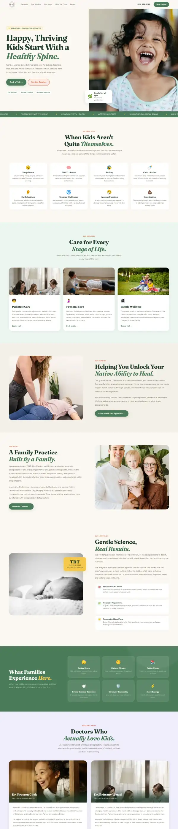
Steal this: 5 fixes for any chiropractor
- Say what you do in the headline, in the words a parent would type into Google. "Pediatric and family chiropractic in Oklahoma City" beats a mission statement, and the mission can move to the second screen.
- Put the phone number where a thumb can reach it. A tap-to-call link in the header and a bar at the bottom of the phone screen. A parent with a baby on their arm will not scroll to the footer.
- Name the doctors and show their faces on the first screen or the next. The office already has a good photo of the two doctors with their child. It works harder near the top.
- Move two or three real patient reviews onto the homepage. A "Testimonials" menu link is easy to miss. Name the source, such as Google, next to each one.
- Point the Book button at the booking form or the online schedule. Do not send it to a page of hours. Keep the form to four fields, as the original's booking page already does.
What I'd still fix with more time
The concept does not score 100. About 2 hours doesn't fix everything, and the checklist applies to my work too:
- The three parent quotes are not real. "Ashley M.", "James T." and "Sarah R." are not on the original site. They need to be swapped for real patient reviews, with a source.
- The "DBE Certified" badge is mine. It is not on the original pages I checked. Webster Technique certification is on the original (Dr. Britt), so that badge stays, but the office needs to confirm the other one or drop it.
- The health claims are mine, not the doctors'. The eight "When kids aren't quite themselves" cards (sleep, ADHD, anxiety, ear infections, constipation and others) and the six "What families experience" results are not on the original homepage. The doctors need to approve each one, or cut it.
- The doctor cards use stock photos. The photos over "Dr. Preston Cook" and "Dr. Brittany Wetzel" are a child and a stock doctor, not the two of them. Real portraits are needed, and the hero photo is stock as well.
- The Book buttons do not book. They jump to the hours block. They should go to the original's booking form, or to an online schedule.
- The city is missing from the first screen. "Oklahoma City" appears only lower down and in the footer. It belongs in the tag above the headline.
- Mobile text is 14.4px, and the accessibility scan found 57 issues. The original's mobile text is 21px with 2 issues. Lighthouse mobile speed is 67 against the original's 50, and I would push it above 90.
My take
If I were talking to Dr. Preston and Dr. Britt, I would say this: your site already looks like you. The photos are real, the story is honest and the booking form is short. The only thing I would change first is the headline, because it is written for someone who already knows what you do. A parent who has never heard of Torque Release Technique should still be able to tell in three seconds that you treat kids.
The choice I am least sure about is leading with children. The original menu has paperwork for adults as well as pediatric patients, so adults are clearly welcome. I put kids first because the office's own Instagram posts and its pediatric and family page lean that way, and it is what makes an Oklahoma City office different. If adult patients are a bigger part of the practice than I think, that headline should be softer. I also gave the site a lot of color and rounded corners, which is a taste call, and the emoji icons on the condition cards may not suit a clinic.
What the concept does not solve is proof, and it adds some risk. The quotes are placeholders, several health claims are my wording, and the doctor cards use stock photos. Layout cannot fix any of that. Two hours made the first screen do its job, and the rest needs the doctors' own reviews, photos and sign-off.
The live concept
The full concept is live on this site, with a bar at the top saying it is a concept and not Native Chiropractic's real website.
The real site: gonativechiro.com
Questions
What should a chiropractor's homepage show first?
Who the doctors treat, where they are and how to book. A parent decides in a few seconds whether this office is for their family. The technique, the story and the science can sit further down.
What did the 2 hours on Native Chiropractic go into?
About 2 hours went into the first screen (headline, tag, doctors' names, phone and one main button), the services and conditions sections, the doctor cards, the "first visit" steps and the mobile call bar. They did not cover real reviews, real portraits, a booking connection, speed, accessibility or checking each health claim with the doctors.
Did Native Chiropractic ask for this redesign?
No. This is an unsolicited concept, and I'm not affiliated with the business. If you own it and want anything changed or removed, email me and it's done within 48 hours.
How is the score worked out?
With a 100-point checklist: clarity, contact, proof, trust, mobile, integrity, speed and accessibility. A script runs the technical checks; I judge the rest from screenshots and note a reason for each. The original site gets the benefit of the doubt.
Own Native Chiropractic and want this changed or removed? Email anshul@anshuldesigns.com and it's done within 48 hours.