80/20 Redesigns / Land buyer / Dallas, TX
By Anshul
Updated
An unsolicited 2-hour concept for Assets for Acres, a land buyer in Dallas, TX. What held the original homepage back, what I changed, and how both score on the same checklist.
Unsolicited concept. Not commissioned by or affiliated with Assets for Acres. All trademarks belong to their owners.
Checklist score46 → 60out of 100
Time spentabout 2 hours
The short version
- 01
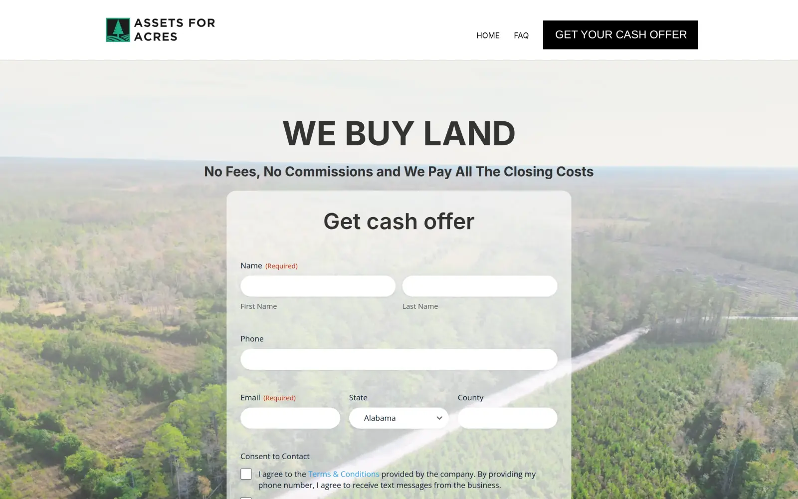
Problem: The first screen never says where the company buys. The only hint is a State drop-down inside the form.
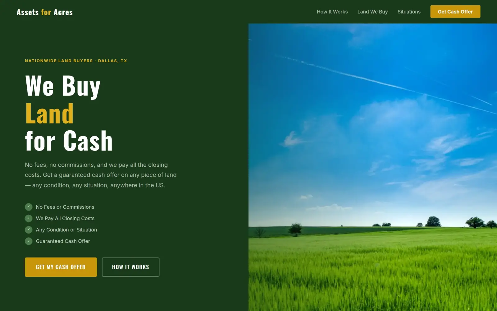
Fix: A tag above the headline reads "Nationwide Land Buyers, Dallas, TX", and the line under it says "anywhere in the US".
- 02
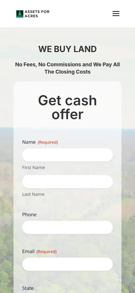
Problem: The form fills the first screen: six fields and two long consent boxes, so the Submit button is a full scroll away. On a phone the first screen holds only the top four fields.
Fix: The first screen now carries the promise, four checkmarks and one gold "Get My Cash Offer" button (56px tall on a phone). Not solved: the form the button leads to has seven fields, one more than the original.
- 03
Problem: The phone number appears only in the footer. The header offers a button and two links, nothing to call.
Fix: The number now sits in a yellow strip right under the first screen and in the contact block. Not solved: it is still not in the header or the hero.
Assets for Acres and the job of its homepage
Assets for Acres is a land buyer based in Dallas, Texas. It makes cash offers on land parcels: farm, forestry, rural, residential and commercial land.
Its own site says it buys land in any condition and any situation, from owners who inherited a parcel, are behind on taxes, owe liens or have a lot they will never use. It promises no fees, no commissions and that it pays all the closing costs, and it says it closes with title through escrow.
A landowner arriving here has probably held the parcel for years and is not sure it is worth selling. The page has one job: get that person to send the details of the land, without asking for so much that they leave.
Same checklist, both sites
The score
This is not an agency rebuild. I gave the concept about 2 hours and spent them on the fixes that do the most for customers: the 20% of the work that gets 80% of the improvement.
To show how much that improves, I score every original homepage and every concept on the same 100-point checklist. Most checks are yes or no, and a script runs the technical ones (speed, mobile, accessibility). When in doubt, the point goes to the original site.
Original site
46/ 100
Concept
60/ 100
ClarityOriginal: 14/20Concept: 20/20
First screen says what the business does, in plain words (8 pts)
PassOriginal: The headline reads "WE BUY LAND" with "No Fees, No Commissions and We Pay All The Closing Costs" under it.
PassConcept: "We Buy Land for Cash" with "Get a guaranteed cash offer on any piece of land" under it.
First screen says where, or who it serves (6 pts)
FailOriginal: The first screen names no city or region; the form has a State drop-down, and "across the nation" appears only in text further down.
PassConcept: The tag above the headline reads "Nationwide Land Buyers - Dallas, TX" and the paragraph says "anywhere in the US".
One main action stands out on the first screen (6 pts)
PassOriginal: The offer form sits in the middle of the first screen and the header has one black "Get Your Cash Offer" button; both lead to the same action.
PassConcept: A filled gold "Get My Cash Offer" button, with "How It Works" as an outline button beside it and a gold "Get Cash Offer" in the header.
ContactOriginal: 8/20Concept: 16/20
Phone or main button visible on the first mobile screen (8 pts)
FailOriginal: no phone link or call-to-action on the first mobile screen
PassConcept: first mobile screen: "Get My Cash Offer"
Phone number is tap-to-call (4 pts)
PassOriginal: 1 tap-to-call link(s)
PassConcept: 1 tap-to-call link(s)
Phone or main button in the desktop header (4 pts)
PassOriginal: desktop header: "Get Your Cash Offer"
PassConcept: desktop header: "Land We Buy", "Get Cash Offer"
Short form, or the main button leads straight to one (4 pts)
FailOriginal: The first-screen form has six fields (first name, last name, phone, email, state, county) plus two consent checkboxes.
FailConcept: The offer button scrolls to a form with seven fields (first name, last name, phone, email, state, county, additional details), which is one more than the original's form.
ProofOriginal: 0/15Concept: 0/15
Reviews or a rating in the first two screens (6 pts)
FailOriginal: There are no reviews, ratings or testimonials anywhere on the page.
FailConcept: The page has no reviews or ratings; its yellow strip of promises ("Buying Nationwide", "Zero Fees or Commissions") is not proof.
Testimonials carry real names or a named platform (5 pts)
FailOriginal: There are no testimonials at all, named or anonymous.
FailConcept: There are no testimonials, as on the original.
At least one specific, checkable number (4 pts)
FailOriginal: No years in business, deal count or rating appears; the page states promises (no fees, all closing costs paid) but no numbers.
FailConcept: No years in business, deal count or rating appears; "Response within 24 hours" is a promise and is not on the original site.
TrustOriginal: 8/15Concept: 3/15
Real photos of the team, work or place (5 pts)
PassOriginal: An aerial photo of wooded land fills the first screen and a photo of a road sign on a dirt road sits further down; both look like real land photos, though I cannot confirm they are the business's own.
FailConcept: The only large photo is a stock field under a blue sky; the original's aerial land photo and road-sign photo are gone.
Owner or team named or shown (4 pts)
FailOriginal: No owner or team member is named or shown; the footer lists only the email taylor@assetsforacres.com.
FailConcept: No owner or team member is named or shown; the contact block lists only the email taylor@assetsforacres.com.
Full address or clear service area (3 pts)
PassOriginal: The footer lists "11816 Inwood Rd, Ste 71367, Dallas, TX 75244" with a phone number and email.
PassConcept: The contact block and footer give "11816 Inwood Rd, Ste 71367, Dallas, TX 75244" and "All 50 states".
License, insurance or "since [year]" (3 pts)
FailOriginal: No license, insurance, accreditation or founding year is shown; the footer carries a copyright line only.
FailConcept: No license, insurance, accreditation or founding year; the footer is a copyright line.
MobileOriginal: 4/10Concept: 7/10
No sideways scroll at 390px (4 pts)
PassOriginal: page is 390px wide at 390px
PassConcept: page is 390px wide at 390px
Body text 16px or larger (3 pts)
FailOriginal: median paragraph text 14px on mobile
FailConcept: median paragraph text 14.72px on mobile
Main buttons at least 44px tall (3 pts)
FailOriginal: no actions on the first mobile screen
PassConcept: first-screen actions: 56px tall
IntegrityOriginal: 5/5Concept: 5/5
No placeholder text or broken images (3 pts)
PassOriginal: no placeholder text or broken images found (screenshots still get a manual look)
PassConcept: no placeholder text or broken images found (screenshots still get a manual look)
Header and footer links all work (2 pts)
PassOriginal: 4 header/footer link(s) checked, all work
PassConcept: 1 header/footer link(s) checked, all work
SpeedOriginal: 4/10Concept: 7/10
Lighthouse mobile performance (10 pts)
FailOriginal: Lighthouse mobile performance 61 (median of 3: 52, 61, 63)
FailConcept: Lighthouse mobile performance 88 (median of 3: 86, 88, 89)
AccessibilityOriginal: 3/5Concept: 2/5
No serious accessibility issues (axe) (3 pts)
PassOriginal: 3 serious/critical axe issue(s)
FailConcept: 31 serious/critical axe issue(s)
Content images have alt text (2 pts)
PassOriginal: 5/5 content images have alt text
PassConcept: 1/1 content images have alt text
Scored 2026-09-30 · How the checklist works
What held the original back
The original does more right than most sites I look at. It puts the offer form on the first screen, which is where a seller who is ready wants it. "No Fees, No Commissions and We Pay All The Closing Costs" is a strong promise and the page repeats it in several places. The photos look like real land, and the footer has a full Dallas address, a phone number and an email. What holds it back is how much the first screen asks of the visitor, and how little it says about who is asking.
- The headline says what the company does, but not where. A landowner in Georgia has no way to tell that Assets for Acres buys there until they reach a State drop-down.
- The header has one black "Get Your Cash Offer" button and no phone number. The only number on the page is in the footer, at the very bottom.
- The form has six fields: first name, last name, phone, email, state and county. It is the only thing on the first screen, so a visitor sees a form before they see a reason to fill it in.
- Two long consent boxes with text-message wording come before the Submit button, which sits below this screen. On a phone the button is several screens down.
What I changed
The first screen and the mobile view, original on the left and concept on the right. The slider at the top of the post compares the first screen up close.
Before
After
First screen
- Say where, next to what
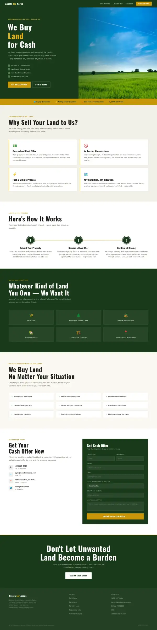
- The tag "Nationwide Land Buyers, Dallas, TX" sits above the headline, and the paragraph says "anywhere in the US". The original only says "across the nation" in a paragraph further down.
- The promise first, the form later
- The headline "We Buy Land for Cash", the three promises the original already makes and a four-item checklist take the first screen. The form moves to a section near the bottom of the page.
- One main button
- "Get My Cash Offer" is the one filled button. "How It Works" is an outline beside it, so the second choice does not compete with the first.
Before
After

Mobile
- A button on the first phone screen
- The original's first phone screen is a form with no button on it. The concept shows the headline, the checklist and a 56px gold "Get My Cash Offer" button before the visitor scrolls.
- Text that is still small
- Body text on the concept's phone view is 14.7px at the median, up from 14px. That is better but still under the 16px I want, and I list it below.
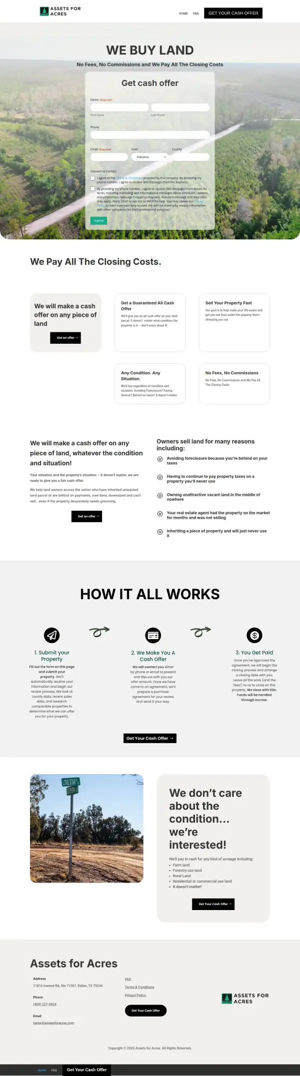
The whole page, before and after
Steal this: 5 fixes for any land buyer
- Say where you buy on the first screen. "We buy land" is clear, but a visitor should not have to hunt for a drop-down to learn whether you cover their state.
- Keep the form short and tell people why. Name, phone and state are enough to start an offer on a parcel. Ask for county, acreage and the story on the call.
- Put a button before the form, not a form before the reason. A landowner who is not sure yet needs the promise first: no fees, closing costs paid, any condition.
- Put your phone number where a thumb can reach it. A seller who would rather talk than type should not need to reach the footer.
- Show a name, a face or a past deal. A land buyer who is only an email address is a big ask for someone selling a family parcel. One real sold parcel, with the county and the price range, does more than any layout change.
What I'd still fix with more time
The concept does not score 100. About 2 hours doesn't fix everything, and the checklist applies to my work too:
- The form is longer than the original. It has seven fields, one more than before. I would cut it to name, phone and state and ask the rest on the call.
- The form is not wired up. It posts nowhere, and the consent wording about text messages that the original form carries is gone. If the business sends texts, that wording has to come back.
- Two claims are mine. "Response within 24 hours" and "All 50 states" are not on the original site. Assets for Acres needs to confirm each one or drop it.
- The photo is stock. The green field under a blue sky is not the business's land. The original's aerial forest and its road-sign photo looked real, and I dropped them; they should go back in.
- There is still no proof. No reviews, no number of parcels bought, no years in business, no owner name. Neither site has them, and layout cannot invent them.
- The phone number is not in the header or the hero. It is on the second screen and in the footer.
- Accessibility got worse. The scan found 31 serious issues in the concept, almost all low-contrast text, against 3 on the original. Lighthouse mobile speed is better, 88 against 61.
My take
If I were talking to the owner of Assets for Acres, I would start with what the original gets right. Your form is on the first screen, you say "we pay all the closing costs" several times, and your footer shows a real Dallas address. Plenty of land buyers hide all three. My concept mostly rearranges what you already say so a visitor sees the promise and a button before a wall of fields.
The choice I am least sure about is moving the form off the first screen. For a seller who is ready, a form on the first screen is the fastest path, and I may have added a click for them. I think the button wins for the seller who is unsure, but I would want to see the numbers from a real test before I told anyone to do it. I also made the form longer, which is the wrong direction.
What the concept does not solve is trust. There are no reviews, no owner name, no count of parcels bought and no photos of land you have handled. I could not find any of them on the original site either, so I did not make them up. The business has to supply them, and they will do more than any color I picked.
The live concept
The full concept is live on this site, with a bar at the top saying it is a concept and not Assets for Acres's real website.
The real site: www.assetsforacres.com
Questions
What should a land buyer's homepage show first?
What you buy, where, one main button and a way to call. An owner who has held land for years decides in seconds whether you are a real buyer. The form, the steps and the list of land types can sit lower down.
What did the 2 hours on Assets for Acres go into?
About 2 hours went into the first screen (headline, location tag, checklist and one main button), a promises strip with the phone number, a three-step "how it works" section, the land types and situations, and a form section near the bottom. They did not cover real photos, a shorter form, wiring up the form, checking each claim with the business, or the contrast problems on the phone.
Did Assets for Acres ask for this redesign?
No. This is an unsolicited concept, and I'm not affiliated with the business. If you own it and want anything changed or removed, email me and it's done within 48 hours.
How is the score worked out?
With a 100-point checklist: clarity, contact, proof, trust, mobile, integrity, speed and accessibility. A script runs the technical checks; I judge the rest from screenshots and note a reason for each. The original site gets the benefit of the doubt.
Own Assets for Acres and want this changed or removed? Email anshul@anshuldesigns.com and it's done within 48 hours.