80/20 Redesigns / Cash home buyer / Colorado
By Anshul
Updated
An unsolicited 2-hour concept for Mile High Offer, a cash home buyer in Colorado. What held the original homepage back, what I changed, and how both score on the same checklist.
Unsolicited concept. Not commissioned by or affiliated with Mile High Offer. All trademarks belong to their owners.
Checklist score37 → 51out of 100
Time spentabout 2 hours

The short version
- 01
Problem: The headline "Selling Your Home, Simplified" does not say that Mile High Offer buys houses, and no place is named in the text.
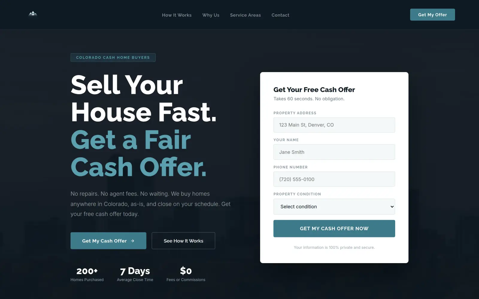
Fix: The headline is "Sell Your House Fast. Get a Fair Cash Offer.", with a "Colorado Cash Home Buyers" tag above it.
- 02
Problem: The one button goes to a separate Contact page, so the form is a click away and the phone number is at the very bottom.
Fix: A four-field offer form (address, name, phone, condition) sits next to the headline, and the phone layout carries a Call Us link.
- 03
Problem: Nothing on the page proves the promises. "Client Testimonials" is a menu link and there is no number of homes bought.
Fix: Not solved: the concept adds numbers and three testimonials, but none come from Mile High Offer, so they are placeholders and must go.
Mile High Offer and the job of its homepage
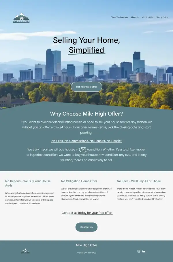
Mile High Offer is a company that buys houses for cash. Its logo is a mountain with a small cabin, and the hero photo is the Denver skyline.
Its homepage promises an offer within 24 hours, no fees, no commissions and no repairs, a purchase in any condition, and a closing date the seller picks, in as little as 7 days. There are menu links for testimonials and an About page, and a phone number, 720-407-4400, in the footer.
A seller reading this page probably needs to move fast or has a house they do not want to fix. The homepage has to say that this company buys, and make the next step obvious.
Same checklist, both sites
The score
This is not an agency rebuild. I gave the concept about 2 hours and spent them on the fixes that do the most for customers: the 20% of the work that gets 80% of the improvement.
To show how much that improves, I score every original homepage and every concept on the same 100-point checklist. Most checks are yes or no, and a script runs the technical ones (speed, mobile, accessibility). When in doubt, the point goes to the original site.
Original site
37/ 100
Concept
51/ 100
ClarityOriginal: 6/20Concept: 20/20
First screen says what the business does, in plain words (8 pts)
FailOriginal: The headline "Selling Your Home, Simplified" over a Denver skyline does not say the firm buys houses for cash; that first appears in the "Why Choose Mile High Offer?" text one screen down.
PassConcept: "Sell Your House Fast. Get a Fair Cash Offer." with "We buy homes anywhere in Colorado, as-is" under it.
First screen says where, or who it serves (6 pts)
FailOriginal: The first screen shows a Denver skyline photo but no text names a city or state.
PassConcept: A "Colorado Cash Home Buyers" tag above the headline and "anywhere in Colorado" in the line under it.
One main action stands out on the first screen (6 pts)
PassOriginal: One button, "Get Your Free Offer", sits under the headline; the header holds only text links.
PassConcept: A filled "Get My Cash Offer" button beside the offer form, with "See How It Works" as a quiet outline button.
ContactOriginal: 12/20Concept: 20/20
Phone or main button visible on the first mobile screen (8 pts)
PassOriginal: first mobile screen: "Get Your Free Offer"
PassConcept: first mobile screen: "Get My Offer", "Get My Cash Offer", "Call Us"
Phone number is tap-to-call (4 pts)
FailOriginal: 0 tap-to-call link(s)
PassConcept: 3 tap-to-call link(s)
Phone or main button in the desktop header (4 pts)
FailOriginal: no phone or call-to-action in the top 120px on desktop
PassConcept: desktop header: "Contact", "Get My Offer"
Short form, or the main button leads straight to one (4 pts)
PassOriginal: "Get Your Free Offer" leads to a Contact page titled "Request Your Free Offer Now"; its form is loaded by script so I could not count the fields, and the original keeps the point when in doubt.
PassConcept: The first-screen form has four fields (property address, name, phone, property condition).
ProofOriginal: 0/15Concept: 0/15
Reviews or a rating in the first two screens (6 pts)
FailOriginal: "Client Testimonials" is only a menu link, and no review or rating appears in the first two screens.
FailConcept: The three testimonials and the "5 star average rating" box are invented and sit far below the first two screens.
Testimonials carry real names or a named platform (5 pts)
FailOriginal: No testimonials appear on the homepage.
FailConcept: The testimonials ("Mark and Lisa T., Aurora", "Sandra R., Lakewood", "James K., Westminster") are not on the original site and name no platform.
At least one specific, checkable number (4 pts)
FailOriginal: "Within 24 hours" and "as little as 7 days" are promises, and no years, deal count or rating appears.
FailConcept: "200+ Homes Purchased" in the hero and "100+ Homes Purchased" further down contradict each other and neither is on the original site.
TrustOriginal: 0/15Concept: 0/15
Real photos of the team, work or place (5 pts)
FailOriginal: The only photo is a Denver skyline that looks like stock; there are no photos of the team or of a house they bought.
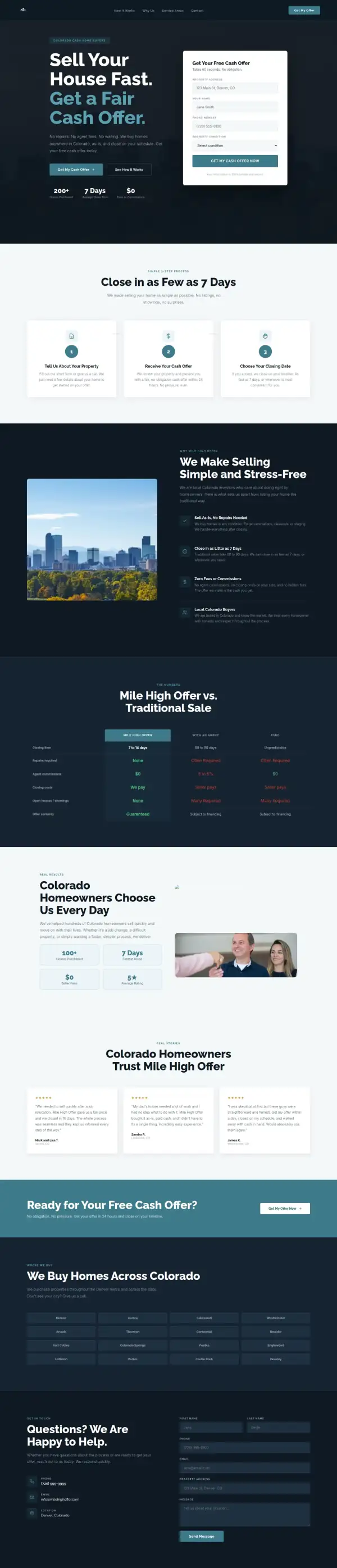
FailConcept: The photos are the same Denver skyline and a stock photo of a couple getting keys, and one image in the results section shows as broken.
Owner or team named or shown (4 pts)
FailOriginal: No owner or team member is named or shown on the homepage; "About Us" is only a menu link.
FailConcept: No owner or team member is named or shown.
Full address or clear service area (3 pts)
FailOriginal: The homepage gives only a phone number in the footer, with no address, city or service area in the text.
FailConcept: The footer says "Denver, Colorado" and lists sixteen cities, but neither the city nor the list is on the original site.
License, insurance or "since [year]" (3 pts)
FailOriginal: No license, insurance, accreditation or founding year appears.
FailConcept: No license, insurance or founding year is shown.
MobileOriginal: 10/10Concept: 0/10
No sideways scroll at 390px (4 pts)
PassOriginal: page is 390px wide at 390px
FailConcept: page is 564px wide at 390px
Body text 16px or larger (3 pts)
PassOriginal: median paragraph text 16px on mobile
FailConcept: median paragraph text 14.4px on mobile
Main buttons at least 44px tall (3 pts)
PassOriginal: first-screen actions: 130px tall
FailConcept: first-screen actions: 36px, 49px, 48px, 48px tall
IntegrityOriginal: 5/5Concept: 2/5
No placeholder text or broken images (3 pts)
PassOriginal: no placeholder text or broken images found (screenshots still get a manual look)
FailConcept: 1 broken image(s)
Header and footer links all work (2 pts)
PassOriginal: 5 header/footer link(s) checked, all work
PassConcept: 1 header/footer link(s) checked, all work
SpeedOriginal: 1/10Concept: 7/10
Lighthouse mobile performance (10 pts)
FailOriginal: Lighthouse mobile performance 41 (median of 3: 38, 41, 47)
FailConcept: Lighthouse mobile performance 74 (median of 3: 72, 74, 99)
AccessibilityOriginal: 3/5Concept: 2/5
No serious accessibility issues (axe) (3 pts)
PassOriginal: 2 serious/critical axe issue(s)
FailConcept: 26 serious/critical axe issue(s)
Content images have alt text (2 pts)
PassOriginal: 3/3 content images have alt text
PassConcept: 3/3 content images have alt text
Scored 2026-09-30 · How the checklist works
What held the original back
The original does several things right. It has one clear button, it is short, the mobile text is a comfortable 16px, and its promises ("No Fees, No Commissions, No Repairs, No Hassle!") are the right ones for a seller. The button on the phone is large. The problem is what the first screen leaves out. The skyline photo in my capture matches what the live page serves.
- "Selling Your Home, Simplified" could be a listing agent or a cash buyer. The words "cash" and "we buy" first appear in the text one screen down.
- "Client Testimonials" is only a link. No review, star rating or homes-bought number shows on the homepage, so a nervous seller has nothing to weigh.
- There is no phone number in the header. The number, 720-407-4400, is plain text at the very bottom of the page, and it is not a tap-to-call link.
- "Get Your Free Offer" is the right single button, but it leads to another page, "Contact Us", so the form is one more click away.
What I changed
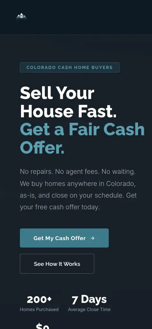
The first screen and the mobile view, original on the left and concept on the right. The slider at the top of the post compares the first screen up close.
Before
After
First screen
- Say buying, for cash, in Colorado
- The headline says "Sell Your House Fast. Get a Fair Cash Offer." and a tag reads "Colorado Cash Home Buyers". The original headline is about selling, not who buys.
- The form beside the headline
- Property address, name, phone and property condition sit in a white box next to the headline, so a seller can start without leaving the page.
- The original's promises, up top
- "No repairs. No agent fees. No waiting." is the first line under the headline. These are the original's own promises, moved from the second screen to the first.
Before

After
Mobile
- A form-first path
- On the phone, "Get My Cash Offer" is the filled button and "See How It Works" is a quiet outline. The original has one large round button, which was already good.
- A call bar at the bottom
- A "Call Us" and "Get My Offer" bar is built into the phone layout, though it is not visible in the first screen of my capture. The call link goes to a number I made up, which I list below.
The whole page, before and after
Steal this: 6 fixes for any cash home buyer
- Say "cash" and "we buy" in the headline. "Selling Your Home, Simplified" sounds like a listing agent. A seller deciding in five seconds needs to know this company writes the check.
- Name where you buy, in words. A skyline photo suggests a city, but a visitor from Colorado Springs cannot tell if the firm covers them. One line of text does it.
- Put the form on the homepage. One button that opens another page adds a step for someone in a hurry. Four fields next to the headline saves it.
- Put the phone number in the header, as a link. On a phone, a tap should dial. Plain text at the bottom of the page is easy to miss.
- Show at least one real number or one real review with a name. "Client Testimonials" as a menu link hides the best thing you have. Put one quote on the homepage, with the person's name and where it came from.
- Keep what already works. The original's short page, big button and readable mobile text are right. Do not add sections for the sake of it.
What I'd still fix with more time
The concept does not score 100. About 2 hours doesn't fix everything, and the checklist applies to my work too:
- The phone number in the concept is made up. "(720) 999-9999" is a placeholder I used, and the "Call Us" button dials it. The real number on the original is 720-407-4400, and the concept also invents an info@ email while the original lists two named addresses. The real ones must go in.
- The testimonials and numbers are mine. The three testimonials, the "5 star average rating", the "200+ homes" in the hero and the "100+ homes" further down (which do not even match each other) are not on the original site. Real ones, with a source, or nothing.
- The comparison table and city list are unchecked. "Offer certainty: Guaranteed", "7 to 14 days" and the sixteen Colorado cities are my wording. Mile High Offer needs to confirm each one or drop it.
- One image is broken and there are no real photos. The results section has an image that fails to load, and the rest are stock. A real photo of the team or a house they bought would help most.
- The mobile page scrolls sideways. My scan measured the page 564px wide on a 390px screen, and the mobile header shows only a logo with no menu.
- Mobile text is 14.4px. It should be 16px or more, and the accessibility scan found 26 serious issues, mostly low contrast, against 2 on the original.
- Mobile speed is 74 on Lighthouse. The original scored 41, so it is better, but I would push it above 90.
My take
If I were talking to Mile High Offer, I would say this: your old page is short, has a good big button and says the right things. It just does not say you buy for cash until the second screen, and the form is one click away. My concept mostly fixes those two things.
The part I am least sure about is length. I built a page about three times as long as yours, with a comparison table and a city list, and a shorter page might convert just as well. Your original's calm look is also a real strength, and my dark version is a taste call the owner should make.
What the concept does not solve is the part I filled with placeholders. The phone number, the reviews and the numbers are not yours, and I should not have made them look real. Two hours got the first screen to do its job. The proof has to come from Mile High Offer.
The live concept
The full concept is live on this site, with a bar at the top saying it is a concept and not Mile High Offer's real website.
The real site: milehighoffer.com
Questions
What should a cash home buyer's homepage say first?
That you buy houses for cash, where, and one way to start. A seller in a hurry decides in seconds. A form next to the headline, a phone link, and one real review or number can follow right under it.
What did the 2 hours on Mile High Offer go into?
About 2 hours went into the first screen (tag, headline and the four-field form), a three-step section, a numbers section and the mobile layout. They did not cover the real phone number and email, real reviews, real photos, the sideways scroll, the form connection, speed, or checking each claim with the business.
Did Mile High Offer ask for this redesign?
No. This is an unsolicited concept, and I'm not affiliated with the business. If you own it and want anything changed or removed, email me and it's done within 48 hours.
How is the score worked out?
With a 100-point checklist: clarity, contact, proof, trust, mobile, integrity, speed and accessibility. A script runs the technical checks; I judge the rest from screenshots and note a reason for each. The original site gets the benefit of the doubt.
Own Mile High Offer and want this changed or removed? Email anshul@anshuldesigns.com and it's done within 48 hours.