80/20 Redesigns / Home care agency / Rocky Mount, NC
By Anshul
Updated
An unsolicited 2-hour concept for Abloom Home Care, a non-medical home care agency in Rocky Mount, NC. What held the original homepage back, what I changed, and how both score on the same checklist.
Unsolicited concept. Not commissioned by or affiliated with Abloom Home Care. All trademarks belong to their owners.
Checklist score45 → 57out of 100
Time spentabout 2 hours
The short version
- 01
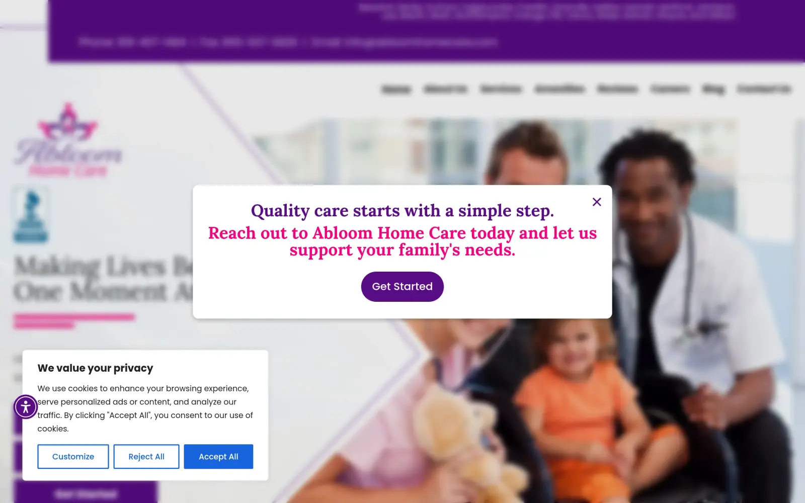
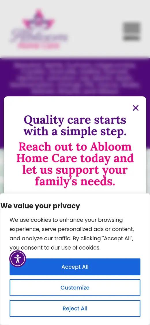
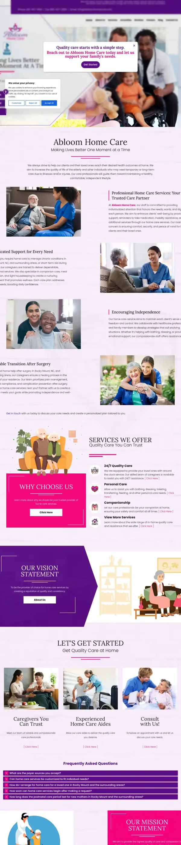
Problem: When the page loads, a pop-up and a cookie notice sit on top of the first screen, and the page behind them is blurred. On a phone they cover most of it.
Fix: Not solved: the concept has no pop-up and no cookie notice, but that is because a static concept does not carry the business's cookie tool. The real site needs its pop-up removed or delayed.
- 02
Problem: Behind the pop-up, the headline is a slogan ("Making Lives Better One Moment At A Time") and three equal purple buttons compete for the click.
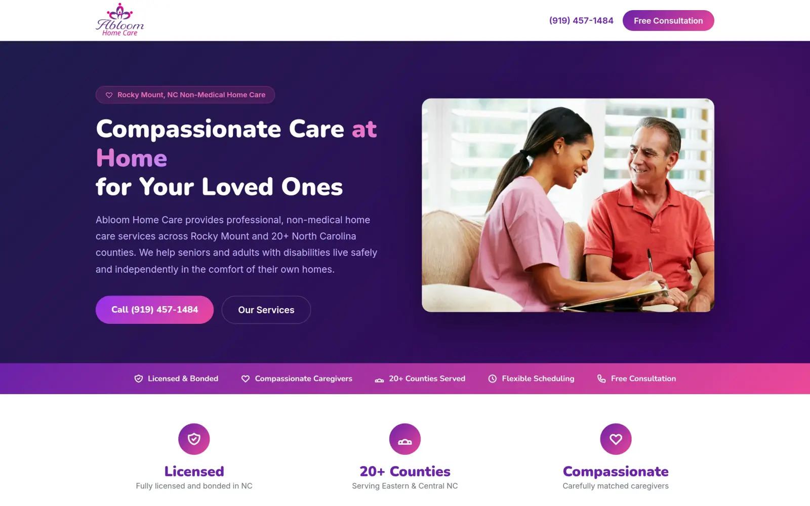
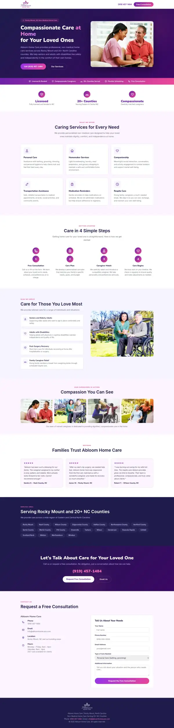
Fix: The headline says "Compassionate Care at Home", the text says non-medical home care in Rocky Mount and 20+ counties, and one filled button calls the number.
- 03
Problem: The page does not tell a worried family what the agency accepts, or show a face. The BBB badge is the only trust signal.
Fix: Not solved: the concept moves the phone number and service area up, but it drops the BBB badge and the payer list, and it adds trust claims the original does not make.
Abloom Home Care and the job of its homepage
Abloom Home Care is a non-medical home care agency at 107 SE Main Street in Rocky Mount, North Carolina. It sends caregivers to people at home who need help for a short time or for the long run.
Its own site lists personal care, companionship, homemaking, respite care, post-operative assistance, a postnatal program and 24/7 care, across 21 counties. It also says which payers it accepts: private pay, long-term insurance, Medicaid, Veterans Aid & Attendance, workers' compensation and Medicare Advantage.
The person reading this page is usually a son or daughter, worried and short on time, who wants to know in seconds: do they do what my parent needs, do they cover my area, and how do I reach a person. That is the job of the first screen.
Same checklist, both sites
The score
This is not an agency rebuild. I gave the concept about 2 hours and spent them on the fixes that do the most for customers: the 20% of the work that gets 80% of the improvement.
To show how much that improves, I score every original homepage and every concept on the same 100-point checklist. Most checks are yes or no, and a script runs the technical ones (speed, mobile, accessibility). When in doubt, the point goes to the original site.
Original site
45/ 100
Concept
57/ 100
ClarityOriginal: 6/20Concept: 20/20
First screen says what the business does, in plain words (8 pts)
FailOriginal: The headline is "Making Lives Better One Moment At A Time" with "Let us be the source of quality care for your loved ones" under it; neither says home care, only the small logo does.
PassConcept: "Compassionate Care at Home for Your Loved Ones" with "professional, non-medical home care services" under it, and a "Non-Medical Home Care" tag above.
First screen says where, or who it serves (6 pts)
PassOriginal: A purple bar above the header lists the counties served (Beaufort, Bertie, Durham ... Wayne, and Wilson) next to the phone number.
PassConcept: A tag reads "Rocky Mount, NC Non-Medical Home Care" and the text says "Rocky Mount and 20+ North Carolina counties".
One main action stands out on the first screen (6 pts)
FailOriginal: Three equal purple buttons stack under the headline ("Learn Who We Are", "Send Your Referral", "Get Started").
PassConcept: A filled "Call (919) 457-1484" button sits under the text, with "Our Services" as a plain outline button beside it.
ContactOriginal: 20/20Concept: 20/20
Phone or main button visible on the first mobile screen (8 pts)
PassOriginal: first mobile screen: "Get Started", "919-457-1484"
PassConcept: first mobile screen: "(919) 457-1484", "Call (919) 457-1484", "(919) 457-1484"
Phone number is tap-to-call (4 pts)
PassOriginal: 3 tap-to-call link(s)
PassConcept: 5 tap-to-call link(s)
Phone or main button in the desktop header (4 pts)
PassOriginal: desktop header: "919-457-1484", "Contact Us"
PassConcept: desktop header: "(919) 457-1484"
Short form, or the main button leads straight to one (4 pts)
PassOriginal: The contact form at the bottom of the page has four visible fields.
PassConcept: The consultation form at the bottom has five fields: name, phone, email, type of care and a notes box.
ProofOriginal: 0/15Concept: 0/15
Reviews or a rating in the first two screens (6 pts)
FailOriginal: No reviews or rating appear in the first two screens; "Reviews" is only a menu link.
FailConcept: The reviews start about 3,700px down the page, far past the first two desktop screens.
Testimonials carry real names or a named platform (5 pts)
FailOriginal: The homepage carries no testimonials with names and shows no rating from a named platform.
FailConcept: The three reviews ("Sandra H.", "James W.", "Robert T.") with towns under them are not on the original site and name no platform; they are invented.
At least one specific, checkable number (4 pts)
FailOriginal: No number that proves anything (years in business, clients served, a rating with its count) appears on the homepage.
FailConcept: The only numbers are "20+ Counties" and hours; nothing proves years in business, clients served or a rating.
TrustOriginal: 6/15Concept: 3/15
Real photos of the team, work or place (5 pts)
FailOriginal: Every photo I can see looks like stock (a doctor and a nurse with a child, a nurse with an older man on a sofa).
FailConcept: Every photo is stock (a nurse and an older man, caregivers with wheelchair users); none shows the Abloom team.
Owner or team named or shown (4 pts)
FailOriginal: No owner or team member is named or shown; the "Caregivers You Can Trust" card links elsewhere.
FailConcept: No owner or team member is named or shown.
Full address or clear service area (3 pts)
PassOriginal: The contact block gives "107 SE Main Street, Rocky Mount, NC 27804" and lists the counties served.
PassConcept: The page names Rocky Mount, NC and lists the towns and counties served; it gives no street address.
License, insurance or "since [year]" (3 pts)
PassOriginal: A BBB Accredited Business badge sits under the logo in the first screen.
FailConcept: "Licensed & Bonded" and "Fully licensed and bonded in NC" do not appear on the original site, and the original's BBB badge is gone.
MobileOriginal: 7/10Concept: 0/10
No sideways scroll at 390px (4 pts)
PassOriginal: page is 390px wide at 390px
FailConcept: page is 596px wide at 390px
Body text 16px or larger (3 pts)
PassOriginal: median paragraph text 19px on mobile
FailConcept: median paragraph text 14.08px on mobile
Main buttons at least 44px tall (3 pts)
FailOriginal: first-screen actions: 54px, 20px tall
FailConcept: first-screen actions: 38px, 50px, 52px, 52px tall
IntegrityOriginal: 5/5Concept: 5/5
No placeholder text or broken images (3 pts)
PassOriginal: no placeholder text or broken images found (screenshots still get a manual look)
PassConcept: no placeholder text or broken images found (screenshots still get a manual look)
Header and footer links all work (2 pts)
PassOriginal: 20 header/footer link(s) checked, all work
PassConcept: 1 header/footer link(s) checked, all work
SpeedOriginal: 1/10Concept: 7/10
Lighthouse mobile performance (10 pts)
FailOriginal: Lighthouse mobile performance 28 (median of 3: 15, 28, 33)
FailConcept: Lighthouse mobile performance 82 (median of 3: 80, 82, 84)
AccessibilityOriginal: 0/5Concept: 2/5
No serious accessibility issues (axe) (3 pts)
FailOriginal: 7 serious/critical axe issue(s)
FailConcept: 8 serious/critical axe issue(s)
Content images have alt text (2 pts)
FailOriginal: 12/15 content images have alt text
PassConcept: 7/7 content images have alt text
Scored 2026-09-30 · How the checklist works
What held the original back
The original has real strengths. The phone number is a tap-to-call link, the service area is printed at the very top, the street address is in the footer, there is a BBB Accredited Business badge under the logo, and the questions at the bottom answer the things families ask, including which payers are accepted. What I looked at is the first few seconds. I loaded the live page twice in fresh browsers to be sure of what follows: a pop-up opens on top of the page, and a cookie notice opens beside it, so a visitor has to close both before they can read anything.
- A pop-up opens over the page as soon as it loads and blurs everything behind it. It asks for a click ("Get Started") before the visitor has read a word about the agency.
- A cookie notice opens at the same time, with three buttons. On a phone it takes about 40% of the screen, under the pop-up.
- Once the pop-up is closed, the headline is a slogan. It never says home care; only the small logo and the browser tab title do.
- Under the headline sit three equal purple buttons: "Learn Who We Are", "Send Your Referral" and "Get Started". A family looking for care has to guess which one is theirs.
What I changed
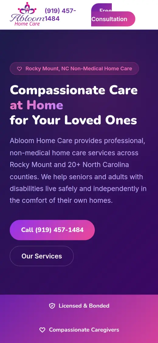
The first screen and the mobile view, original on the left and concept on the right. The original is shown as it loads, with the pop-up and the cookie notice. The concept has neither, so part of this difference is a real fix and part is just what a static concept leaves out.
Before
After
First screen
- Say what it is, and where
- A tag reads "Rocky Mount, NC Non-Medical Home Care", and the line under the headline names home care for seniors and adults with disabilities across Rocky Mount and 20+ counties. The original spreads the counties over a small bar at the top.
- One button, and a number in the header
- "Call (919) 457-1484" is the filled button. "Our Services" is a plain outline beside it. The phone number also sits in the header next to a "Free Consultation" button, so it is there on every scroll.
- A form that asks what care is needed
- The consultation form at the bottom asks for name, phone, email, type of care and a note. The original's form has four fields, so this one is not shorter, but the type-of-care choice tells the agency what the request is about.
Before
After
Mobile
- A call button in the thumb zone
- On the concept's mobile first screen the call button is 50px tall and sits under the text. On the original, the phone number is small text in the purple bar, 20px tall.
- A header that breaks
- On a phone the concept's header is crowded: the phone number wraps onto two lines and the Free Consultation button overlaps it. I list this below because it matters.
The whole page, before and after
Steal this: 5 fixes for any home care agency
- Let the page load without a pop-up on top of it. A worried family needs to read what you do before they are asked to click. If you keep a pop-up, wait until they have scrolled or have been on the page for a while.
- Put "home care" in the headline. "Making Lives Better One Moment At A Time" is a good sentence for a brochure. A search visitor needs the words they typed: home care, and the town.
- Give one button the main job. If a visitor can Learn Who You Are, Send a Referral or Get Started, most will do none of them. Pick the call or the consultation and make the others plain links.
- Say who pays, on the homepage. Abloom's original answers "what payer sources do you accept" in a list of questions near the bottom: private pay, long-term insurance, Medicaid, Veterans Aid & Attendance and more. Many families choose on that answer, so it should not be that far down.
- Keep your proof and show a real face. The BBB Accredited Business badge is the strongest trust signal on the original. Keep it in the first screen, add a real photo of the owner or a caregiver with a name, and link to real reviews.
What I'd still fix with more time
The concept does not score 100. About 2 hours doesn't fix everything, and the checklist applies to my work too:
- The reviews are not real. The three reviews in the concept ("Sandra H.", "James W." and "Robert T.") are not on the original site. They need to be swapped for real reviews, with a source.
- "Licensed & Bonded" is my wording, not the business's. The original site does not say it, and I dropped the BBB Accredited Business badge that it does show. Abloom needs to confirm its license and bond and put the badge back.
- Other details are mine too. The opening hours, the four-step process, the list of towns and "Transportation Assistance" as a service do not come from the original. Each needs checking with the business or removing.
- The photos are stock. So are the original's. Real photos of the team and of a caregiver at work would do more than anything in the layout.
- The concept drops the address and the payer list. The original has "107 SE Main Street, Rocky Mount, NC 27804" and a clear answer on payers. Both should be on the new page.
- The mobile page scrolls sideways. The concept measured 596px wide on a 390px screen, the header overlaps, and body text is 14.08px on mobile where the original's is 19px. It needs 16px or more and a fixed header.
- Speed and contrast. Mobile speed is 82 on Lighthouse. The original scored 28, so it is much better, but the accessibility scan still found 8 serious issues, mostly colour contrast on the purple.
My take
If I were talking to the owner of Abloom Home Care, I would start with the pop-up. The site is not bad. It has a real phone number, a real address, a BBB badge and honest answers to the questions families ask. But the first thing anyone sees is a box asking them to click and a cookie notice on top of it. A family looking for care for a parent should be reading, not closing windows.
The part I am least sure about is the look. I went with a deep purple and a hero photo that is clearly stock, and I moved the page toward a calmer, more modern feel. That is a taste call, and the original's bright pink and purple may be part of how local people know Abloom. I also cut the page short, and a family may want the longer answers the original gives on payers and on what care looks like after surgery.
What the concept does not solve is trust. I added a "Licensed & Bonded" line and three reviews to fill the space, and I should not have: none of it comes from Abloom. The real fix is the owner's own reviews, a real photo, the BBB badge back on the first screen and the license shown as it actually is. Layout got the first screen to say what Abloom does. It does not make a family trust it. That takes proof only the business has.
The live concept
The full concept is live on this site, with a bar at the top saying it is a concept and not Abloom Home Care's real website.
The real site: abloomhomecare.com
Questions
What should a home care agency's homepage show first?
What you do in plain words (home care), where you work, and one way to reach a person. Families are often reading in a hurry and worried. Payers, services and the form can sit below, and the phone number should be a tap-to-call link that stays in the header.
What did the 2 hours on Abloom Home Care go into?
About 2 hours went into a new first screen (headline, location, phone number and one main button), a services section, a four-step "how it starts" section, a shorter page order and a mobile layout. They did not cover real photos, real reviews, the license and BBB details, the payer list, the pop-up and cookie tool on the real site, the mobile header or a check of each claim with the business.
Did Abloom Home Care ask for this redesign?
No. This is an unsolicited concept, and I'm not affiliated with the business. If you own it and want anything changed or removed, email me and it's done within 48 hours.
How is the score worked out?
With a 100-point checklist: clarity, contact, proof, trust, mobile, integrity, speed and accessibility. A script runs the technical checks; I judge the rest from screenshots and note a reason for each. The original site gets the benefit of the doubt.
Own Abloom Home Care and want this changed or removed? Email anshul@anshuldesigns.com and it's done within 48 hours.