80/20 Redesigns / Custom home builder / Flagstaff, AZ
By Anshul
Updated
An unsolicited 2-hour concept for Reitz Builders, a custom home and commercial builder in Flagstaff, AZ. What held the original homepage back, what I changed, and how both score on the same checklist.
Unsolicited concept. Not commissioned by or affiliated with Reitz Builders. All trademarks belong to their owners.
Checklist score50 → 63out of 100
Time spentabout 2 hours
The short version
- 01
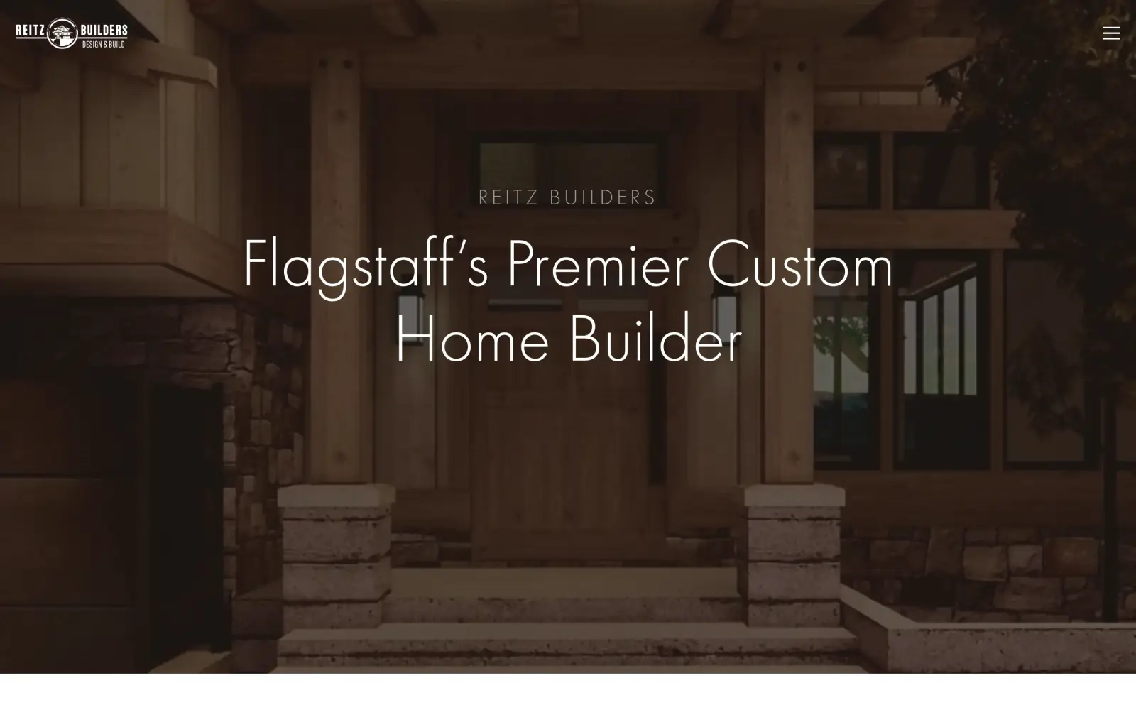
Problem: The first screen is a dark photo and a headline, with no button. The only way to act is a small menu icon at the top right.
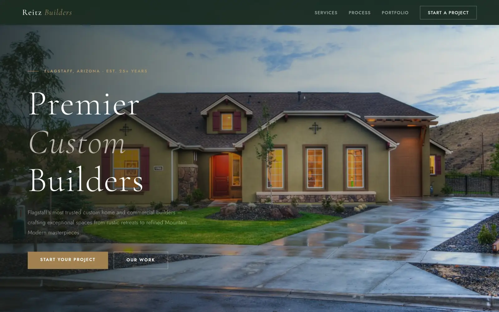
Fix: A gold "Start Your Project" button sits under the headline, and "Start a Project" sits in the header.
- 02
Problem: The photo is dimmed so far that the house is hard to see, and the headline is thin white type on brown.
Fix: A brighter photo of a finished house, with the headline set larger and the town in a tag above it.
- 03
Problem: Contact is a menu link, and the phone, email and street address are in the footer as small plain text.
Fix: Not solved: the concept adds a form, but it drops the street address, phone and email, so a visitor can no longer call.
Reitz Builders and the job of its homepage
Reitz Builders is a design and build firm in Flagstaff, Arizona. It builds custom homes, "from rustic mountain cabins to Mountain Modern homes", and commercial spaces for restaurants, bars and churches.
The original site says the firm has "over 25 years of experience", works with the finest architectural designers in Arizona and is an inaugural partner of LUXE magazine's Arizona issue. Its menu lists luxury home builds, a winery and a historic tap room, a client portal, preferred partners and a video series.
Someone landing here is probably planning a big project and comparing a few builders. The homepage has to say who Reitz is, show work worth trusting and make it easy to start a conversation.
Same checklist, both sites
The score
This is not an agency rebuild. I gave the concept about 2 hours and spent them on the fixes that do the most for customers: the 20% of the work that gets 80% of the improvement.
To show how much that improves, I score every original homepage and every concept on the same 100-point checklist. Most checks are yes or no, and a script runs the technical ones (speed, mobile, accessibility). When in doubt, the point goes to the original site.
Original site
50/ 100
Concept
63/ 100
ClarityOriginal: 14/20Concept: 20/20
First screen says what the business does, in plain words (8 pts)
PassOriginal: Headline "Flagstaff's Premier Custom Home Builder" over the hero photo, with the business name above it.
PassConcept: "Premier Custom Builders" with "Flagstaff's most trusted custom home and commercial builders" under it.
First screen says where, or who it serves (6 pts)
PassOriginal: "Flagstaff" is in the headline on the first screen.
PassConcept: A "Flagstaff, Arizona" tag above the headline and "Flagstaff's" in the line under it.
One main action stands out on the first screen (6 pts)
FailOriginal: The first screen has no button or phone number; the only control is a small menu icon at the top right.
PassConcept: A solid gold "Start Your Project" button beside a plain outline "Our Work" button, and "Start a Project" in the header.
ContactOriginal: 0/20Concept: 12/20
Phone or main button visible on the first mobile screen (8 pts)
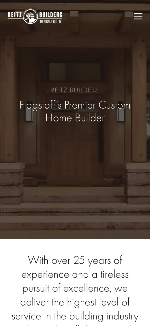
FailOriginal: no phone link or call-to-action on the first mobile screen
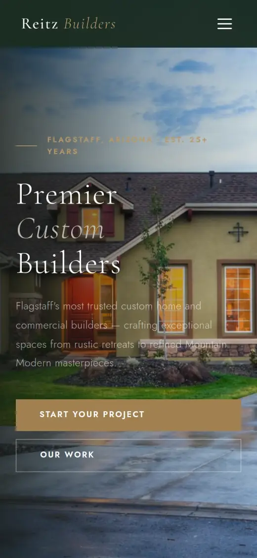
PassConcept: first mobile screen: "Start Your Project"
Phone number is tap-to-call (4 pts)
FailOriginal: 0 tap-to-call link(s)
FailConcept: 0 tap-to-call link(s)
Phone or main button in the desktop header (4 pts)
FailOriginal: no phone or call-to-action in the top 120px on desktop
PassConcept: desktop header: "Start a Project"
Short form, or the main button leads straight to one (4 pts)
FailOriginal: There is no form on the page and no main button on the first screen; "Contact Us" is only a link inside the menu.
FailConcept: The contact form has first name, last name, email, phone, a project-type select and a message box, six fields with the message box.
ProofOriginal: 9/15Concept: 4/15
Reviews or a rating in the first two screens (6 pts)
FailOriginal: The two quotes start about 1,990px down, past the first two screens; "Client Reviews" in the first two screens is only a menu link.
FailConcept: The quotes start roughly 2,400px down, past the first two screens; the bar under the hero has "Award-Winning Craftsmanship", which is not on the original.
Testimonials carry real names or a named platform (5 pts)
PassOriginal: The quotes are signed "Kim Duncan Design" and "Lloyd P., Client", with a "Read More Client Reviews" link.
FailConcept: Kim Duncan Design and Lloyd P. are reworded and lengthened from the original, and "M. & J. Thornton" is not on the original site at all.
At least one specific, checkable number (4 pts)
PassOriginal: "With over 25 years of experience" in the intro paragraph under the hero.
PassConcept: "25+ Years in Flagstaff" in the bar under the hero, matching the original's "over 25 years".
TrustOriginal: 11/15Concept: 6/15
Real photos of the team, work or place (5 pts)
PassOriginal: Photos of the firm's work: a rendering of a timber and stone mountain home, and interiors of a winery and tap room.
FailConcept: Two photos, a house at dusk and a white kitchen, repeat across the page; I cannot tie either to the firm's work and the kitchen looks like stock.
Owner or team named or shown (4 pts)
FailOriginal: No owner or team member is named or shown; the only names on the page are the two people quoted.
FailConcept: No owner or team member is named or shown anywhere.
Full address or clear service area (3 pts)
PassOriginal: The footer gives the full address, "2201 N Gemini Dr. Box #6, Flagstaff, Arizona", plus phone and email.
PassConcept: "Flagstaff, Arizona" and "25+ Years in Northern Arizona" in the contact section; the street address and phone are gone.
License, insurance or "since [year]" (3 pts)
PassOriginal: A "LUXE Arizona, the State of Epic Design, Inaugural Partner" badge and text near the bottom (a magazine badge, not a license).
PassConcept: "LUXE Magazine Inaugural Partner" in the bar and the about section, which matches the original's LUXE badge (a magazine badge, not a license).
MobileOriginal: 7/10Concept: 7/10
No sideways scroll at 390px (4 pts)
PassOriginal: page is 390px wide at 390px
PassConcept: page is 390px wide at 390px
Body text 16px or larger (3 pts)
PassOriginal: median paragraph text 16px on mobile
FailConcept: median paragraph text 14.08px on mobile
Main buttons at least 44px tall (3 pts)
FailOriginal: no actions on the first mobile screen
PassConcept: first-screen actions: 48px tall
IntegrityOriginal: 5/5Concept: 5/5
No placeholder text or broken images (3 pts)
PassOriginal: no placeholder text or broken images found (screenshots still get a manual look)
PassConcept: no placeholder text or broken images found (screenshots still get a manual look)
Header and footer links all work (2 pts)
PassOriginal: 13 header/footer link(s) checked, all work
PassConcept: 1 header/footer link(s) checked, all work
SpeedOriginal: 1/10Concept: 7/10
Lighthouse mobile performance (10 pts)
FailOriginal: Lighthouse mobile performance 29 (median of 3: 28, 29, 29)
FailConcept: Lighthouse mobile performance 74 (median of 3: 74, 74, 77)
AccessibilityOriginal: 3/5Concept: 2/5
No serious accessibility issues (axe) (3 pts)
PassOriginal: 5 serious/critical axe issue(s)
FailConcept: 40 serious/critical axe issue(s)
Content images have alt text (2 pts)
PassOriginal: 6/6 content images have alt text
PassConcept: 6/6 content images have alt text
Scored 2026-09-30 · How the checklist works
What held the original back
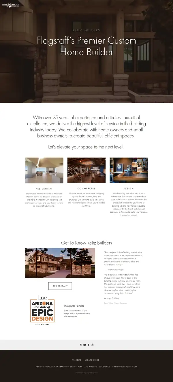
The original has real strengths. The headline says what Reitz does and where, the intro gives "over 25 years", the two quotes are signed and the footer has a full address, a phone number and an email. The work photos, a mountain home and a winery, are the firm's own. The problem is the first screen: a visitor sees a dark picture and has nothing to press.
- The whole menu is behind a small icon, even on a wide screen. "Contact Us" and "Client Reviews" are inside it.
- The headline is clear: custom home builder, in Flagstaff. But the letters are thin and white, and there is nothing to click right under it.
- The photo is covered by a dark layer, so the house and its stonework are barely visible. The best proof of the work is the part a visitor cannot see.
- The lower half of the screen is empty photo: no button, no phone number, no way to start a project.
What I changed
The first screen and the mobile view, original on the left and concept on the right. The slider at the top of the post compares the first screen up close.
Before
After
First screen
- A button under the headline
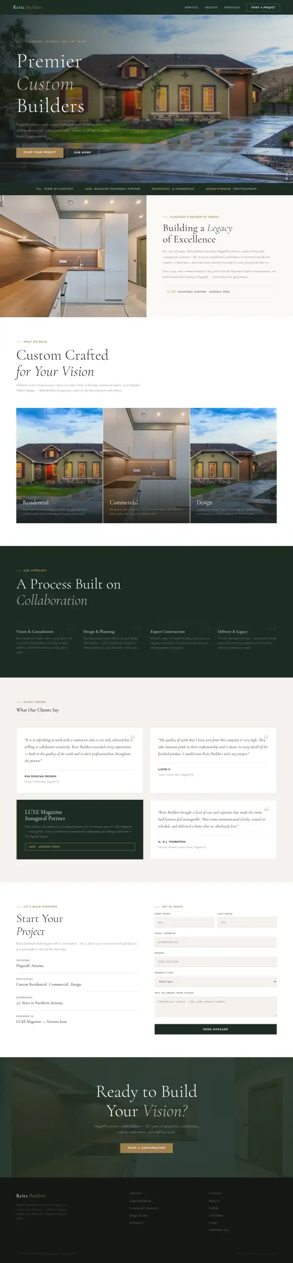
- "Start Your Project" is a solid gold button, and "Our Work" is an outline beside it. The header repeats "Start a Project". The original has neither.
- A brighter photo
- A finished home at dusk fills the screen, so the visitor sees what Reitz builds before reading a word. The original's photo is a dark porch.
- A contact form on the page
- First name, last name, email, phone, a project type and a message. It has six fields, which is more than a first contact needs.
Before
After
Mobile
- Two full-width buttons
- On a phone the gold button and the outline button are stacked and wide, and the first is 48px tall. The original's first phone screen has no button at all.
- The town is in the first lines
- The tag reads "Flagstaff, Arizona" on its own line above the headline. The original's headline says Flagstaff too, so this keeps what worked.
The whole page, before and after
Steal this: 6 fixes for any custom home builder
- Put one button under the headline. "Start Your Project" tells a person with a lot to spend what to do next. A menu icon does not.
- Do not dim the best photo. A dark layer helps white type read, but it hides the work. A gradient at the bottom keeps the type readable and the house visible.
- Keep the phone number where a thumb can reach it. Reitz's number is in small type at the bottom of the page. On a phone it should be a tap-to-call link in the header.
- Use the quotes higher up. The original's two signed quotes sit about 1,990px down. One of them near the top would do more than the line "Premier".
- Name the person. A builder with 25 years should have a name and a face on the page. Neither the original nor my concept has one.
- Show the work you already have. The winery and the tap room are in the original's menu and photos. They are stronger proof than a kitchen that could be anywhere.
What I'd still fix with more time
The concept does not score 100. About 2 hours doesn't fix everything, and the checklist applies to my work too:
- The reviews are not the original's. In the concept, the two real quotes are reworded and longer, and "M. & J. Thornton" is not on the original site at all. They need to go back to the original words, with a link to the source.
- Some claims are mine, not the business's. "Award-Winning Craftsmanship", "since 1999", "most trusted" and "Est. 25+ Years" are not on the original site. The original says "over 25 years" and nothing more exact.
- The photos are not enough. The two images repeat, a house and a white kitchen, and I cannot tie either to Reitz. The real photos of the winery, the tap room and the mountain homes should come back.
- I dropped the address and phone. The original has both in the footer. The concept has "Flagstaff, Arizona" and no way to call, which is a step back.
- The form is long and not connected. Six fields is more than the first message needs, and it goes nowhere yet.
- Client Portal, Preferred Partners, the blog and the video series are gone. I left them out to keep the page short. The firm has to decide whether existing clients need them on the homepage.
- Mobile text is 14px and contrast is weak. The paragraph over the house photo is hard to read, and the accessibility scan found 40 contrast and label issues.
- Speed is 74 on Lighthouse. The original scored 29, so it is better, but I would get it above 90.
My take
If I were talking to Reitz Builders, I would say this: your site already says the right things. Custom homes, Flagstaff, over 25 years, a magazine feature and a footer with your real address. The trouble is a first screen that gives a visitor nothing to press and hides your best photo. My concept mostly puts a button and a brighter photo there.
The choice I am least sure about is the look. I went with a deep green and gold and a serif headline, which feels established. The original's thin, dark, quiet style may suit a luxury builder better, and a real project photo may work harder than my house at dusk. I also went back and forth on the form. It is long, and a phone number might get you more calls than a six-field form.
What the concept does not solve is proof. There is still no owner or team named or shown, the quotes need to go back to the originals and the photos need to be yours. It also lost the address and phone, which is a mistake I would fix first. Two hours made the first screen ask for the project. It did not make the site more trustworthy than the facts you gave it.
The live concept
The full concept is live on this site, with a bar at the top saying it is a concept and not Reitz Builders's real website.
The real site: reitzbuilders.com
Questions
What should a custom home builder's homepage show first?
The work, the town and one way to start. A person about to spend a lot of money wants to see a finished house, know you build near them and be able to reach you in one click. Everything else can sit lower down.
What did the 2 hours on Reitz Builders go into?
About 2 hours went into the first screen (a brighter photo, the headline, the town and two buttons), the services, the process steps, the quotes and the contact form. They did not cover real project photos, the original's wording for the reviews, the address and phone, a shorter form, connecting it, or the client portal.
Is a dark photo a bad idea for a home builder?
Not always. A dark hero can look premium. On the original it is dimmed so far that the house is hard to see, and there is no button. If the photo stays dark, the headline and one button have to carry the first screen.
Did Reitz Builders ask for this redesign?
No. This is an unsolicited concept, and I'm not affiliated with the business. If you own it and want anything changed or removed, email me and it's done within 48 hours.
How is the score worked out?
With a 100-point checklist: clarity, contact, proof, trust, mobile, integrity, speed and accessibility. A script runs the technical checks; I judge the rest from screenshots and note a reason for each. The original site gets the benefit of the doubt.
Own Reitz Builders and want this changed or removed? Email anshul@anshuldesigns.com and it's done within 48 hours.