80/20 Redesigns / Business funding network / USA
By Anshul
Updated
An unsolicited 2-hour concept for JWoodward Network, a startup business loan site. What held the original homepage back, what I changed, and how both score on the same checklist.
Unsolicited concept. Not commissioned by or affiliated with JWoodward Network. All trademarks belong to their owners.
Checklist score45 → 58out of 100
Time spentabout 2 hours
The short version
- 01
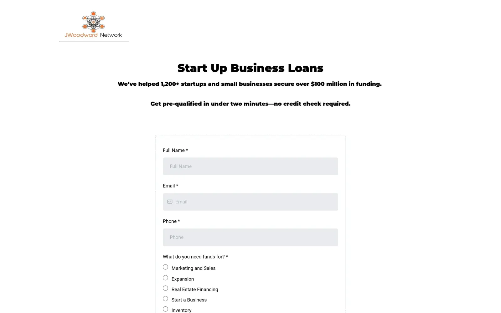
Problem: The first screen is a headline and the top of an eleven-question form. No menu, no button, no way to learn more.
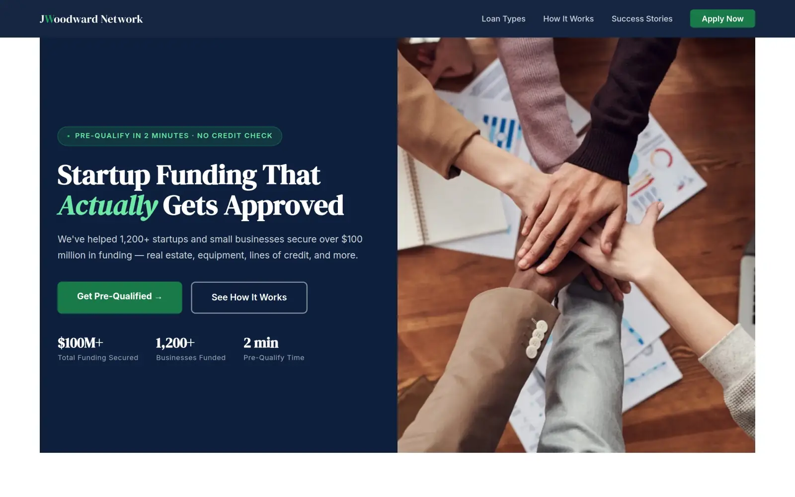
Fix: A headline, one line on what is funded, one green "Get Pre-Qualified" button and a menu with Loan Types, How It Works and Success Stories.
- 02
Problem: The form asks for revenue, entity type, credit score and who referred you, all before the visitor knows if they qualify.
Fix: The form has six fields: name, email, phone, purpose, amount and time in business. Not solved: I would still cut it to five.
- 03
Problem: The 4.9 stars, the 98% and the named testimonials sit below the form, as pasted screenshots.
Fix: Not solved: the concept moves three numbers up under the headline, but its three testimonial cards are mine, not the business's. They have to go.
JWoodward Network and the job of its homepage
JWoodward Network is a business funding site for startups and small businesses. Its page title lists what it arranges: real estate financing, equipment financing, business lines of credit, business credit and term loans.
The homepage says the network has helped "1,200+ startups and small businesses secure over $100 million in funding" and that a visitor can get pre-qualified in under two minutes with no credit check. Its footer says the site is not part of Facebook, and its testimonials are screenshots of Facebook posts, so many visitors probably arrive from a Facebook group.
A person landing here is asking for money for a business and has to decide whether to trust a stranger with their credit details. The page has one job: get that person to start, and to believe the two-minute promise.
Same checklist, both sites
The score
This is not an agency rebuild. I gave the concept about 2 hours and spent them on the fixes that do the most for customers: the 20% of the work that gets 80% of the improvement.
To show how much that improves, I score every original homepage and every concept on the same 100-point checklist. Most checks are yes or no, and a script runs the technical ones (speed, mobile, accessibility). When in doubt, the point goes to the original site.
Original site
45/ 100
Concept
58/ 100
ClarityOriginal: 20/20Concept: 20/20
First screen says what the business does, in plain words (8 pts)
PassOriginal: The headline "Start Up Business Loans" and the line "helped 1,200+ startups and small businesses secure over $100 million in funding" say what the business does.
PassConcept: "Startup Funding That Actually Gets Approved" with "real estate, equipment, lines of credit, and more" in the line under it.
First screen says where, or who it serves (6 pts)
PassOriginal: The first screen says who it serves: "startups and small businesses"; it names no city or region.
PassConcept: The line under the headline names "startups and small businesses"; no city or region is given.
One main action stands out on the first screen (6 pts)
PassOriginal: The first screen is a headline and one long form; there is no menu and no second button.
PassConcept: A filled green "Get Pre-Qualified" button; "See How It Works" is a plain outline beside it.
ContactOriginal: 0/20Concept: 12/20
Phone or main button visible on the first mobile screen (8 pts)
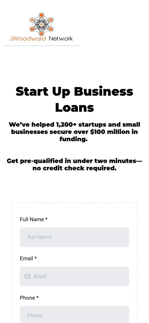
FailOriginal: no phone link or call-to-action on the first mobile screen
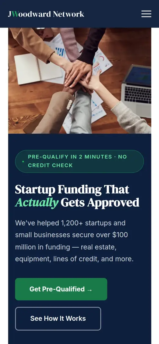
PassConcept: first mobile screen: "Get Pre-Qualified →"
Phone number is tap-to-call (4 pts)
FailOriginal: 0 tap-to-call link(s)
FailConcept: 0 tap-to-call link(s)
Phone or main button in the desktop header (4 pts)
FailOriginal: no phone or call-to-action in the top 120px on desktop
PassConcept: desktop header: "Apply Now"
Short form, or the main button leads straight to one (4 pts)
FailOriginal: The form has eleven fields (name, email, phone, a funding-purpose list, amount, time in business, business name and state, revenue, entity type, FICO score, referral).
FailConcept: The main button leads to a form with six fields (name, email, phone, funding purpose, amount, time in business), one over the limit.
ProofOriginal: 9/15Concept: 4/15
Reviews or a rating in the first two screens (6 pts)
FailOriginal: The 4.9 stars, 98% recommended and testimonial screenshots start about 1,900px down, below the form and the first two desktop screens.
FailConcept: The three testimonial cards start about 4,000px down the page, far past the first two desktop screens.
Testimonials carry real names or a named platform (5 pts)
PassOriginal: The testimonials are screenshots of Facebook posts signed with real names, such as Arnulfo Nuño Jr. and Vinay Reddy, and a video labelled "Unnamed Respondent".
FailConcept: The cards ("Marcus T., T&T Logistics, Atlanta", "Danielle R.", "Kevin S., Apex Tech Solutions") do not appear on the original, which shows Facebook posts by other people.
At least one specific, checkable number (4 pts)
PassOriginal: Specific claims appear on the page: "1,200+ startups", "$100 million in funding", "4.9 / 5 Stars" and "98% Recommended"; none names a review count.
PassConcept: "$100M+" and "1,200+ businesses funded" in the first screen are both on the original page; the 4.9 rating from the original was not carried over.
TrustOriginal: 0/15Concept: 0/15
Real photos of the team, work or place (5 pts)
FailOriginal: The only images are a logo, four small portrait avatars over "42+ people in queue" and testimonial screenshots; no photos of the team or the work.
FailConcept: Every photo is stock (hands in a huddle, a lightbox reading "TAXES" on cash, a laptop and calculator).
Owner or team named or shown (4 pts)
FailOriginal: No owner or team member is named or shown anywhere on the page.
FailConcept: No owner or team member is named or shown; the testimonial avatars are stock portraits.
Full address or clear service area (3 pts)
FailOriginal: No address, city or service area appears on the page.
FailConcept: No address or service area; the footer says only "JWoodward Network LLC".
License, insurance or "since [year]" (3 pts)
FailOriginal: No license, accreditation or founding year; the "SECURE SSL Encryption" badge is a web-security label, not a credential.
FailConcept: No license, accreditation or "since" year; the footer's "© 2025 JWoodward Network LLC" is a copyright line.
MobileOriginal: 7/10Concept: 7/10
No sideways scroll at 390px (4 pts)
PassOriginal: page is 390px wide at 390px
PassConcept: page is 390px wide at 390px
Body text 16px or larger (3 pts)
PassOriginal: median paragraph text 16px on mobile
FailConcept: median paragraph text 14.88px on mobile
Main buttons at least 44px tall (3 pts)
FailOriginal: no actions on the first mobile screen
PassConcept: first-screen actions: 54px tall
IntegrityOriginal: 5/5Concept: 5/5
No placeholder text or broken images (3 pts)
PassOriginal: no placeholder text or broken images found (screenshots still get a manual look)
PassConcept: no placeholder text or broken images found (screenshots still get a manual look)
Header and footer links all work (2 pts)
PassOriginal: 0 header/footer link(s) checked, all work
PassConcept: 1 header/footer link(s) checked, all work
SpeedOriginal: 1/10Concept: 7/10
Lighthouse mobile performance (10 pts)
FailOriginal: Lighthouse mobile performance 49 (median of 3: 43, 49, 49)
FailConcept: Lighthouse mobile performance 79 (median of 3: 77, 79, 79)
AccessibilityOriginal: 3/5Concept: 3/5
No serious accessibility issues (axe) (3 pts)
PassOriginal: 4 serious/critical axe issue(s)
PassConcept: 3 serious/critical axe issue(s)
Content images have alt text (2 pts)
PassOriginal: 8/8 content images have alt text
PassConcept: 5/5 content images have alt text
Scored 2026-09-30 · How the checklist works
What held the original back
The original does some things right. The headline says what the business does, the two-minute, no-credit-check promise is stated on the first screen, and the numbers are specific: 1,200+ startups, $100 million, 4.9 out of 5 stars. The testimonials are real posts with real names on them. The trouble is the order. The first screen holds a headline and a form that keeps going, and everything that would make a visitor comfortable comes after it.
- There is only a logo at the top. No menu, no phone number and no button, so a visitor who is not ready to fill in a form has nowhere else to go.
- The headline and the line below it say what the business does and give its numbers, but all of it is the same bold weight. Nothing tells the eye what to read first or what to press.
- The form starts here and it is the whole page. A visitor is asked for name, email and phone before they have seen a single review.
- The form keeps going past this screen: revenue, entity type, credit score and who referred you. The submit button is about 1,400px down the page, and the page reads as an application, not as a first step.
What I changed
The first screen and the mobile view, original on the left and concept on the right. The slider at the top of the post compares the first screen up close.
Before
After
First screen
- A first screen with one job
- "Startup Funding That Actually Gets Approved" and the same "1,200+ startups, $100 million" line as the original. A green "Get Pre-Qualified" button sits right under it, with "See How It Works" as a quieter second choice.
- The numbers as numbers
- The original's own claims, $100M+ and 1,200+ businesses, get a row under the buttons and a band below. They are the business's own figures, and I could not check them.
- A menu and a shorter form
- Loan Types, How It Works, Success Stories and an Apply Now button now run across the top. The form at the end of the page has six fields, not eleven.
Before
After
Mobile
- A button on the first screen
- On the original phone screen there is a headline and three fields, but nothing to tap. In the concept "Get Pre-Qualified" is 54px tall, in the first screen.
- A trade-off in the photo
- The stock photo of stacked hands comes first on a phone and pushes the button to about four fifths of the way down the screen. Not solved: there is still no phone number to call.
The whole page, before and after
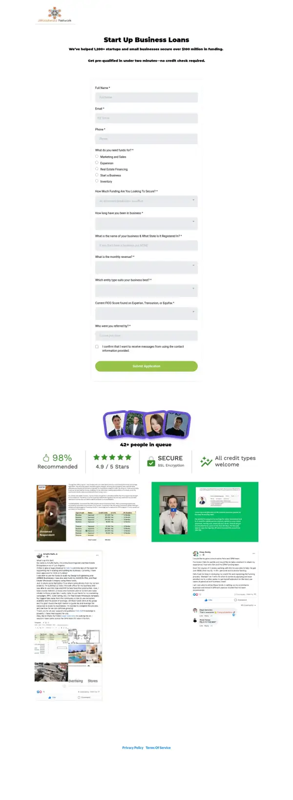
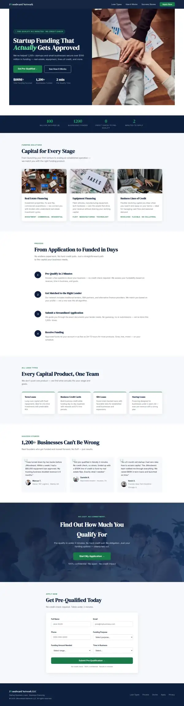
Steal this: 5 fixes for any business funding network
- Put the button before the form. Give a visitor one clear step, then show the questions on the next screen. An eleven-question form as the whole first screen reads as paperwork.
- Ask only what you need to call back. Contact details, what the money is for and how much. Revenue, entity type and credit score can be asked on the call.
- Show the rating next to the promise. The original has "4.9 / 5 Stars" and "98% Recommended", but they sit under the form. They belong beside "pre-qualify in two minutes".
- Say how many reviews are behind the rating. "4.9 / 5" with no count is weaker than the same number with its count and a link to where the reviews live.
- Show a name and a face. A lending site with no owner, team or address makes a visitor guess who they are giving their details to.
What I'd still fix with more time
The concept does not score 100. About 2 hours doesn't fix everything, and the checklist applies to my work too:
- The three testimonials are not real. "Marcus T.", "Danielle R." and "Kevin S." are in the concept, not on the original. The original's real posts, from named people on Facebook, need to come back, with their permission.
- Some claims are mine. "Funded in as few as 24 to 72 hours", "SBA partners", "no hard credit pulls", the SBA Loans and Business Credit Cards cards and "no collateral" are not on the original site. The business needs to confirm each one or drop it.
- The disclaimers are gone. The original footer carries a notice that the site is not part of Facebook and a financial-advice disclaimer. For a site that arranges loans, both have to come back.
- The 4.9 stars and 98% recommended were dropped. They were the original's best proof, and I did not carry them over.
- The form still has six fields. I would cut it to five, and label the three dropdowns, which the accessibility scan flagged.
- The photos are stock. Hands in a huddle, a "TAXES" lightbox on a pile of cash. A real photo of the owner or team would do more than any of them.
- No phone number, address or owner anywhere. Mobile text is 14.9px and should be 16px or more. Mobile speed is 79 on Lighthouse; the original scored 49, so it is better, but I would get it above 90.
My take
If I were talking to the people behind JWoodward Network, I would say this: your best proof is already on the page. A 4.9 rating, a 98% recommend figure and real posts from named people are more than most small funding sites can show. The old page put a long form in front of all of it.
The part I am least sure about is the tone of the concept. "Actually Gets Approved" and "1,200+ Businesses Can't Be Wrong" are punchy, and in lending, punchy can read as a promise. I would run every line past whoever handles compliance. I also kept the original's 1,200+ and $100 million because they are on its page, but I cannot check them, and a visitor cannot either without a link to something.
What the concept does not solve is trust. It has no owner, no address and no real reviews, and the three testimonial cards are placeholders that show where real ones would go. The layout is better. Whether a stranger hands over a credit score depends on the parts I could not build in two hours.
The live concept
The full concept is live on this site, with a bar at the top saying it is a concept and not JWoodward Network's real website.
The real site: jwoodward.net
Questions
What should a business loan homepage show first?
What you arrange, who it is for, one main button and a reason to trust you. A visitor is deciding whether to hand over credit details. A long form, before any of that, asks for the trust before earning it.
What did the 2 hours on JWoodward Network go into?
About 2 hours went into the first screen, the menu, a shorter form, the loan types, a four-step process and the mobile layout. They did not cover real testimonials, real photos, the legal disclaimers, the form connection or checking each claim with the business.
Did JWoodward Network ask for this redesign?
No. This is an unsolicited concept, and I'm not affiliated with the business. If you own it and want anything changed or removed, email me and it's done within 48 hours.
How is the score worked out?
With a 100-point checklist: clarity, contact, proof, trust, mobile, integrity, speed and accessibility. A script runs the technical checks; I judge the rest from screenshots and note a reason for each. The original site gets the benefit of the doubt.
Own JWoodward Network and want this changed or removed? Email anshul@anshuldesigns.com and it's done within 48 hours.