Web design / 2026
By Anshul
Updated
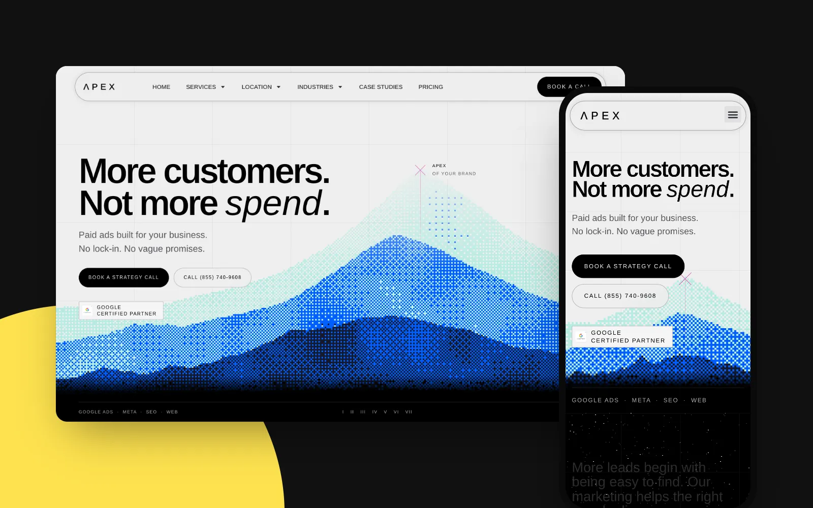
A complete website for a Los Angeles performance-marketing agency that publishes its prices, terms and guarantee up front.
- Client
- Apex Marketing
- Location
- Los Angeles, CA
- Scope
- Complete website design
- Role
- Web designer
- Industry
- Performance marketing agency
The brief
Apex Marketing runs Google Ads, Meta Ads, SEO and websites for local businesses, from dentists and med spas to roofers and law firms.
Their buyers have usually been burned before: a twelve-month contract, a monthly PDF of impressions, and no idea what a lead actually cost. Most agency sites look and sound the same, so a new site that simply said "results-driven" would disappear.
I designed the complete site, the homepage plus the service, location, industry and case-study pages, around one idea: show the terms, the prices and the person up front, and let the design feel as precise as the promise.
Positioning, written into the layout
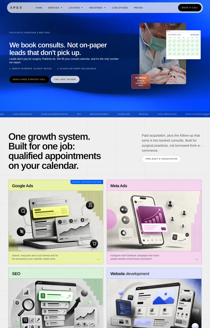
The homepage reads as an argument against the usual agency, one claim per section, each one something a visitor can check:
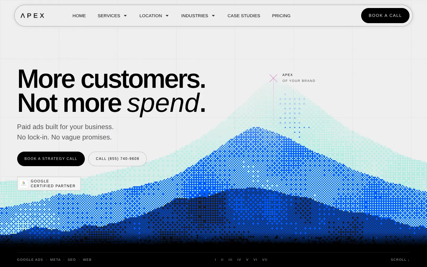
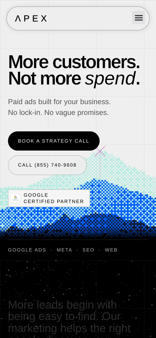
- More customers. Not more spend.
- The headline names the outcome and the fear in six words. The italic on spend is the only flourish on the screen.
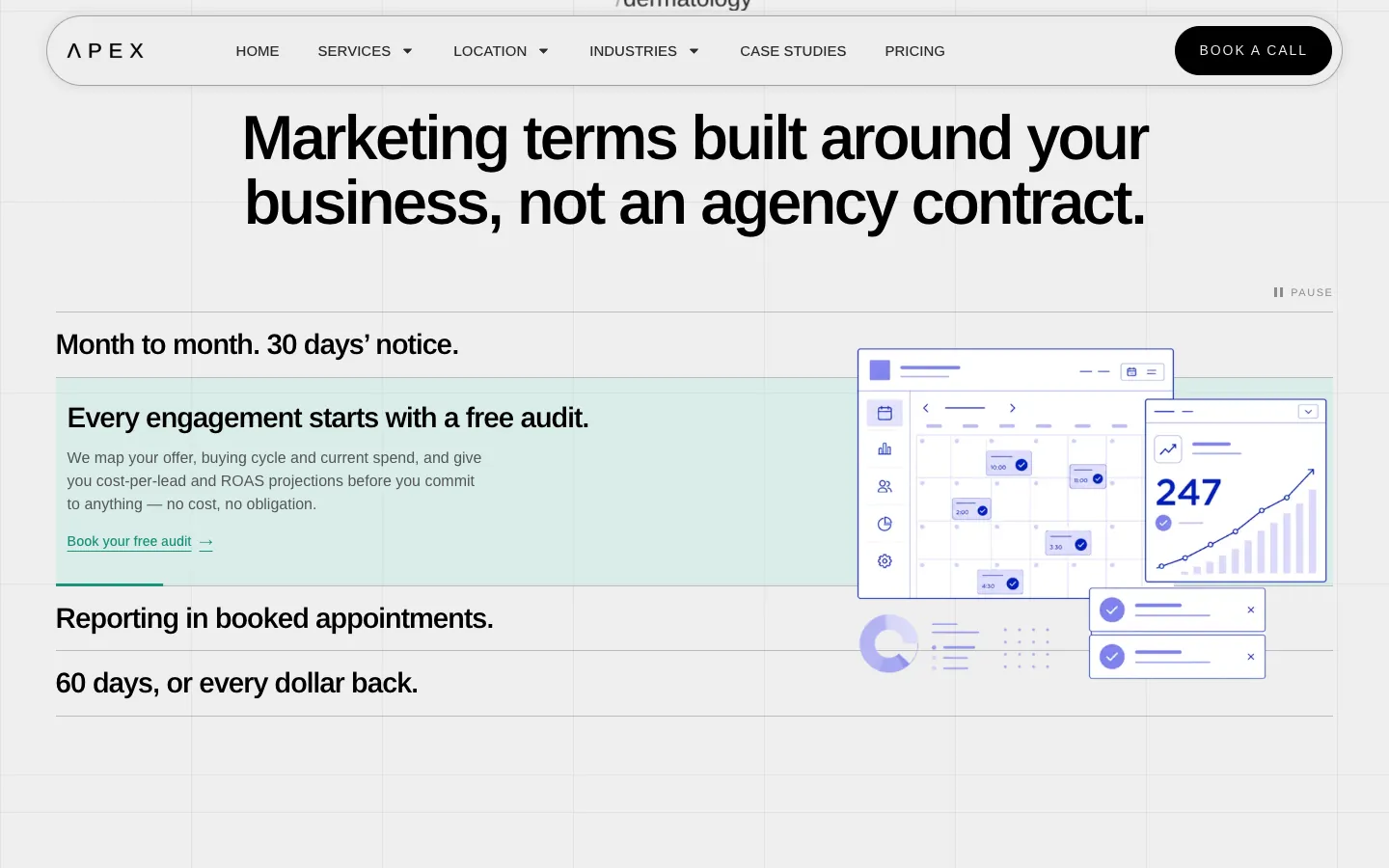
- Month to month, 30 days' notice
- No termination fee and "no conversation about it", stated as a design element, not a footnote.
- Reporting in booked appointments
- One number every month. Impressions and reach are left out on purpose, and the page says so.
- 60 days, or every dollar back
- The guarantee sits beside the pricing, where the doubt actually happens.
Precise, a little technical, never corporate
Design direction
- A grid-paper canvas. A faint square grid under everything, like a planning sheet: the site should feel measured.
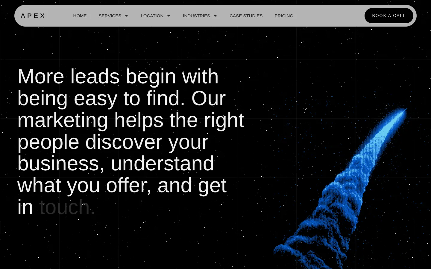
- Halftone and dither for the big visuals. The hero mountain and the comet are built from dots, a nod to data and signal instead of stock photos of laptops.
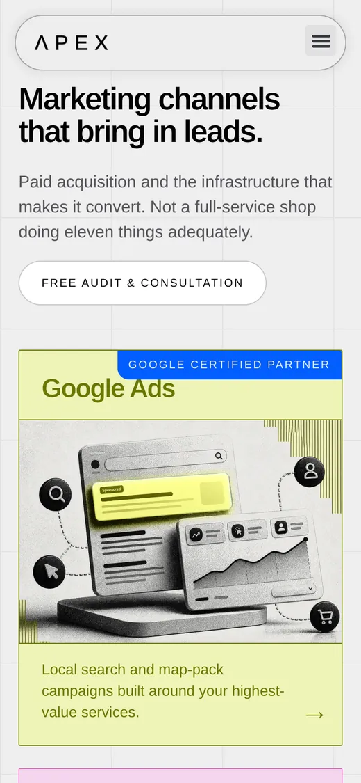
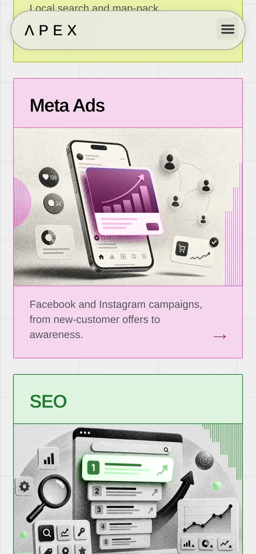
- Monochrome 3D objects on pastel cards. Each channel gets one tint (lime for Google, pink for Meta, mint for SEO, lavender for web) so the colour carries the meaning across pages.
- Black and electric-blue sections for rhythm. The page alternates light and dark so each promise lands as its own moment.
- One grotesque, two voices. Arimo does the heavy lifting with an italic accent word; small uppercase Poppins handles labels and buttons.
Palette and type
- Paper
#EEEEEEPage background, under the grid - Ink
#000000Type, buttons and dark sections - Electric blue
#015EFFAccent, footer and the hero halftone - Night
#151A2CDark panels and the featured plan - Ticket pink
#E086CBThe "Book a call" ticket - Lime
#EAF1A8Google Ads card - Blush
#F5D6EEMeta Ads card - Mint
#D8F1D9SEO card - Lavender
#EEF0FFWebsite card
- Arimo
- Headlines and body. Tight, large and plain, with one italic word per headline.
- Poppins
- Small uppercase labels, badges and buttons.
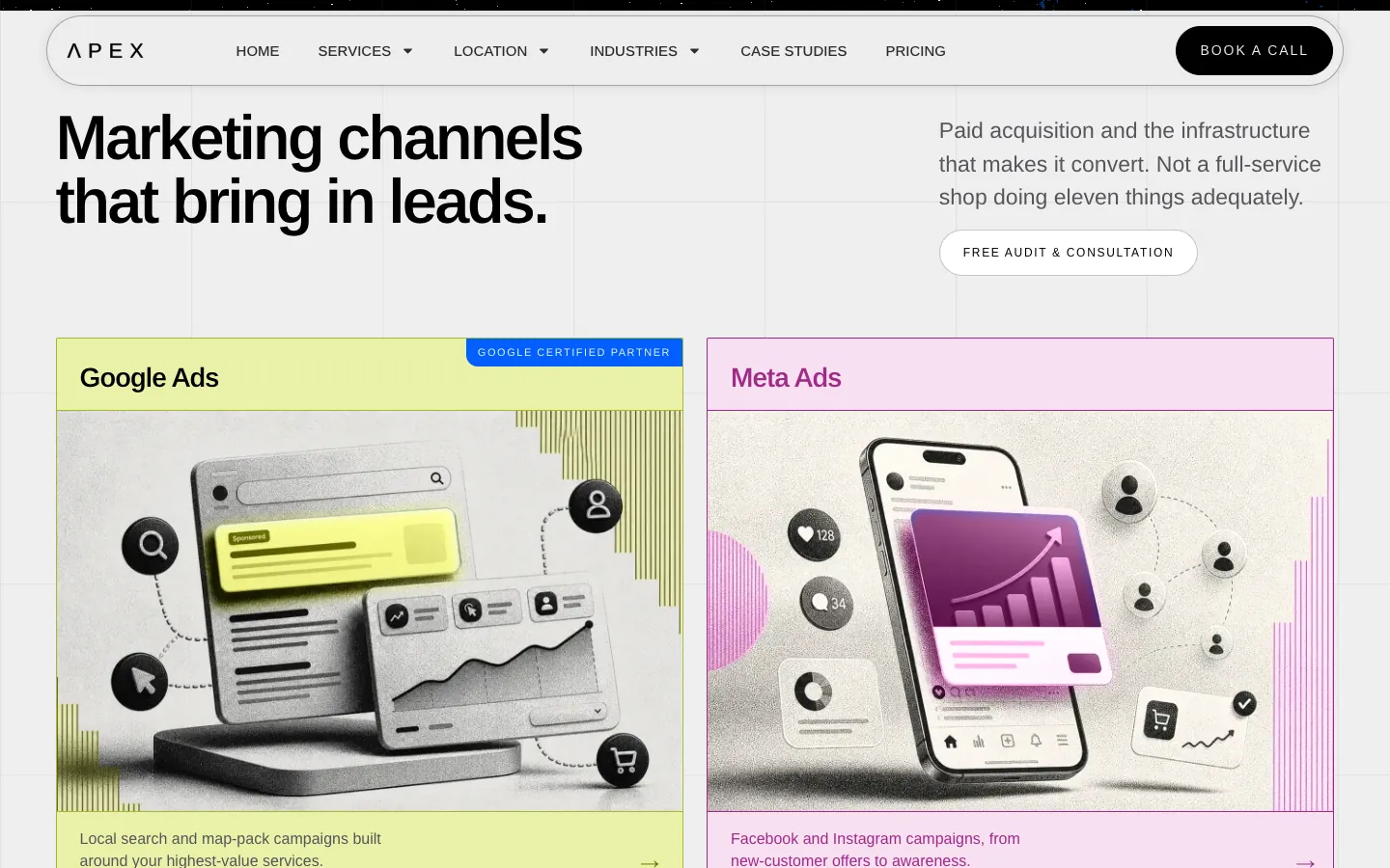
The homepage, section by section
- Promise. Headline, two CTAs (book a call, or just phone) and the Google Partner badge.
- Statement. One sentence on how leads start, revealed word by word on scroll.
- Channels. Four services, and a line that says what Apex does not do: "not a full-service shop doing eleven things adequately."
- Who it is for. Thirty-six industries drifting in a field, so every visitor finds their own word.
- Terms. The four promises, one at a time.
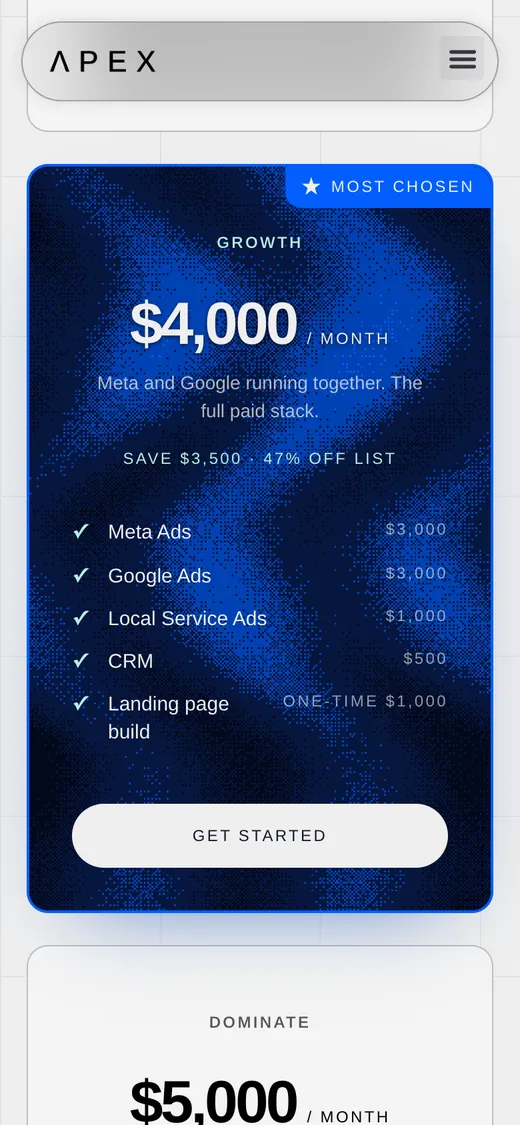
- Pricing. Three plans with every line item priced and the list-price saving shown.
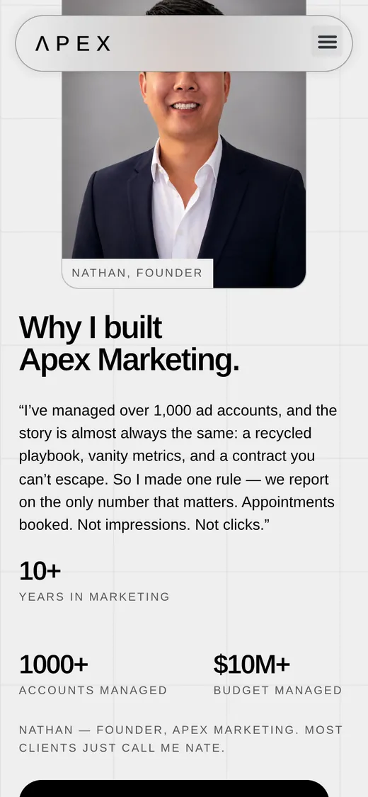
- The founder. Nathan, his photo, his reason for starting Apex and a direct booking link.
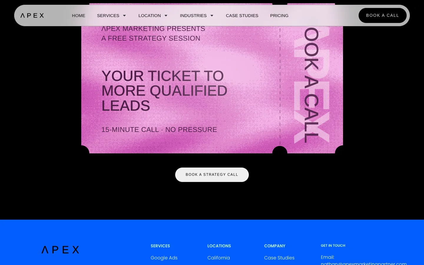
- The ticket. A pink "Your ticket to more qualified leads" card that turns the final CTA into an object.
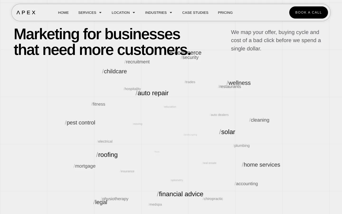
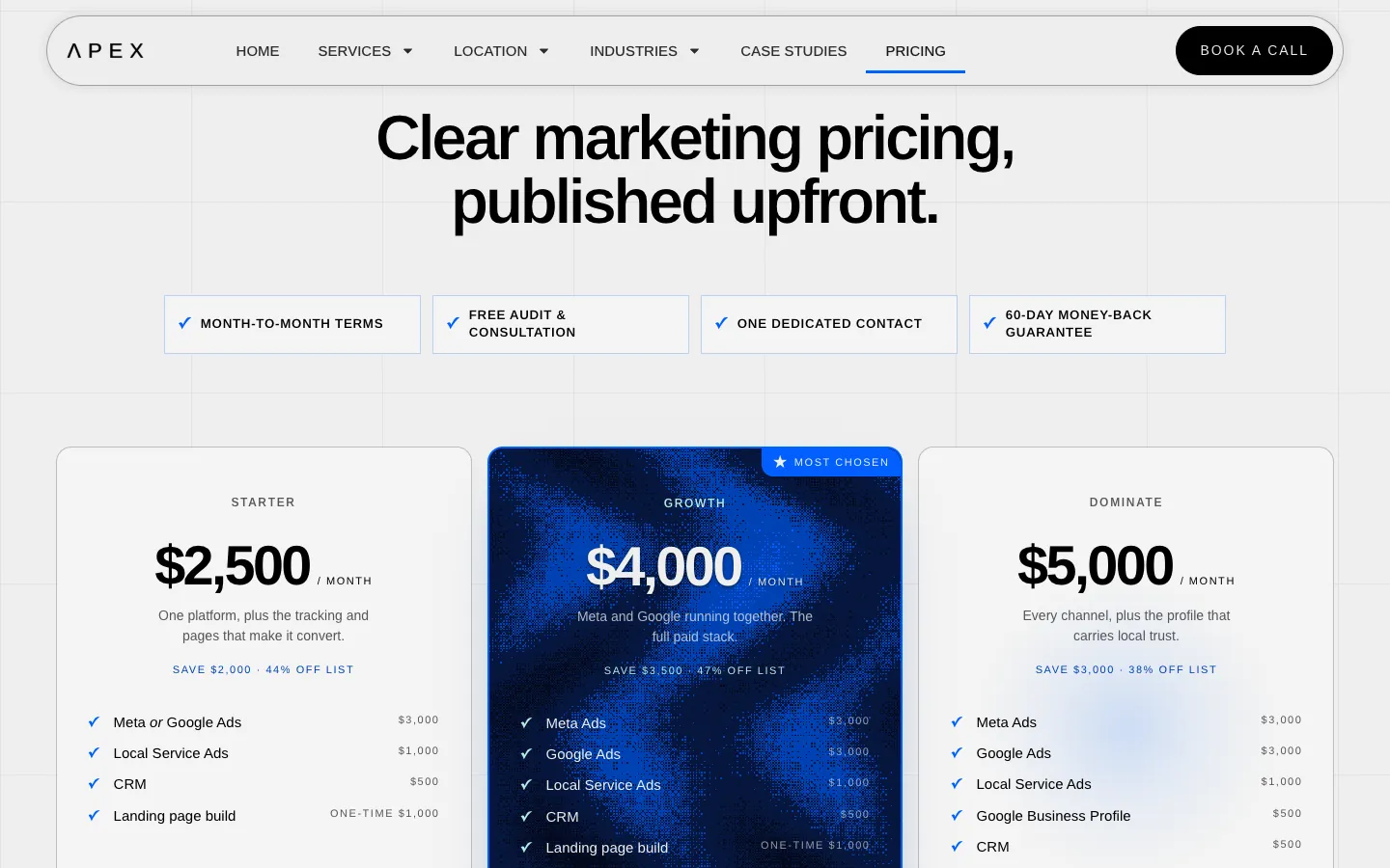
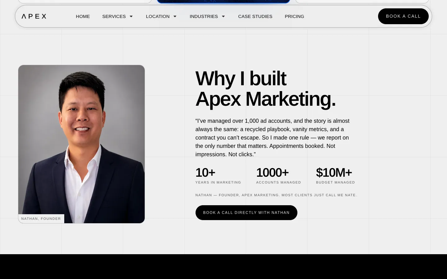
A page system, not a set of pages
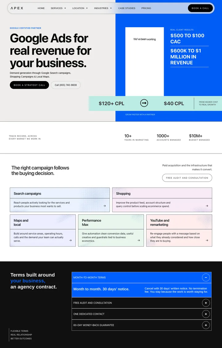
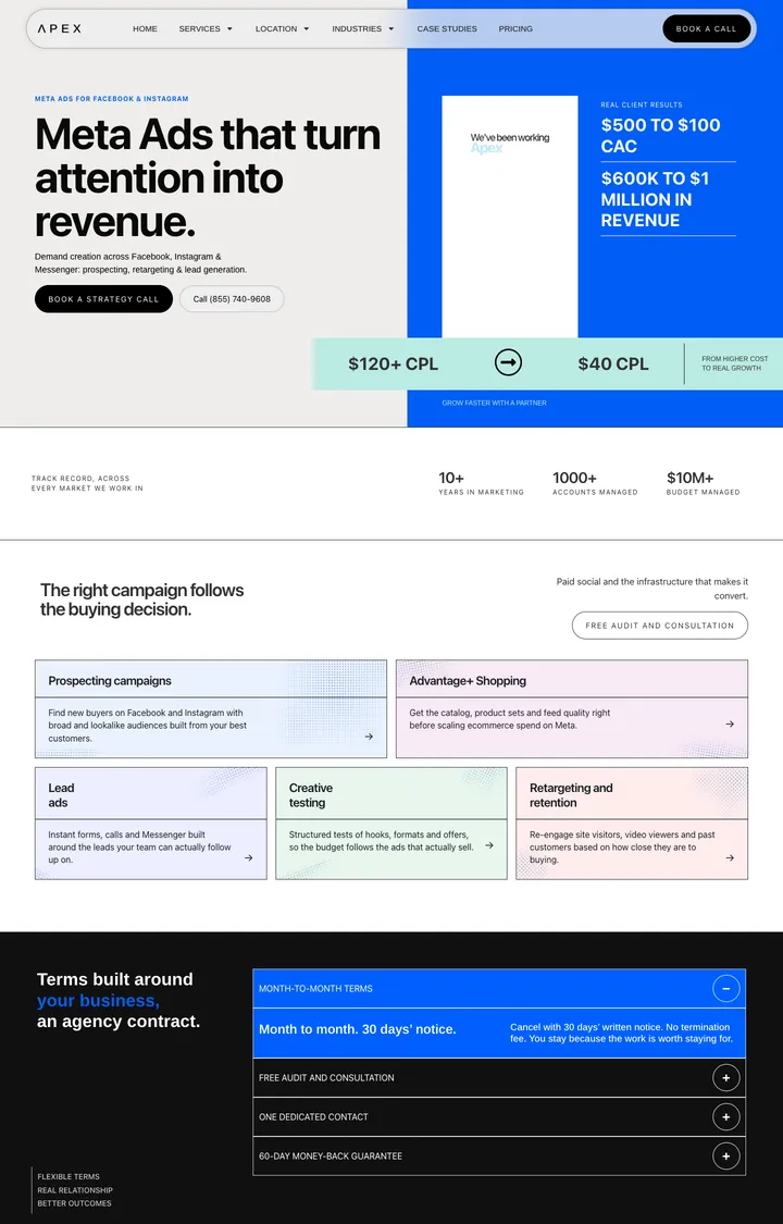
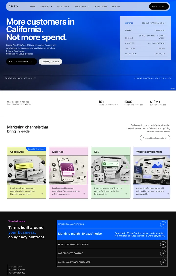
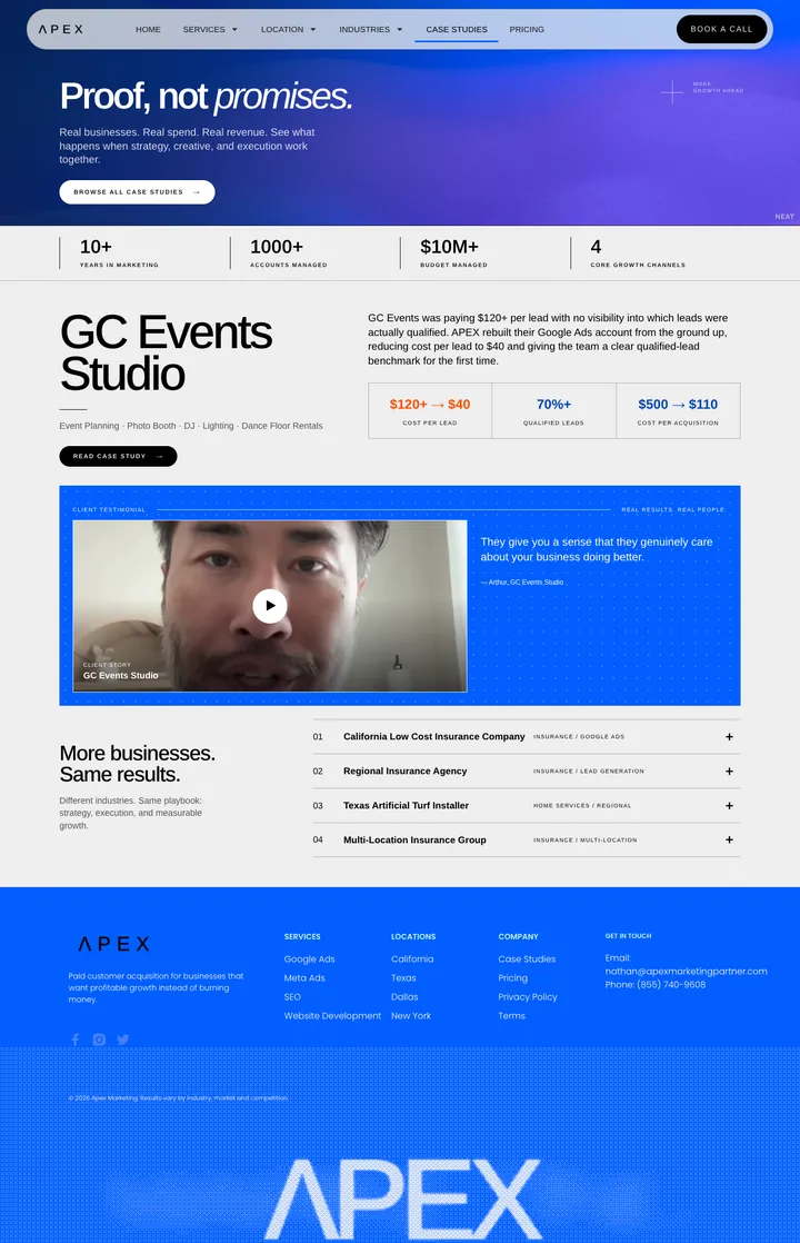
Apex sells the same few services to many industries in many places, so the inner pages are built from one kit: a proof hero (a client video with a before-and-after cost-per-lead chip), a stats strip, a campaign grid, the terms, "three things to ask whoever runs your ads now", an FAQ and the audit booking.
Each page recombines those blocks with its own copy. A new location or industry page is an assembly job, not a new design, and every page still makes the same four promises.
Built to turn a visit into a call
- A call to action in every screen
- Book a call in the nav, the hero, the founder section and the ticket, and a phone number beside the first one.
- Prices, not "contact us"
- Every plan and every line item has a number, so a visitor can self-qualify before the call.
- A face on the offer
- The founder section and his direct booking link answer "who will actually run my account?"
- Objections said out loud
- Industry pages open with the lines owners already say to themselves: "The leads were garbage", "Twelve-month contract, month three".
- Proof next to the claim
- Cost-per-lead before and after sits beside the video testimonial, not on a separate page.
- A low-risk first step
- The main ask is a 15-minute strategy call or a free audit, so booking feels small.
On a phone
The mobile layout keeps the frosted pill nav, stacks the channel cards full width, and gives each pricing plan its own screen.
Takeaway
When every agency promises results, publish the terms.
Results
What the site is built to do
- Pre-qualify visitors
- Published prices and terms mean the calls that do get booked are from people who already fit.
- Earn trust fast
- Guarantee, month-to-month terms and a named founder answer the three usual agency fears.
- Scale to new markets
- One kit of blocks covers every service, location and industry page.
- Stand out in a sameness category
- Grid paper, halftone and pastel channel colours look like nothing else in local-ads marketing.