Skip to content
All work

UI/UX design / 2025

By Anshul

Updated

The advisor app for a direct-selling company, redesigned from an icon launcher into a store with the business always in view.
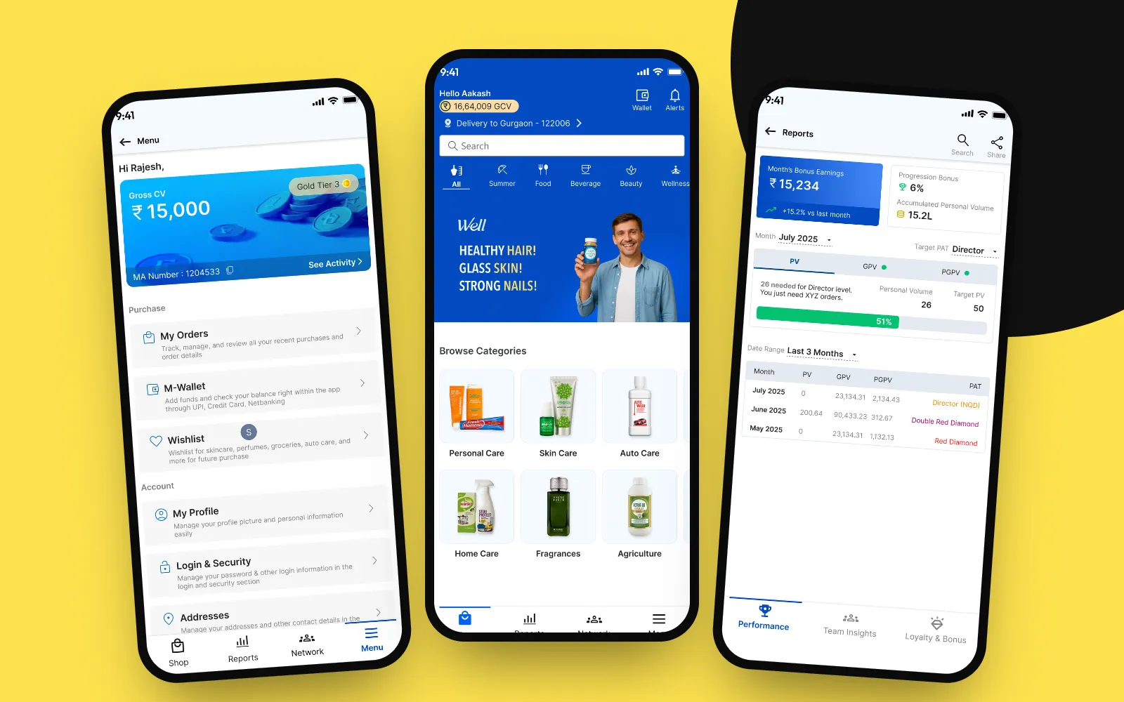
The redesigned Modicare app on two phones: a shopping home with a blue header showing the advisor's volume, a search bar and product categories, next to a reports screen with bonus earnings and a progress bar.
Client
Modicare
Platform
Android and iOS app
Scope
Shopping, business, onboarding
Scale
250k monthly users, $5M+ revenue
Role
Product designer
Industry
Direct selling

Context

Modicare is a direct-selling company. Its advisors use one app every day to buy products, place orders for customers and track the business volume their bonuses depend on.

Modiway grew feature by feature. I redesigned it end to end: shopping, reports, account and onboarding.

What was wrong with the old app

  • No clear starting point. The home was a grid of 20 equal icons.
  • Numbers without meaning. Charts and codes, but no targets or next steps.
  • Forms before content. You had to fill filters just to see your orders.
  • Shopping felt like paperwork. Dense price rows, a receipt-style cart, plain-text offers.
  • Websites inside the app. Some tasks opened a web page, address bar and all.

Design principles

Shop first, business always in view
A store home, with the advisor's volume always in the header.
One navigation
Four tabs replace the icon grid and side drawer.
Numbers with context
Every figure shows a target, progress or trend.
Status over forms
Show orders, wallet and KYC status first; forms only when needed.

Before and after

Home

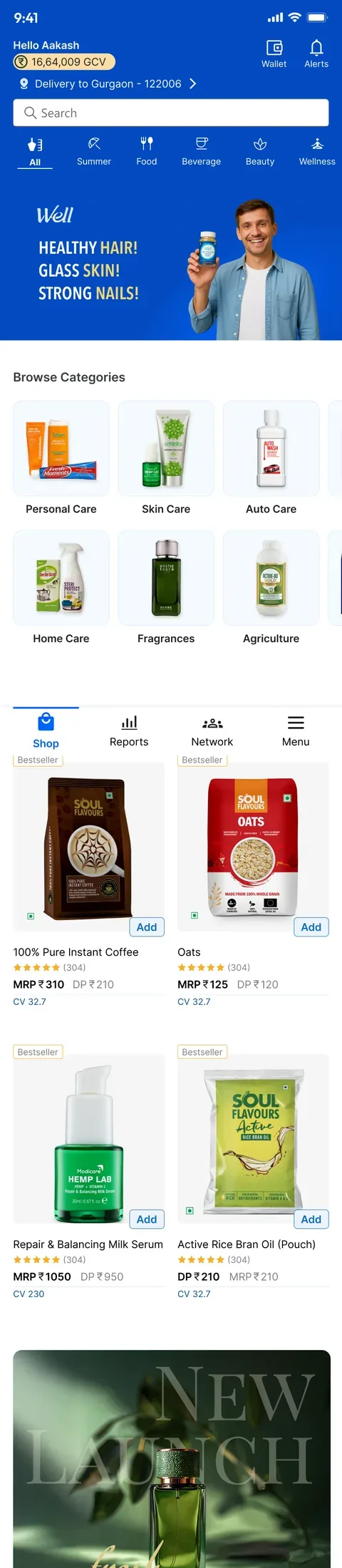
The old home was a greeting and an icon grid. The new one opens on the store, with search, categories, and the advisor's volume and wallet always in the header.

Before
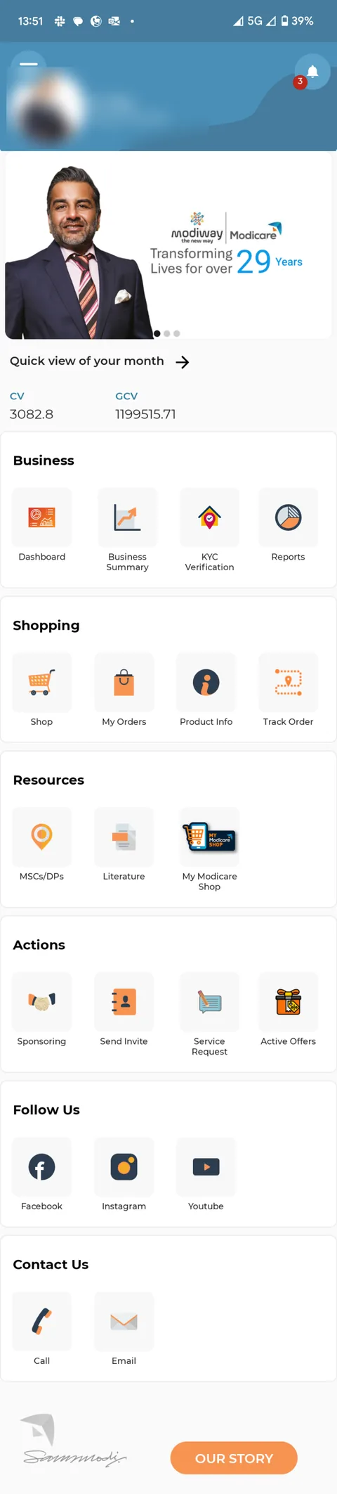
The old Modiway home: a blue header with the advisor's photo and title (blurred here), a banner, CV and GCV figures, and a grid of twenty icons grouped as Business, Shopping, Resources, Actions, Follow us and Contact us.

After

The new home: a blue header with "Hello Aakash", 16,64,009 GCV, wallet and alerts, a delivery location, search, category tabs, a "Healthy hair, glass skin, strong nails" banner, browse categories, bestsellers and a bottom bar with Shop, Reports, Network and Menu.

Shopping

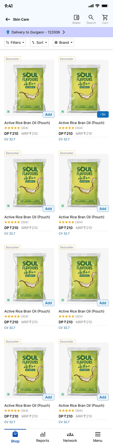
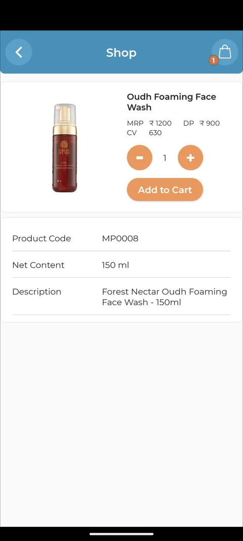
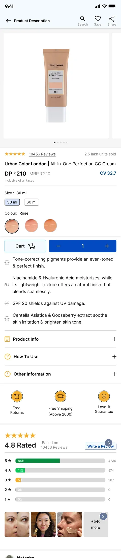
Rows of numbers became product cards with a photo, price and one Add button. Listings gained filters and sort; product pages gained a gallery, options and reviews.

Before
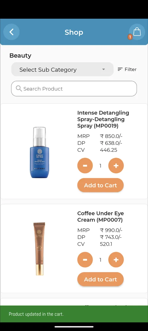
The old product list: a Beauty sub-category dropdown and filter, then product rows with a small image, MRP, DP and CV figures, a quantity stepper and an Add to Cart button.

After

The new Skin Care listing: delivery location, Filters, Sort and Brand chips, and a two-column grid of product cards marked Bestseller with ratings, DP, MRP, CV and an Add button.

Before

The old product page: a small product image, Add to Cart, and a table of product code, net content and description.

After

The new product page: a large image gallery, 10,456 reviews, title, member price, size and shade options, a cart button with a quantity stepper, product details and reviews.
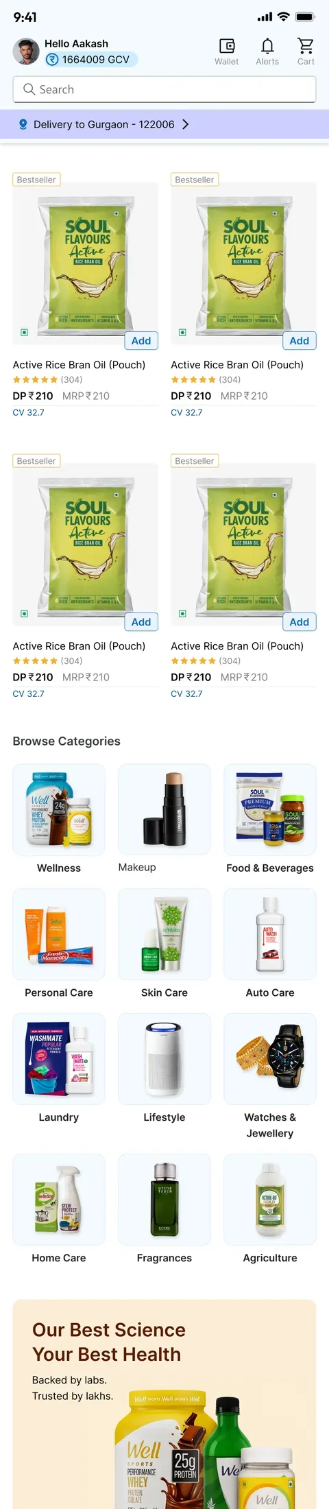
The new shop home: header with the advisor's volume, search, bestseller cards, browse categories with product photos, a "Our best science, your best health" banner, a Love-it Guarantee and a "Delivery Bharat ke har kone tak" banner.
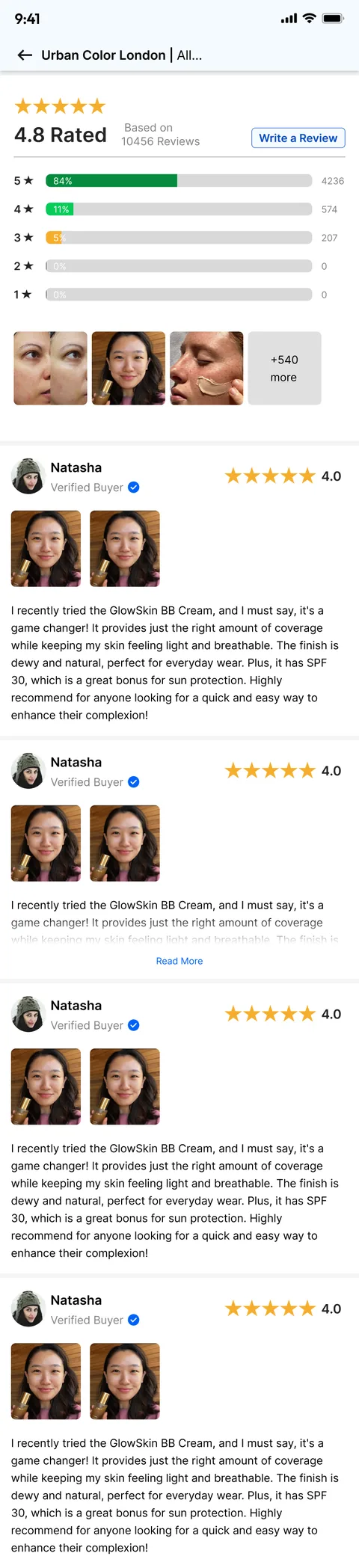
The see-all-reviews screen: a 4.8 rating with a breakdown by stars, photo reviews from customers and written reviews.
The shop home and the reviews flow.

Cart, offers and payment

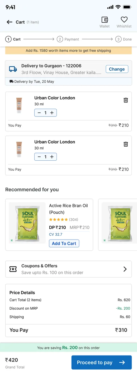
The old cart was a summary table, followed by a separate list of offers. The new checkout has three clear steps, with free-shipping progress, delivery date, recommendations and coupons on the cart, and the wallet as a payment option.

Before
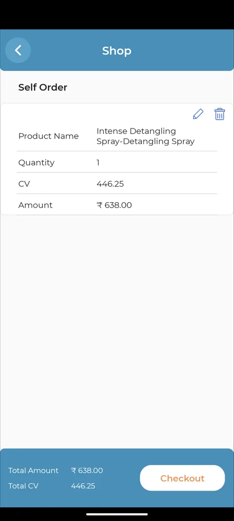
The old cart, titled Self Order: a table of product name, quantity, CV and amount, with total amount, total CV and a Checkout button.

After

The new cart: a Cart, Payment, Done stepper, an "Add Rs. 1580 worth items more to get free shipping" bar, delivery address and date, line items with quantity steppers, recommendations and Coupons and offers.
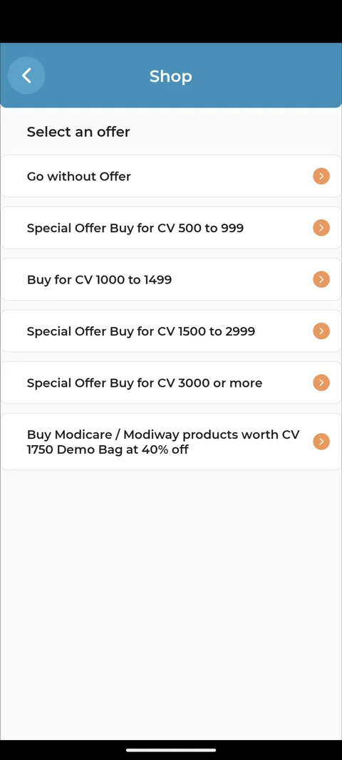
The old offer picker: a plain list of text rows such as "Special Offer Buy for CV 500 to 999".
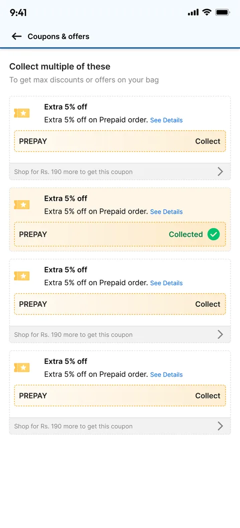
The new Coupons and offers screen: coupon cards with "Extra 5% off on Prepaid order", a Collect button, one marked Collected, and how much more to shop to unlock each.
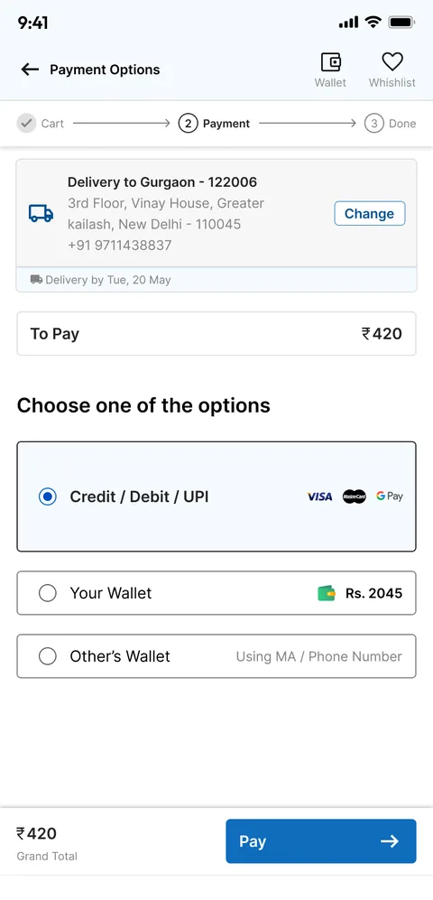
The new payment step: delivery address, amount to pay, and a choice of Credit, Debit or UPI, your wallet with its balance, or another advisor's wallet.

Reports and business

The old screens showed charts without context. The new Reports tab has three views, and every number has context: bonus vs last month, volume vs the next title, team growth over time.

Before
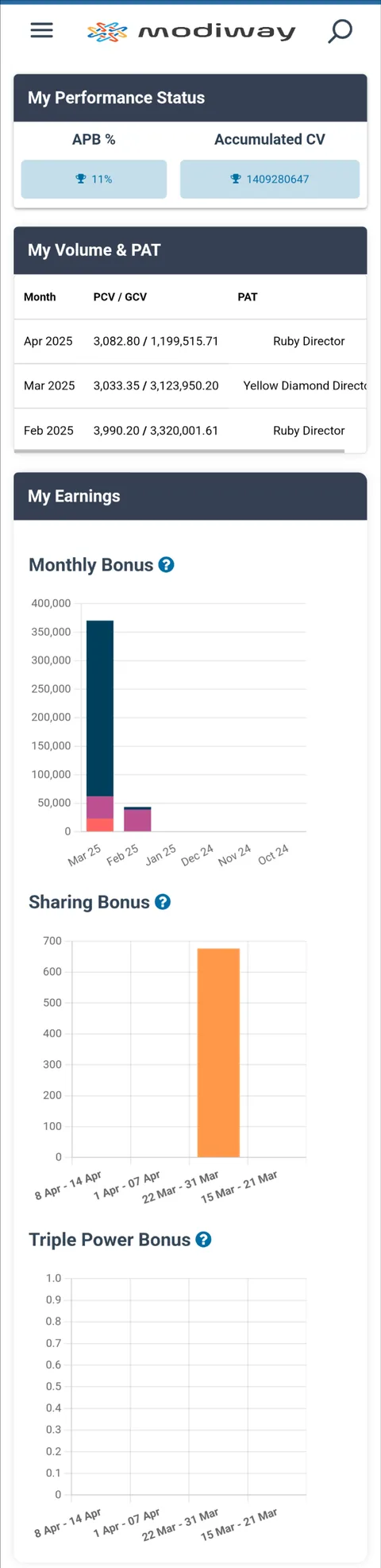
The old dashboard: My Performance Status with APB % and accumulated CV, a My Volume and PAT table, and bar charts for monthly, sharing and triple power bonus.

After

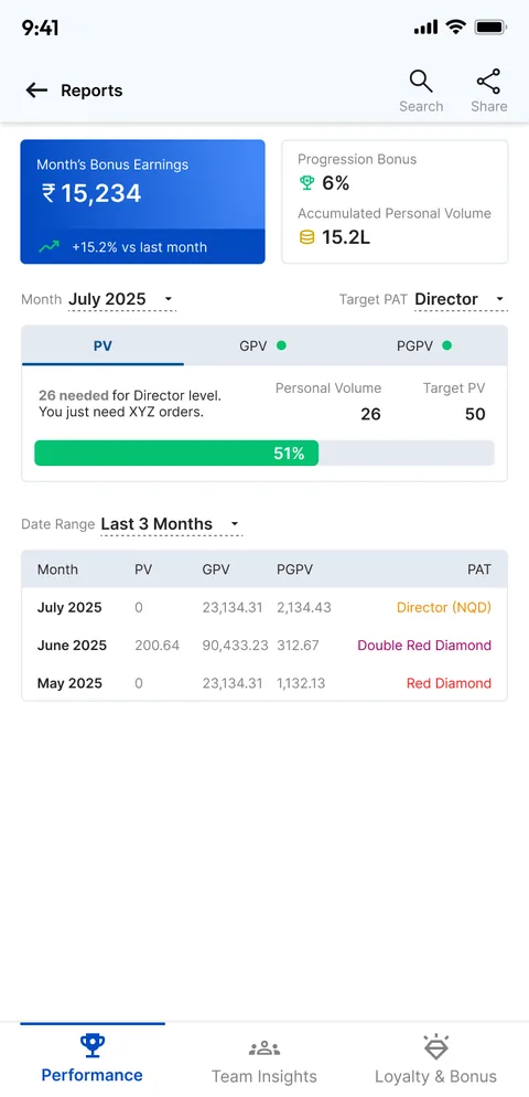
The new Performance report: month's bonus earnings of 15,234 with +15.2% versus last month, progression bonus, a month and target title selector, a PV progress bar at 51% towards Director, and a monthly table.
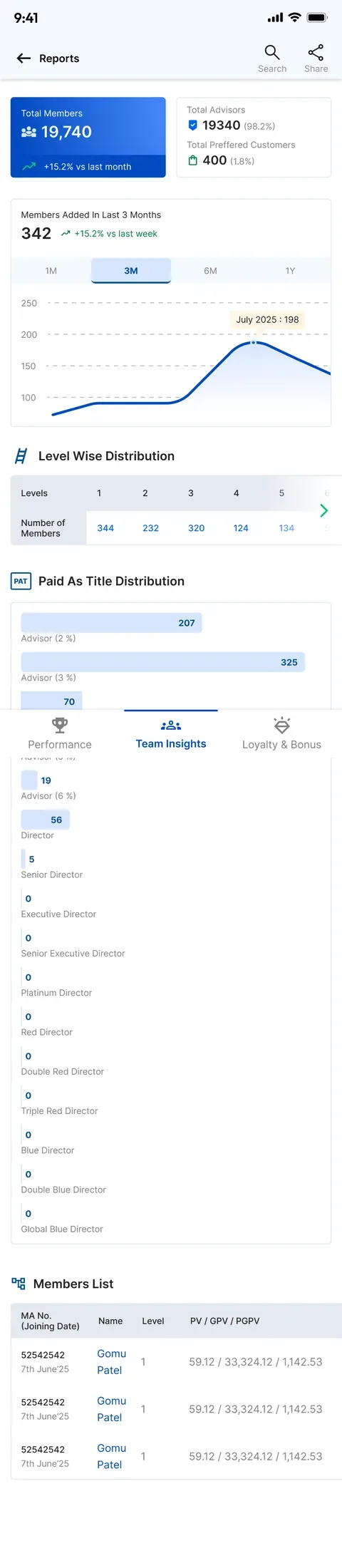
Team insights: total members 19,740 with +15.2% versus last month, a members-added chart over 1, 3, 6 and 12 months, a level-wise distribution and a paid-as-title distribution.
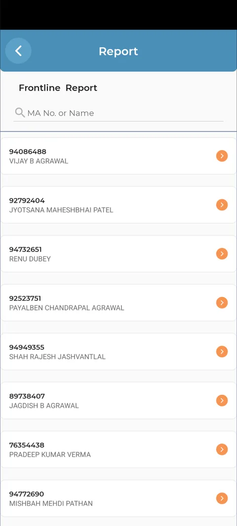
The old Reports screen: three list rows, Frontline Report, Travel and Vehicle Bonus and Loyalty Report.
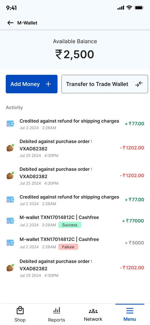
The new M-Wallet: available balance of 2,500, Add money and Transfer to trade wallet buttons, and an activity list of credits and debits with status tags.

Orders, menu and profile

Account screens now show where things stand. Orders open on a tracker, the menu leads with volume and tier, and the profile flags what is missing before the form.

Before
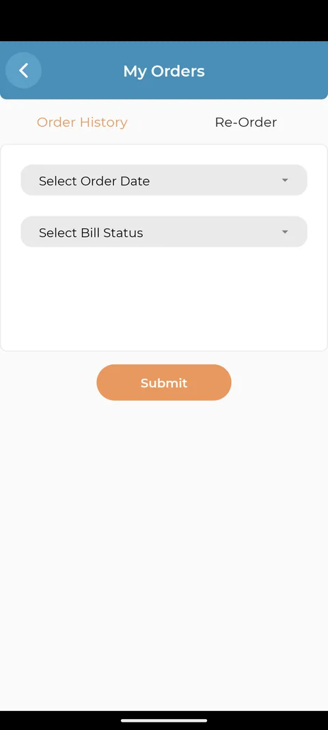
The old My Orders screen: Order history and Re-order tabs, Select order date and Select bill status dropdowns and a Submit button, with no orders shown.

After

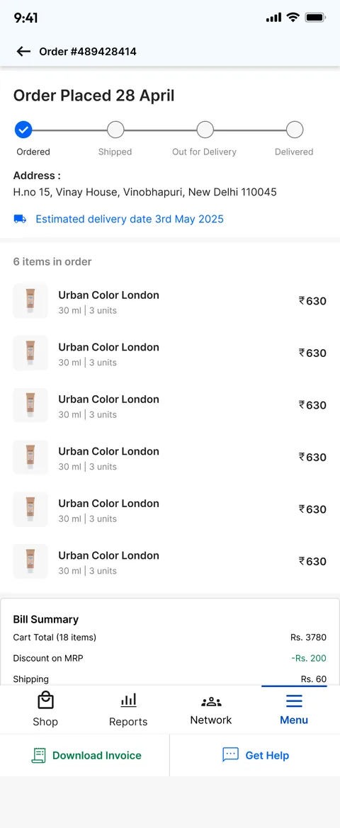
The new order screen: Order placed 28 April with an Ordered, Shipped, Out for delivery, Delivered tracker, the address, an estimated delivery date, the items and the bill summary.
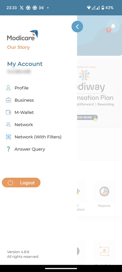
The old side drawer: the Modicare logo, My Account with the advisor ID (blurred here), and links to Profile, Business, M-Wallet, Network and Answer query, with Logout.
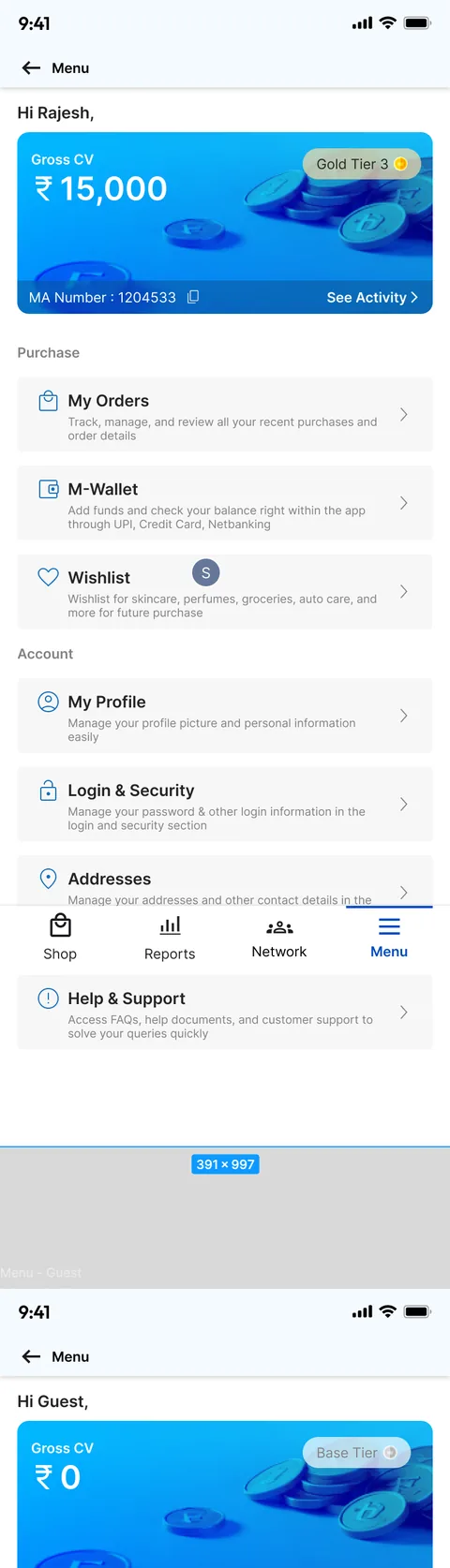
The new Menu: "Hi Rajesh", a gross CV card of 15,000 with Gold tier 3, and grouped rows for My orders, M-Wallet, Wishlist, My profile, Login and security and Addresses, each with a one-line description.
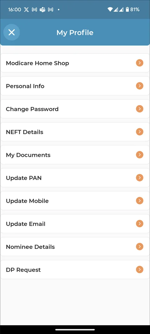
The old My Profile: a list of ten rows such as Personal info, Change password, NEFT details, Update PAN and DP request, each with an orange arrow.
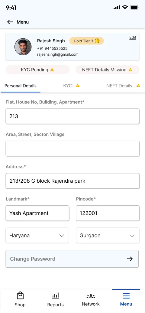
The new profile: photo, name, phone and email, a Gold tier badge, KYC pending and NEFT details missing warnings, and tabs for personal details, KYC and NEFT.

A new onboarding flow

The new app welcomes shoppers too: pick a language, browse as a guest, then register as an Advisor or Customer in five short steps.
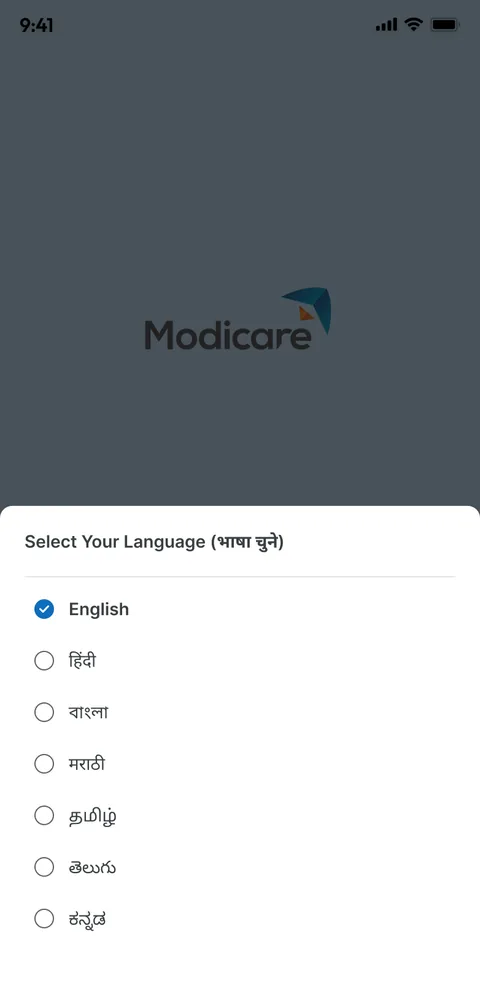
Language selection with English, Hindi and other Indian languages.
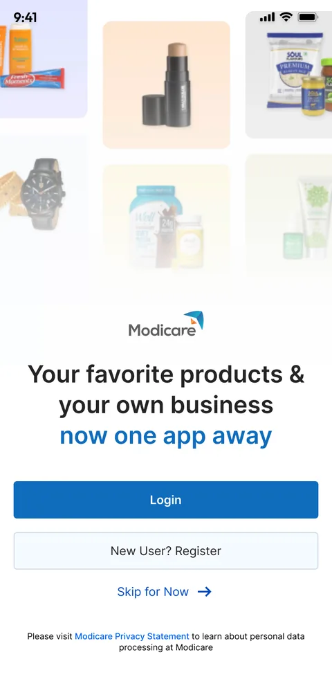
The welcome screen: product photos, "Your favorite products and your own business, now one app away", Login, New user? Register and Skip for now.
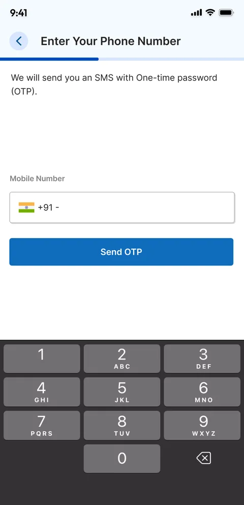
Phone login: enter your phone number to get a one-time password, with a number pad.
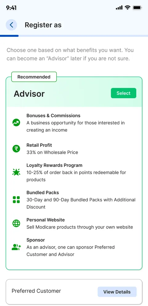
"Register as" with Advisor recommended and its benefits (bonuses, retail profit, loyalty rewards, bundled packs, a personal website, sponsoring), and Preferred Customer below.
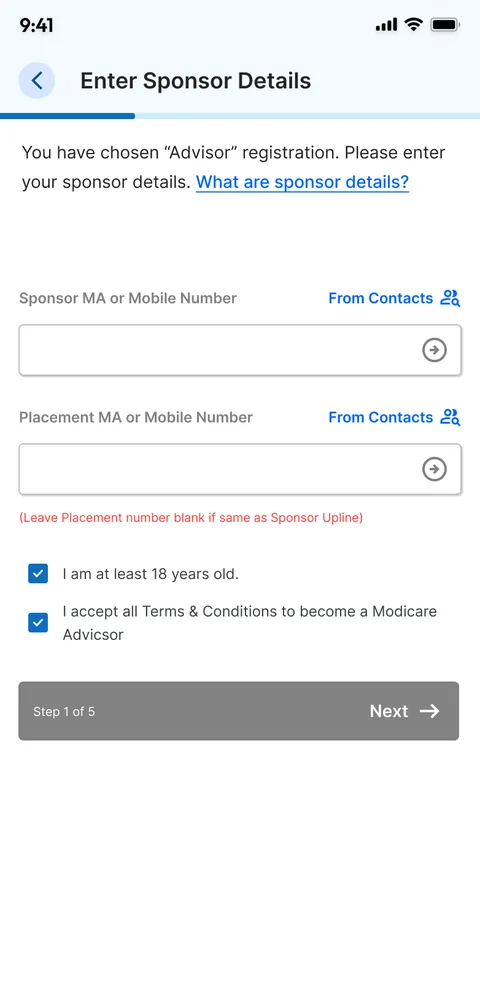
Registration step 1 of 5: sponsor and placement number fields with a pick-from-contacts option, age and terms checkboxes and a Next button.
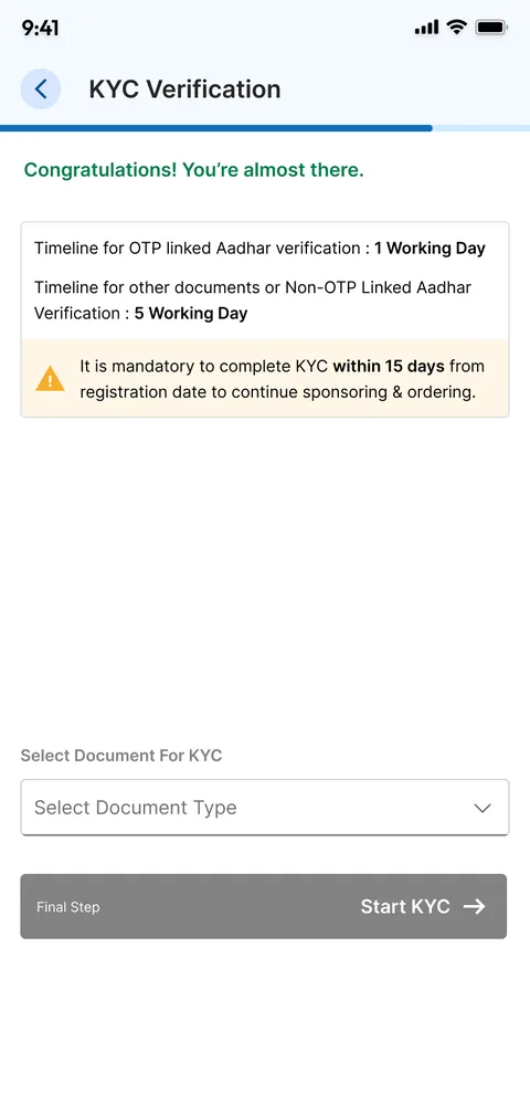
KYC verification: "Congratulations! You're almost there.", verification timelines, a 15-day deadline warning, a document type selector and Start KYC.

Takeaway

Put the next step where the number is.

Results

What the redesign improves

Faster to shop
Search, categories and one-tap Add replace the icon grid and the order form.
Numbers that guide
Targets, progress and trends tell an advisor what to do next, not just what happened.
Fewer dead ends
Orders, wallet and profile open on their current status, not on an empty form.
Room for new customers
Guest browsing and a guided sign-up make the app usable before someone becomes an advisor.
One system
One navigation, one card style and one set of controls across shopping and business.