CRO & e-commerce / 2026
By Anshul
Updated
A bridal-robe product page and cart rebuilt around how bridal parties buy: +30% conversion rate, +27% add to carts.
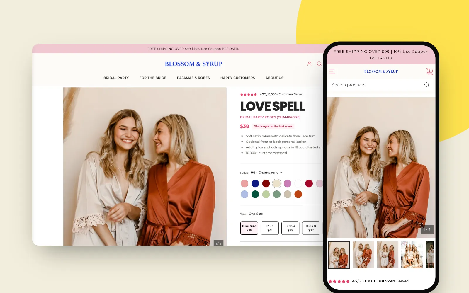
- Client
- Blossom & Syrup
- Platform
- Shopify
- Scope
- Product page and cart drawer
- Role
- UX and UI designer
- Industry
- Bridal party robes and loungewear
The short version
Blossom & Syrup sells satin robes that whole bridal parties wear on the wedding morning. People were visiting the product page and not buying.
I redesigned the product page and the cart drawer around how a bride actually shops: for a group, in coordinated colours, against a date. The page now answers "what does it cost for my sizes, will the colours work together, and will it arrive in time" before it asks for the sale.
Results
More people add to cart, and more of them check out.
- +30%Conversion rate
- +27%Add to carts
Before, on a phone
What was wrong with the old product page
I audited the phone layout first, because that is where the page is hardest to use. The problem was not one broken element; it was the order. On the old page, Add to cart sat 2,253px down, about two and a half screens, behind roughly 350 words of description, and the only colour on offer was the one in the URL.

Issues, top to bottom
- A catalogue title, not a product. "BRIDAL PARTY ROBES (Champagne)" fills the screen; the collection's real name, Love Spell, only appears inside the description.
- A price with nothing around it. No review count, no hint of how many people buy this, and a Shop Pay instalment line competing for the same space.
- 350 words before the first choice. The whole story sits between the price and the size buttons, pushing every purchase control below it.
- Sizes without prices. Five size buttons, including cheaper kids' sizes, and none of them say what they cost.
- One colour per page. Each of the sixteen shades lived on its own product page, so planning a bridal palette meant opening sixteen tabs.
- Personalisation that looks switched off. Pink text on a pale pink button reads as disabled.
- The main button is the weakest one. Add to cart is pale pink on cream. The purple Buy with Shop button below it takes the eye and skips the cart entirely.
- Nothing reassuring at the moment of decision. No delivery estimate (this is a wedding, the date matters), no secure checkout or shipping cue next to the button.
After, on a phone
The new product page
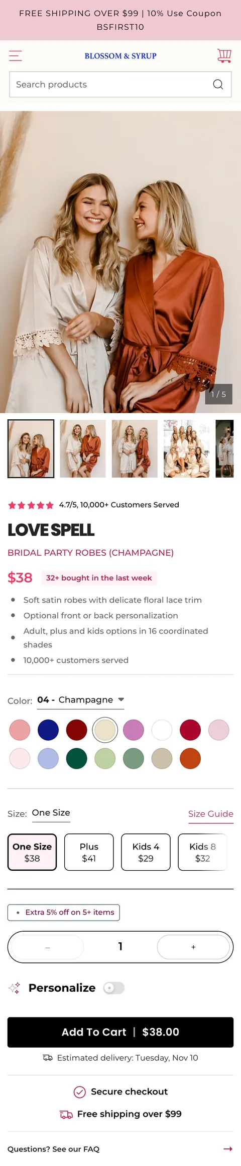
The new page puts every decision a bridal party makes into the first two screens, in the order they make them: is this trusted, what is it, what does it cost, which colours, which sizes, how many, by when. Add to cart now sits at 1,653px, 600px sooner, with far more above it.
What changed, and why
- Proof before the name. 4.7/5 from 10,000+ customers sits above the title, where the eye lands after the photo.
- The product has a name again. LOVE SPELL leads; the catalogue title and shade become a small subtitle.
- A price with momentum. "32+ bought in the last week" sits right next to it.
- Four bullets instead of 350 words. Fabric, personalisation, sizes and shades, customers served. The full story moves further down the page.
- All sixteen shades on one page. Numbered swatches switch the colour in place, so a palette can be planned without leaving.
- Every size shows its price. One Size $38, Plus $41, kids from $29, with the size guide one tap away.
- A nudge made for groups. "Extra 5% off on 5+ items" sits right above the quantity stepper.
- One strong primary action. A full-width black Add To Cart with the total in the button. Personalisation became an inline toggle, and the Shop Pay button went.
- Reassurance under the thumb. Estimated delivery date, secure checkout and the free-shipping threshold, directly below the button.
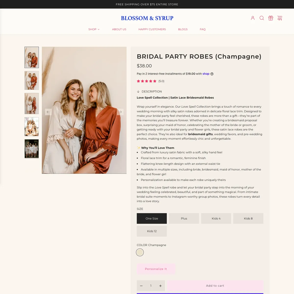
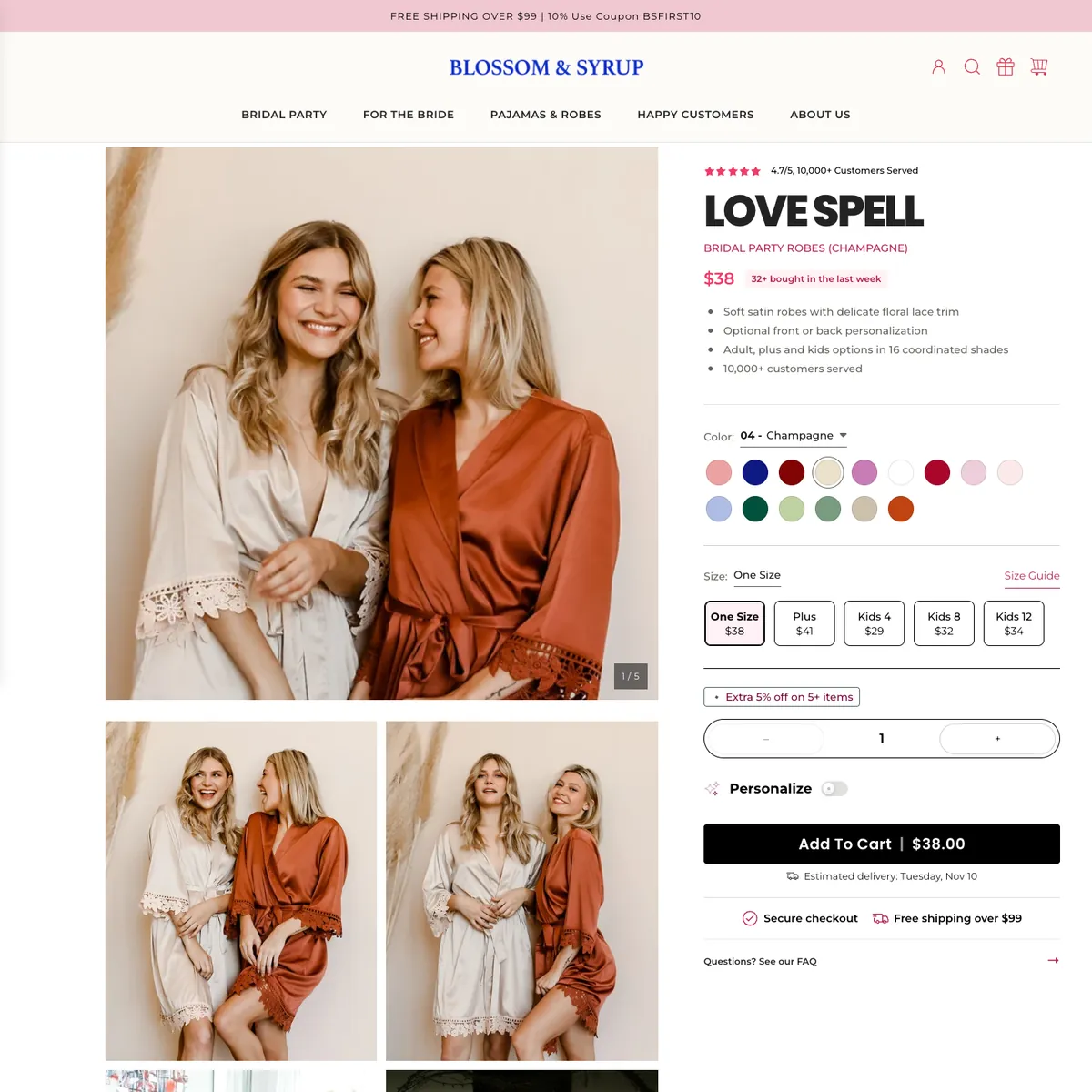
On desktop the same order holds. The old page spent its right column on the description; the new one spends it on the decision, and uses the left column for photos of real bridal parties wearing the robes.
Answering the questions that stall a group order
Below the purchase area, every section exists to remove a reason to wait. Each one answers a question a group order tends to stall on.
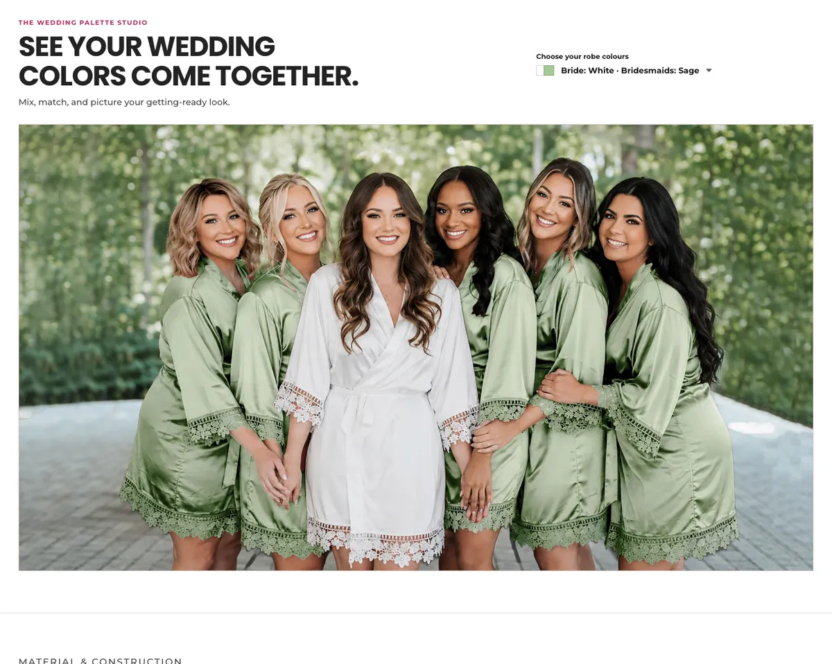
- The Wedding Palette Studio
- Pick a bride and bridesmaid combination (White with Sage, Navy, Terracotta...) and see it on a real group, instead of imagining it from swatches.
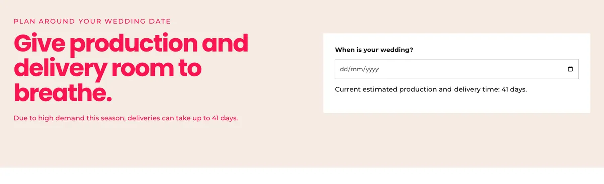
- Plan around your wedding date
- Enter the date and see the current production and delivery time. Honest about the 41-day lead time, so late orders are not a surprise.
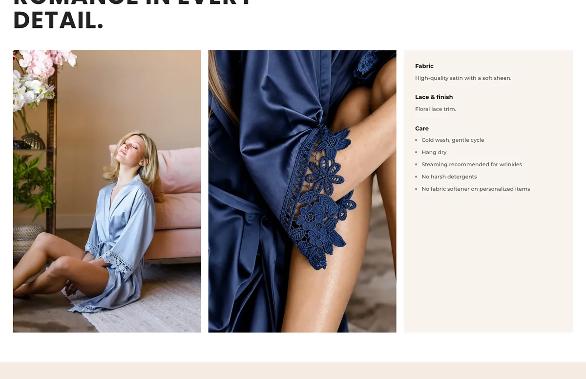
- Romance in every detail
- Fabric, lace and care in plain words, with close-ups of the satin and lace, for shoppers who cannot touch the robe.
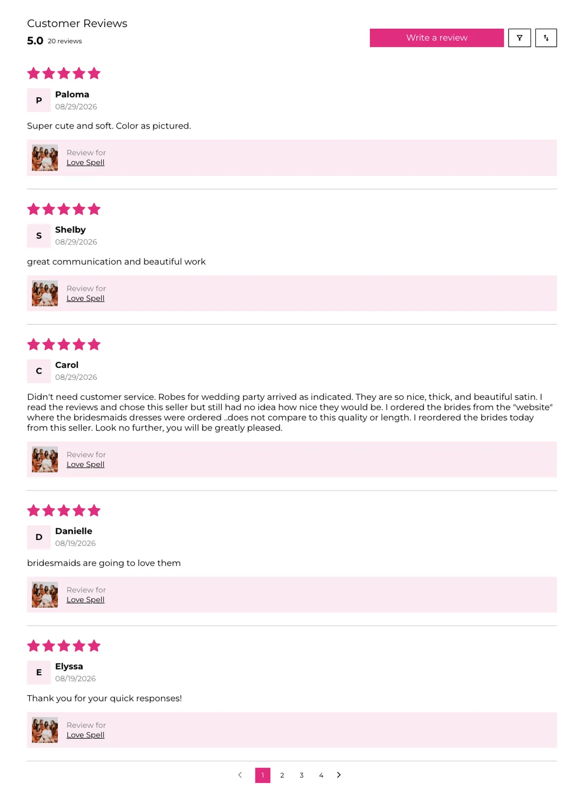
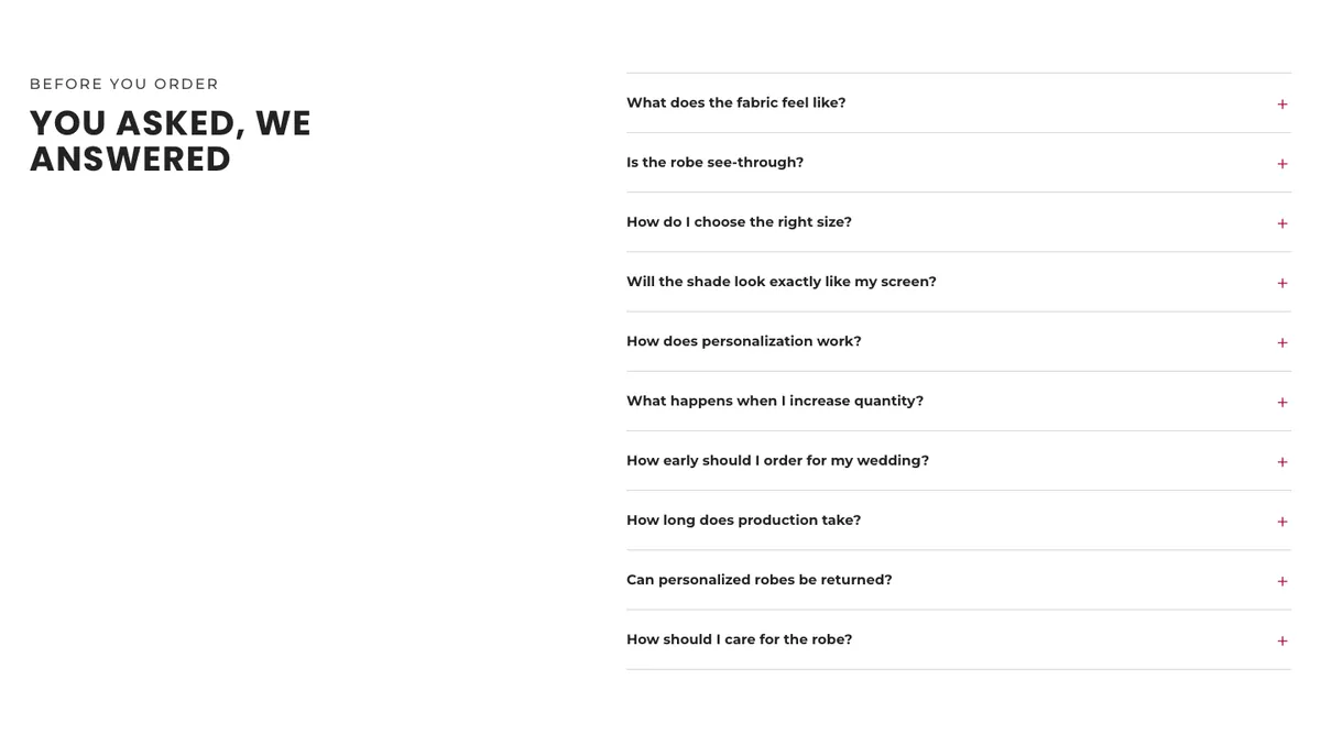
- You asked, we answered
- Ten objections as an accordion: see-through, sizing, shade accuracy, personalisation, returns on personalised robes, lead times.
The cart drawer
The old drawer confirmed the item and then went quiet: half of it was empty space, the cross-sell was pinned to the bottom, and the checkout button looked disabled. The new drawer is where the order grows and where the last doubts get answered.
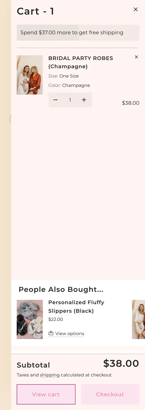
Before
- A threshold with no momentum. "Spend $37.00 more" in grey on grey, with a progress fill that is barely visible.
- Half the drawer is empty. One line item at the top, then nothing, exactly where add-ons could live.
- The wrong cross-sell, in the wrong place. One item at a time in a sideways strip at the bottom. On desktop the list was mostly the same robe in other colours, competing with the one in the cart.
- Two pale buttons of equal weight. Checkout is pale pink on pale pink and looks switched off, next to an outlined View cart.
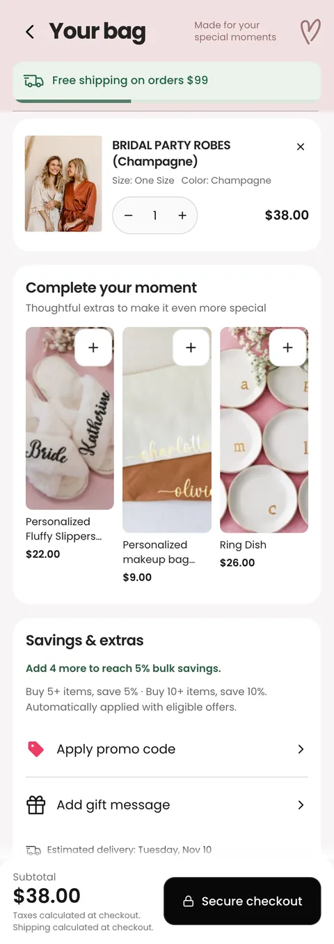
After
- Shipping progress you can see. A green bar that fills towards the free-shipping threshold.
- A tidy line item. Size and colour on one line, a real quantity stepper, the price aligned right.
- Add-ons that complete the order. Personalised slippers, a makeup bag and ring dishes ($9 to $26), one tap each, instead of more robes.
- Bulk savings as a goal. "Add 4 more to reach 5% bulk savings" turns bridal-party maths into a target: 5% at 5+ items, 10% at 10+.
- Promo code and gift message, tucked away. Both are there (a note matters for bridesmaid gifts) without cluttering the drawer.
- One way forward. A single black Secure checkout button next to the subtotal. View cart is gone.
The whole page, before and after
The new page is three times longer, and that is deliberate: the purchase area got shorter and sharper, and everything a hesitant group needs moved below it, where it helps without getting in the way.
Before
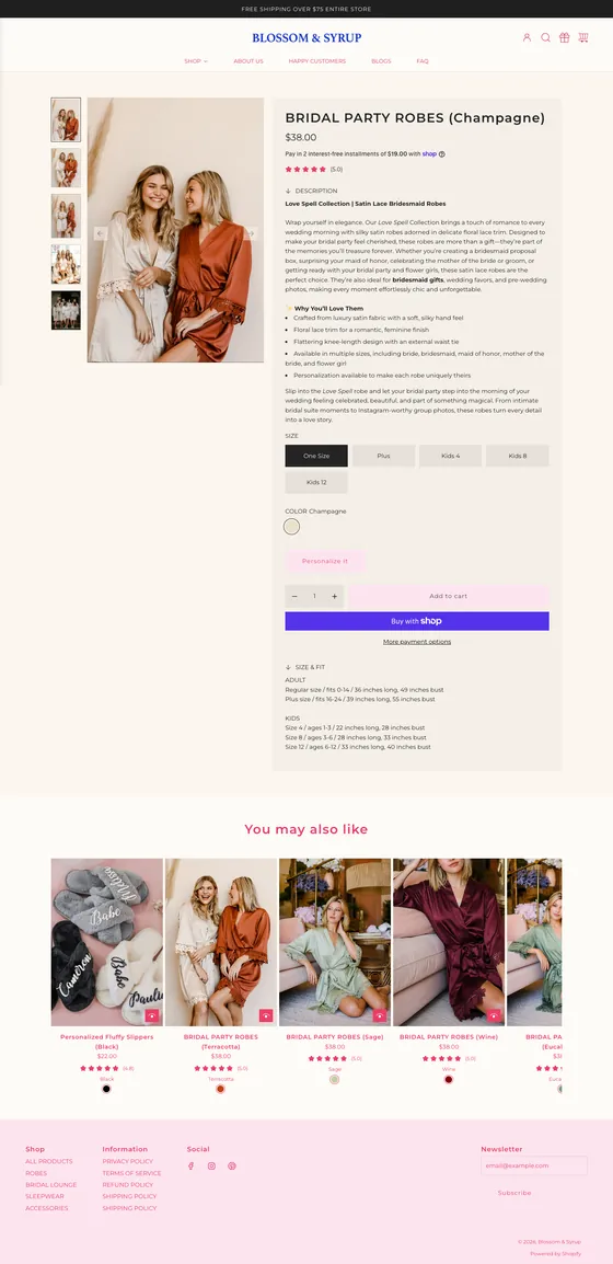
After

What I took from it
Design for the group, not the shopper.
- Order beats ornament. The purchase area gained very little new information; most of the work was putting what already existed above the button, in the right order.
- Show the whole choice. Putting all sixteen shades and every size price on one page removed the tab-hopping that stalls group orders.
- Deadlines are a design input. A delivery date next to the button, and a planner further down, answer the one question every bride has.
- The cart is part of the page. A drawer that suggests the right add-ons and states the bulk discount does more than one that only says "Cart - 1".